

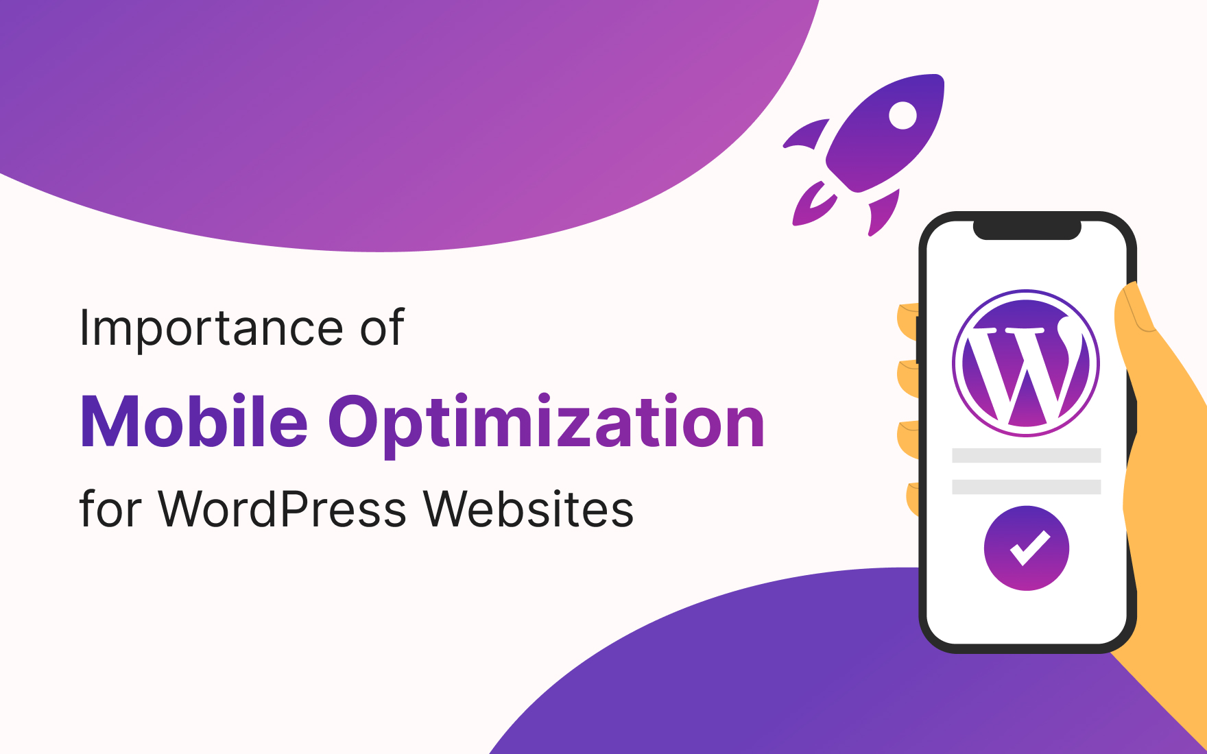
Importance of Mobile Optimization
In today’s digital age, where smartphones and tablets have become an integral part of our lives, the importance of mobile optimization for WordPress websites cannot be overstated. With an increasing number of users accessing the web through mobile devices, failing to optimize your website for mobile can result in missed opportunities and a significant loss in potential traffic and conversions. In this comprehensive guide, we’ll delve into why mobile optimization is crucial for your WordPress website’s success and explore actionable tips to ensure your site thrives in the mobile era.
Chapter 1: The Mobile-First Era
The Dominance of Mobile Devices
The 21st century has witnessed an unprecedented proliferation of mobile devices. Smartphones, tablets, and even wearables have become ubiquitous, changing the way we interact with the digital world. Today, more people access the internet through their mobile devices than ever before. This shift in user behavior has profound implications for website owners and marketers alike.
Mobile devices have become an indispensable part of our daily lives, providing us with instant access to information, entertainment, and social connections. From shopping online and checking emails to navigating with GPS and consuming multimedia content, mobile devices have revolutionized how we engage with the online world.
Google’s Mobile-First Indexing
In response to the mobile revolution, Google, the world’s leading search engine, introduced a significant change in its ranking and indexing approach. This change is known as “mobile-first indexing.” But what exactly does this mean for website owners?
In the past, Google primarily used the desktop version of a website to evaluate its relevance and quality when determining search rankings. However, with the dominance of mobile usage, Google has shifted its focus to the mobile version of websites. This means that Googlebot, Google’s web crawler, predominantly crawls and indexes the mobile version of your site to determine its position in search results.
This shift in Google’s approach underscores the critical importance of mobile optimization for SEO. Websites that are not mobile-friendly or lack mobile optimization may experience a decline in search engine rankings and visibility.
Chapter 2: User Experience Matters
Responsive Design
In the quest for optimal mobile optimization, one term stands out: responsive design. A responsive website design is an approach that aims to provide a consistent and user-friendly experience across a wide range of devices, screen sizes, and resolutions.
With responsive design, your website adapts seamlessly to different screens, whether it’s a smartphone, tablet, laptop, or desktop computer. The layout, images, and text reconfigure themselves to fit the screen, ensuring that visitors have an enjoyable and visually appealing experience regardless of the device they use.
Responsive design is not just a design philosophy; it’s a fundamental component of mobile optimization. Here are some key aspects of responsive design that contribute to an improved mobile user experience:
Fluid Grids:
Responsive design employs fluid grids, which are based on relative units (such as percentages) rather than fixed units (like pixels). This allows web elements to adapt flexibly to various screen sizes.
Media Queries:
Media queries are CSS (Cascading Style Sheets) techniques that enable you to apply different styles or layouts based on specific screen characteristics. With media queries, you can target different devices and adjust the design accordingly.
Flexible Images:
Images are often a critical part of web content. Responsive design ensures that images are appropriately scaled and optimized for different devices, reducing load times and improving the overall user experience.
Mobile-First Approach:
To truly excel in mobile optimization, many web designers and developers adopt a “mobile-first” approach. This means that they begin the design process by creating a mobile-friendly version of the website and then progressively enhance it for larger screens. A mobile-first approach ensures that the core content and functionality are optimized for mobile users.
When you implement responsive design on your WordPress website, you enhance the user experience for mobile visitors. They can easily navigate your site, read content, and interact with your offerings, resulting in higher engagement and, ultimately, increased conversions.
Faster Loading Times
Mobile users are known for their impatience when it comes to website loading times. Research shows that even a one-second delay in page load times can result in a significant increase in bounce rates. In the world of mobile browsing, where users are often on the go and looking for quick answers, speed is of the essence.
Fast-loading web pages are not only essential for retaining visitors but also for SEO. Google considers page speed as a ranking factor, and faster-loading websites are more likely to appear higher in search results.
Here are some strategies for optimizing your website’s loading speed for mobile devices:
Image Compression:
Images are often the largest files on a webpage and can contribute significantly to slow loading times. Use image compression techniques to reduce file sizes without sacrificing quality. There are several WordPress plugins available that can automate this process.
Minimize HTTP Requests:
Every element on a webpage, such as images, scripts, and stylesheets, requires an HTTP request to the server. Minimize the number of requests by combining files and using asynchronous loading for non-essential elements.
Content Delivery Networks (CDNs):
CDNs are networks of servers distributed across the globe. They store cached copies of your website’s content and deliver it from the server closest to the user. This reduces latency and speeds up page loading.
Browser Caching:
Browser caching allows you to store static files (like CSS, JavaScript, and images) on a user’s device. When a user revisits your site, the browser can load these cached files instead of downloading them again, leading to faster load times.
Mobile-Friendly Code:
Ensure that your website’s code is clean and optimized for mobile devices. Minimize unnecessary code and scripts, and use efficient HTML and CSS practices.
By optimizing your website’s loading speed for mobile devices, you not only provide a better user experience but also improve your chances of ranking higher in search engine results. Users are more likely to stay engaged with your content when they don’t have to wait for pages to load, leading to lower bounce rates and increased conversions.
Chapter 3: SEO Benefits of Mobile Optimization
Improved Search Rankings
Search engine optimization (SEO) is a complex and ever-evolving field, and mobile optimization has become an integral part of it. Google, being the dominant search engine, has a significant influence on SEO best practices. As Google prioritizes mobile-first indexing, mobile optimization has a direct impact on your website’s search rankings.
Here’s how mobile optimization can lead to improved search rankings:
Mobile-Friendly Algorithm:
Google has its mobile-friendly algorithm, which is designed to reward websites that provide a great user experience on mobile devices. Websites that pass Google’s mobile-friendly test are more likely to rank higher in mobile search results.
Reduced Bounce Rates:
Bounce rate is a metric that measures the percentage of visitors who navigate away from your site after viewing only one page. High bounce rates are often associated with poor user experiences, such as slow loading times or non-responsive designs. By optimizing your site for mobile, you can reduce bounce rates, which is a positive signal to search engines.
Enhanced User Engagement:
When users find your website easy to use and visually appealing on their mobile devices, they are more likely to engage with your content, spend more time on your site, and explore multiple pages. Increased user engagement can contribute to improved search rankings.
Mobile-First Indexing:
As mentioned earlier, Google’s mobile-first indexing means that Google predominantly uses the mobile version of your site to determine its search
Conclusion
Mobile optimization is no longer an option but a necessity for WordPress website owners. In a mobile-first world, providing an exceptional user experience on smartphones and tablets is paramount for SEO success, user engagement, and conversions. By following the best practices outlined in this guide, you can ensure that your WordPress website thrives in the mobile era, attracting and retaining visitors across all devices. Don’t miss out on the vast opportunities offered by mobile optimization – start optimizing your site today for a brighter online future.