Interactive Error Page is a unique and creatively designed error page, a best choice for all your websites whenever your user or visitor encounters any missing links, broken links or any error situation and they would definitely never get into frustration because of its creative design. This smartly designed error page has an attractive image background along with elegantly crafted 404 digits. This magnificently designed Interactive Error page is 100% responsive cross browser page, compatible on all devices, displayed on all screen sizes. It is entirely built in HTML5 and CSS3. Make it yours now by using it, downloading it and please share it.
TEMPLATE INFORMATION:
Template Name : – Interactive Error Page a Responsive Widget Template License : – Life Time Free License Under Creative Commons Attribution 3.0 Unported. Unlimited Use, you can help & support us (W3Layouts, a Non-Profit) by donations or you should keep link to our website.
Compatible Browsers: – Google Chrome, Firefox, Safari, IE 10, Opera etc. Source Files included: – HTML files (.html), Style Sheets (.css), Images (.jpg/png/gif),
JQuery plugins (.js), Fonts (.ttf). High Resolution: – Yes.
Features:
Fully Responsive
Modern and Elegant Design
HTML5 & CSS3
Google Fonts used
And more…
Sleet is a 404 error widget, the best and simple look theme design for your websites. The notorious 404 error, page not found is often, not totally erroneously, referred to as the last page of the internet. It’s an obligatory heads-up with an outsize reputation. It’s inevitable that at some point users are going to land 404 error page. i.e., if mistakes happen, if there is something not present what we are searching for etc., so this page can also be used to convince them. This simply designed Error Page is 100% responsive cross browser Error Page, compatible on all devices, displayed on all screen sizes. It is entirely built in HTML5 and CSS3. Make it yours now by using it, downloading it and please share it.
TEMPLATE INFORMATION:
Template Name : – Sleet a Flat Responsive Widget Template License : – Life Time Free License Under Creative Commons Attribution 3.0 Unported. Unlimited Use, you can help & support us (W3Layouts, a Non-Profit) by donations or you should keep link to our website.
Compatible Browsers: – Google Chrome, Firefox, Safari, IE 10, Opera etc. Source Files included: – HTML files (.html), Style Sheets (.css), Images (.jpg),
JQuery plugins (.js),Fonts (.ttf),Video(.mp4). High Resolution: – Yes.
Features:
Fully Responsive
Modern and Elegant Design
HTML5 & CSS3
Google Fonts used
And more…
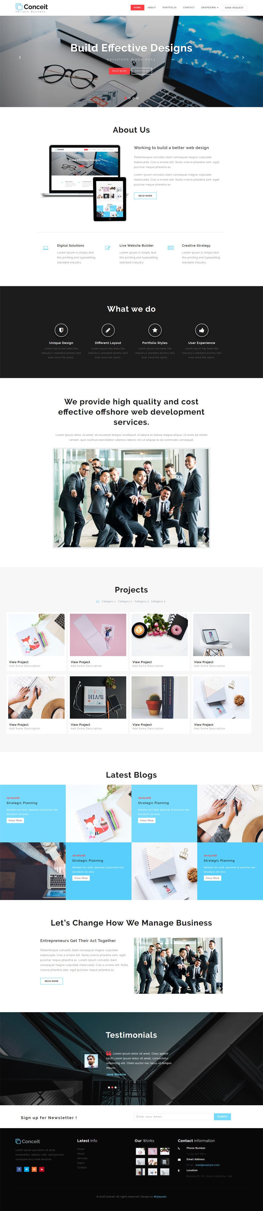
Conceit is a modern theme multipage multipurpose template for business and corporate related website. It is a great high-performance corporate theme with a modern creative design to delight a multitude of creative users for building their websites. This conceit is created for all kinds of business, accounting, financial, business planning, corporate websites, agency, consultancy business, freelancers, marketing business, startup business, creative group, entrepreneurs, web studios, insurance, investment, trading companies, banking business, stock, wealth & tax consultancy and other agencies. This template comes with necessary features for your online existence like projects portfolio page, about page, contact page, 404 page, latest blogs, testimonials, team and newsletter subscribe form etc. It is a comprehensive business consulting theme that offers everything that a potential customer seeks from a website. Conceit can be a great choice for your online existence. Looking for release of your company website? Conceit is best choice. This magnificently designed Conceit template is 100% responsive cross browser template entirely built in Bootstrap framework, HTML5, CSS3 and JQuery. Make it yours now by using it, downloading it and please share it.
TEMPLATE INFORMATION:
Template Name : – Conceit Corporate Category Bootstrap Responsive Web Template License : – Life Time Free License Under Creative Commons Attribution 3.0 Unported. Unlimited Use, you can help & support us (W3Layouts, a Non-Profit) by donations or you should keep link to our website. Date Created : – Jan 29, 2018. Compatible Browsers: – Google Chrome, Firefox, Safari, IE 10, Opera etc. Source Files included: – HTML files (.html), Style Sheets (.css), Images (.jpg/.png/.gif),
JQuery plugins (.js), Fonts (.ttf). High Resolution: -Yes.
100% Responsive with Bootstrap slider
Icons based on Font Awesome
HTML5 & CSS3
Google Fonts used
Bootstrap Carousel Used
Easy to Use/Customize
Simple & Easy to Use/Customize
Bootstrap Framework
Image Transition Effect
Google Map Used
And much more…
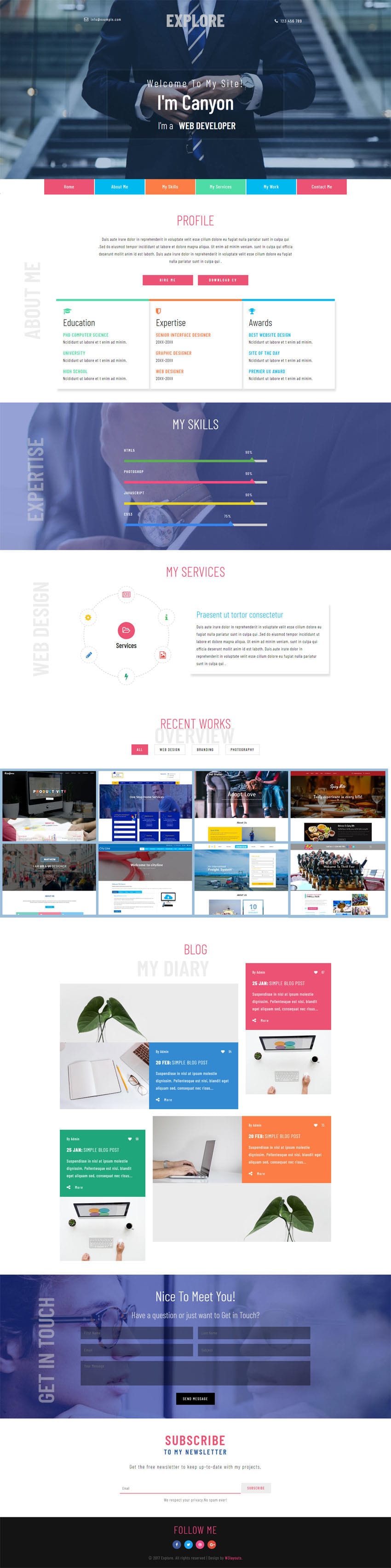
Explore is a personal website theme with its intuitive design and stylish look will help you make your personal blog design or a developer portfolio website really attractive. Apart from a good design layout, you can easily edit and customize to share your work and you’ll easily alter the design as you wish, in order to create an image of a serious job seeker in your industry. This template will help you to present your candidacy in the best way. This personal website theme will be perfectly suited to represent your creative thoughts on the web. This elegantly designed template has awesome features like stylish colorful navigation, banner text slide up, filterizr gallery tabs and elegance style of design in every detail. This template is 100% responsive cross browser template, compatible on all devices, displayed on all screen sizes. It is entirely built in Bootstrap framework, HTML5, CSS3 and JQuery. Make it yours now by using it, downloading it and please share it.
TEMPLATE INFORMATION:
Template Name : – Explore a Personal Category Bootstrap Responsive Web Template License : – Life Time Free License Under Creative Commons Attribution 3.0 Unported. Unlimited Use, you can help & support us (W3Layouts, a Non-Profit) by donations or you should keep link to our website.
Compatible Browsers: – Google Chrome, Firefox, Safari, IE 10, Opera etc. Source Files included: – HTML files (.html), Style Sheets (.css), Images (.jpg/png/gif),
JQuery plugins (.js), Fonts (.ttf). High Resolution: – Yes.
Fully Responsive
Modern and Elegant Design
Used Font awesome icons
HTML5 & CSS3
Google Fonts used
Bootstrap Framework
Elegant and Clean
Used Sticky header
Splash of color
And more…
Falsity error page is a creative 404 error page. This can be used for companies that are error page or page not found online with their business or any other site. To make these error pages more user-friendly, a search form and social buttons are all included in the design and very easy to set up. With this stylish custom 404 error page, your user’s eyes will be delighted instead of frustrated, when they encounter an error. This falsity error page has a nice attractive, eye-catching wooden background image with clean flat design and a search form to find information in your site after that getting a website error. If you are looking for error page, this falsity error page is best choice for your all kinds of websites. This Elegantly designed error page is 100% responsive cross browser Error Page, compatible on all devices, displayed on all screen sizes. It is entirely built in HTML5 and CSS3. Make it yours now by using it, downloading it and please share it.
TEMPLATE INFORMATION:
Template Name : – Falsity Error Page Flat Responsive Widget Template License : – Life Time Free License Under Creative Commons Attribution 3.0 Unported. Unlimited Use, you can help & support us (W3Layouts, a Non-Profit) by donations or you should keep link to our website. Compatible Browsers: – Google Chrome, Firefox, Safari, IE 10, Opera etc. Source Files included: – HTML files (.html), Style Sheets (.css), Images (.jpg/png/gif),
JQuery plugins (.js), Fonts (.ttf). High Resolution: – Yes.
Features:
Fully Responsive
Modern and Elegant Design
HTML5 & CSS3
Google Fonts used
Font awesome icons
And more…
Downy Shoes Ecommerce Category Bootstrap Responsive Web Template
Downy Shoes is an online shopping themed multipage website especially designed for footwear collections. It is a smart choice for all your e-commerce websites in order to boost your profits and expand your business online around the world. This creatively designed template is also a perfect choice for all your online store websites like Clothing store, Men fashion, Women fashion, Furniture, Accessories, Jewelries, mobile store, apparel, mall shop, gift shop, groceries, cosmetics, home appliances, personal care, electronics, books, kids toys and much more. A clean and elegant design suitable for selling products online. It is coded keeping in mid most of widely used e-commerce platforms. This template will create best experience for your customers. This template is one of the most powerful and flexible website designs for your online shopping. This modern design template has awesome features like search bar, responsive banner slider, navigation overlay, eye catching hover effects, carousel slider, add to cart plugin, shopping products page, single page, 404 page, subscribe form, well-structured pages for all your needs, sleek and elegance style of design in every detail. This Downy Shoes template is 100% responsive cross browser template, compatible on all devices, displayed on all screen sizes. It is entirely built in Bootstrap framework, HTML5, CSS3 and JQuery. Make it yours now by using it, downloading it and please share it.
TEMPLATE INFORMATION:
Template Name : – Downy Shoes Ecommerce Category Bootstrap Responsive Web Template License : – Life Time Free License Under Creative Commons Attribution 3.0 Unported. Unlimited Use, you can help & support us (W3Layouts, a Non-Profit) by donations or you should keep link to our website. Compatible Browsers: – Google Chrome, Firefox, Safari, IE 10, Opera etc. Source Files included: – HTML files (.html), Style Sheets (.css), Images (.jpg/.png/.gif),
JQuery plugins (.js), Fonts (.ttf). High Resolution: – Yes.
100% Responsive with banner slider
Icons based on Font Awesome
HTML5 & CSS3
Google Fonts used
Bootstrap Carousel Used
Easy to Use/Customize
Excellent Background Image Used on Scrolling
Simple & Easy to Use/Customize
Used Cart Plugin
Bootstrap Framework
Image Transition Effect
Google Map Used
And much more…

