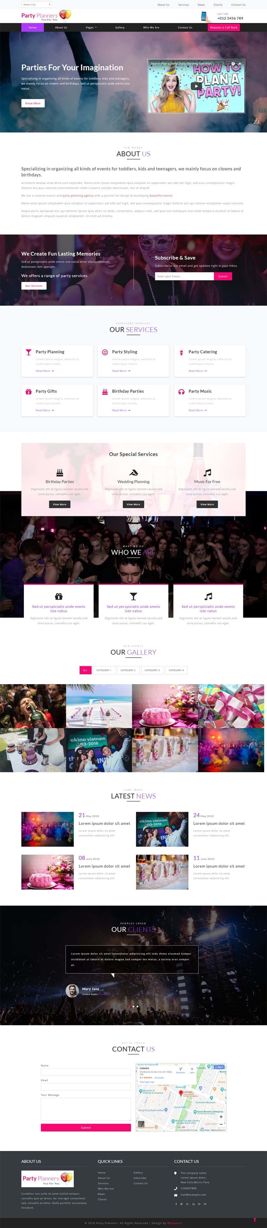
Party planners is an elegant, creative, clean, multipurpose single page template with a fashionable and tender look. It’s designed for professional event management website, party planning agency, an individual wedding planner, catering company or any event planning company (parties, meetings, and conferences). If you are an event or party planner, this Party Planners template has been designed especially for you. It is best suitable template for your event or party celebration related websites like wedding event, new-year parties, birthday parties, anniversaries, engagement parties, DJ parties and any other event related websites. This great design comes with beautifully designed home page with fixed navigation, banner video, about us section, services section, gallery section with pretty photo effect, latest news section, clients testimonials owl carousel slider, services, newsletter subscribe form, location map and a contact form, clean, sleek, minimalistic and elegance style of design in every detail. This elegantly designed Party Planners template is 100% responsive cross browser template, compatible on all devices, displayed on all screen sizes. It is entirely built in Bootstrap framework, HTML5, CSS3 and JQuery. Make it yours now by using it, downloading it and please share it.
TEMPLATE INFORMATION:
Template Name : – Party Planners Entertainment Category Bootstrap Responsive Web Template.
License : – Life Time Free License Under Creative Commons Attribution 3.0 Unported. Unlimited Use, you can help & support us (W3Layouts, a Non-Profit) by donations or you should keep link to our website.
Compatible Browsers: – Google Chrome, Firefox, Safari, IE 10, Opera etc.
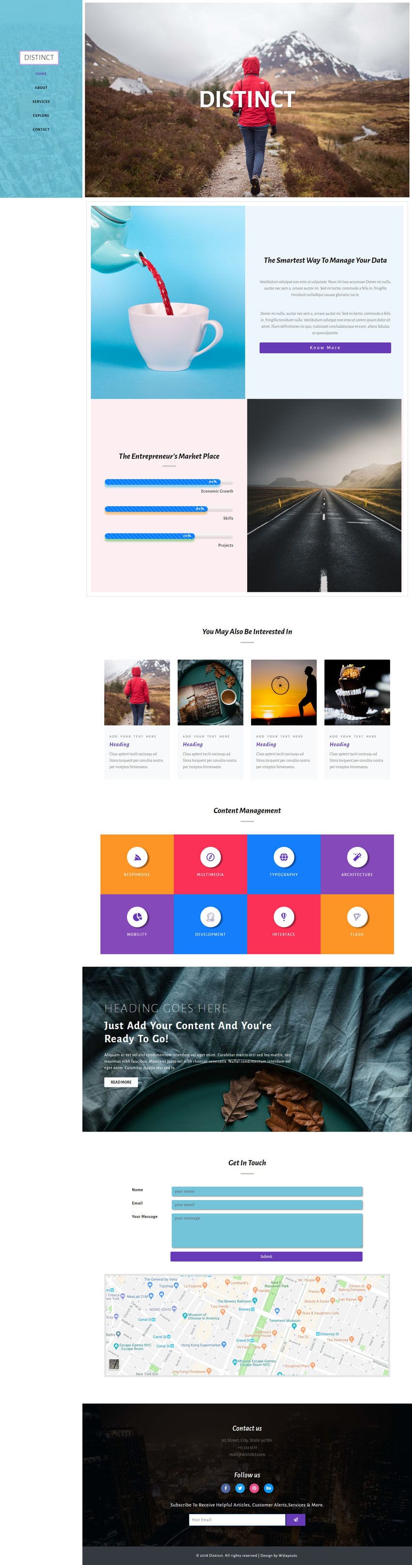
Distinct is a multipurpose bootstrap responsive website template. It is clean and flexible theme based on bootstrap framework. It is suitable for any kind of websites to boost your profits and expand your business online all over the world. This template has smooth scroll, awesome features, modern and unique design which make your website more beautiful. But still can be easily customized for making any types of business, personal and corporate website. It is highly super flexible, with a clean and professional design. Distinct is the perfect template to build a great website for your company. It is bootstrap flat template and you can use it to make any kind of website. It comes with left side fixed navigation and the main template content is scrollable next to the left side navigation, progress bars, services section designed with cards, another section with colorful iconic grids, a contact form and map, social media icons and newsletter subscribe form, clean, elegant style of design in every detail. This elegantly designed template is 100% responsive cross browser template, compatible on all devices, displayed on all screen sizes. It is entirely built in Bootstrap framework, HTML5, CSS3 and JQuery. Make it yours now by using it, downloading it and please share it.
TEMPLATE INFORMATION:
Template Name : – Distinct Multipurpose Category Bootstrap Responsive Web Template.
License : – Life Time Free License Under Creative Commons Attribution 3.0 Unported. Unlimited Use, you can help & support us (W3Layouts, a Non-Profit) by donations or you should keep link to our website.
Compatible Browsers: – Google Chrome, Firefox, Safari, IE 10, Opera etc.
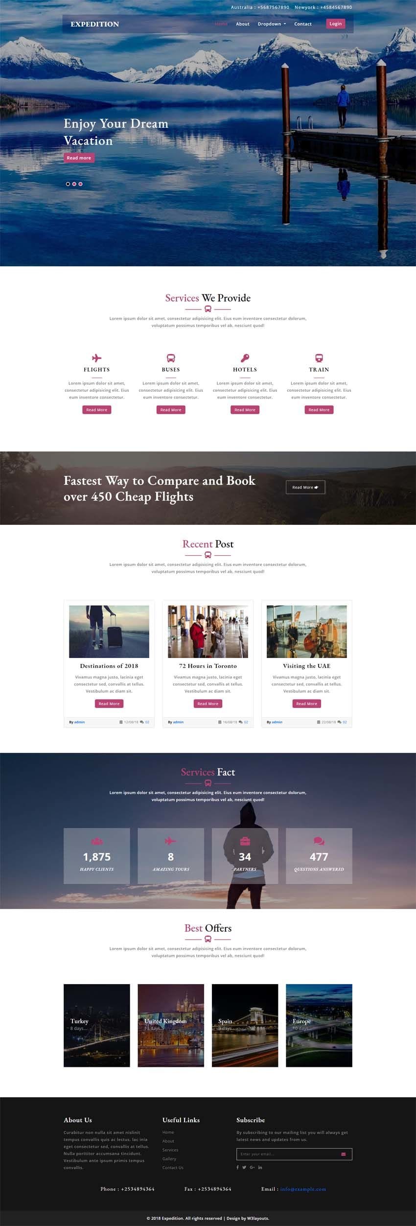
If you are looking for a travel agency website which can help you build your online presence and boost your business. Expedition template will help you create an outstanding travel agency website and start working right away. This template is a clean, beautiful and modern designed website solution. This theme is designed for all services related to tourism such as package tours, travel agency, tour operator, travel blog, adventure tours, travel directory, travelers and much more. It comes with a banner text slider, about page, services page, team of agents section, gallery page with image smooth box effect, location map and contact form, newsletter subscribe form and etc., will provide you for everything to make your site look reliable for your clients and to assure them a comfortable and enjoyable working process. The dedicated Contact page was designed to make the interaction between you and your customers more streamlined. Login and register forms with bootstrap modal popup are also included in this template. Don’t miss a chance to get this beautiful and enjoyable travel agency template, it is very flexible and easy to use and can easily satisfy all of your needs. This beautifully designed Expedition template is an excellent option for creating a stylish site with an extremely attractive design. This magnificently designed Expedition template is 100% responsive cross browser template entirely built in Bootstrap framework, HTML5, CSS3 and JQuery. Make it yours now by using it, downloading it and please share it.
TEMPLATE INFORMATION:
Template Name : – Expedition a Travel Category Bootstrap Responsive Web Template.
License : – Life Time Free License Under Creative Commons Attribution 3.0 Unported. Unlimited Use, you can help & support us (W3Layouts, a Non-Profit) by donations or you should keep link to our website.
Compatible Browsers: – Google Chrome, Firefox, Safari, IE 10, Opera etc.
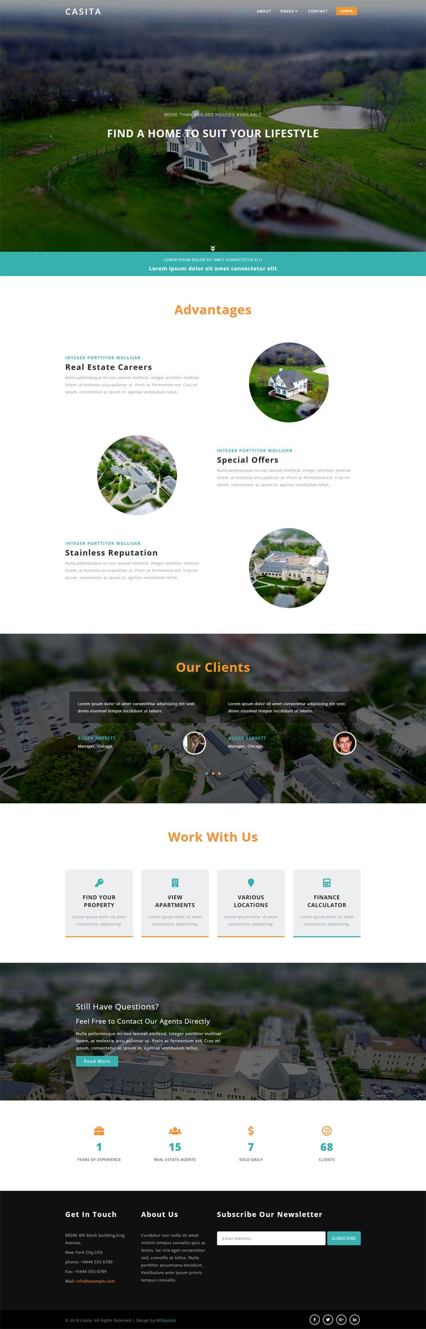
Casita is a sleek and modern real estate web template. It is best suited for Real estate agency, Agents companies, property, real estate, brokerages, apartment managers, residential & commercial developers, rental, houses, apartments and much more. This is a business template that is help full for online presence for Corporate Business and Real Estate Firms. It fits for Small, Medium and Large real estate companies as well as for individual real estate agents too. This smartly designed template has awesome features like login and register forms with bootstrap modal popup, clients owl carousel slider, number counter plugin, stylish hover effects, Real estate advantages section, an about page, commercial real estate services showcase in the services page, mesmerizing gallery page with pretty photo effect to showcase the properties, professional agents team, contact map, contact form and contact information in the contact page, newsletter subscribe form, social media icons, clean, sleek and elegance style of design in every detail. Grab this clean designed Casita template and use it to make your online presence, it is a professional solution for real estate businesses. This elegantly designed Casita template is 100% responsive cross browser template, compatible on all devices, displayed on all screen sizes. It is entirely built in Bootstrap framework, HTML5, CSS3 and JQuery. Make it yours now by using it, downloading it and please share it.
TEMPLATE INFORMATION:
Template Name : – Casita a Real Estate Category Bootstrap Responsive Web Template.
License : – Life Time Free License Under Creative Commons Attribution 3.0 Unported. Unlimited Use, you can help & support us (W3Layouts, a Non-Profit) by donations or you should keep link to our website.
Compatible Browsers: – Google Chrome, Firefox, Safari, IE 10, Opera etc.
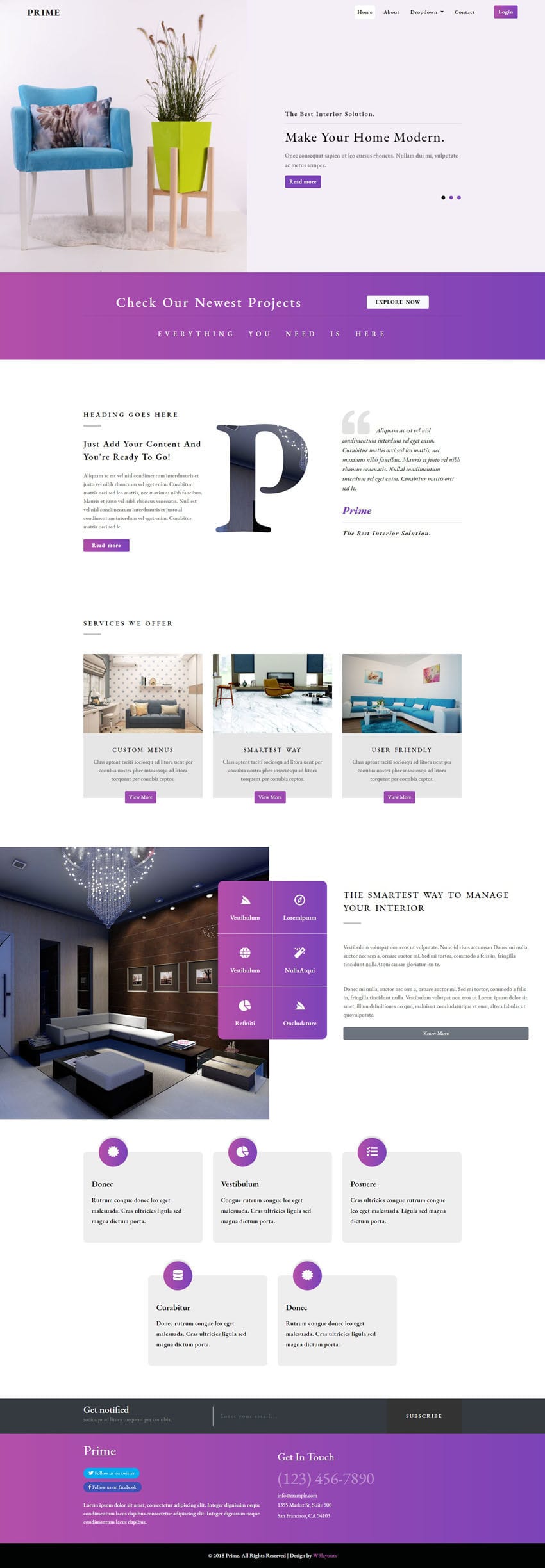
Prime is an Interior or Furniture template designed specifically for Interior design, Interior decoration, Architecture, Furniture design, Remodeling, Renovation, Engineering companies. But the core focus is to highlight your interior design business. It can also be used as a multipurpose template. With its clean design and fresh, unique feel you will be able to make a website that stands out. If you are interested in creating a great website for your interior design agency, Prime template is the essential choice for you. This smartly designed template has awesome features like beautiful banner text slider, stylish hover effects, attracting gradient colors, interior services, team members, newsletter subscribe form, about page, services page, gallery page with smooth box effect, typography page, contact page and very clean, sleek, minimalistic and elegance style of design in every detail. Login and Register forms are included in this template. This Modern designed Prime template is 100% responsive cross browser template, compatible on all devices, displayed on all screen sizes. It is entirely built in Bootstrap framework, HTML5, CSS3 and JQuery. Make it yours now by using it, downloading it and please share it.
TEMPLATE INFORMATION:
Template Name : – Prime Interior Category Bootstrap Responsive Web Template.
License : – Life Time Free License Under Creative Commons Attribution 3.0 Unported. Unlimited Use, you can help & support us (W3Layouts, a Non-Profit) by donations or you should keep link to our website.
Compatible Browsers: – Google Chrome, Firefox, Safari, IE 10, Opera etc.
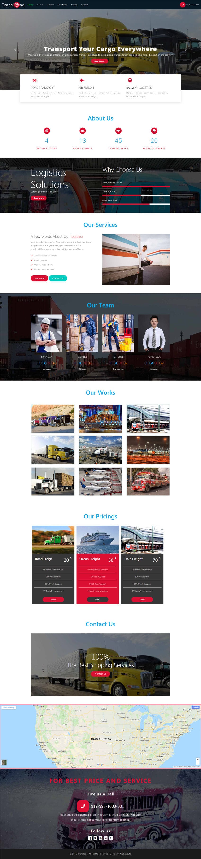
Trans load a Transport Category Bootstrap Responsive Web Template
Transload Theme is a stylish, elegant, versatile & professional theme specially designed for the transportation, logistics, cargo, trucking, mover, warehouse, delivery, shipping, Packaging Services, freight services. You’ll certainly find a layout that will fit your needs. By using this template, your transport and logistics company website will be up and running in minutes. It will be of great help to you when you will decide that your logistics and transportation company needs a website. This smartly designed template has pretty awesome features like banner Bootstrap carousel slider, stats counter, eye catching hover effects, progressive bars, services flex slider, Pricing tables, gallery simple light box effect, social media integration, and clean, sleek, minimalistic and elegance style of design in every detail.It penetrates your customer’s minds and ensures the fulfillment of their needs. It is a best choice for all your transportation or industrial related websites in order to boost your profits and expand your business around the world via online by using this modern and creatively designed template. This elegantly designed Transload template is 100% responsive cross browser template, compatible on all devices, displayed on all screen sizes. It is entirely built in Bootstrap framework, HTML5, CSS3 and JQuery. Make it yours now by using it, downloading it and please share it.
TEMPLATE INFORMATION:
Template Name : – Transload a Transport Category Bootstrap Responsive Web Template.
License : – Life Time Free License Under Creative Commons Attribution 3.0 Unported. Unlimited Use, you can help & support us (W3Layouts, a Non-Profit) by donations or you should keep link to our website.
Compatible Browsers: – Google Chrome, Firefox, Safari, IE 10, Opera etc.
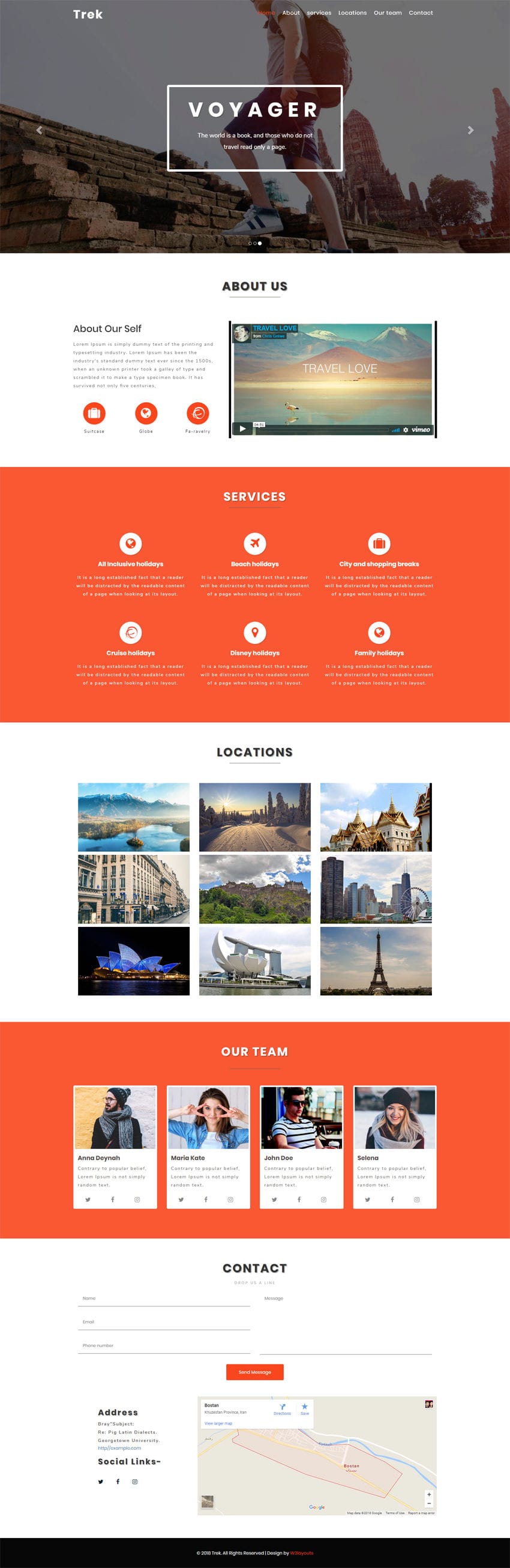
If you are interested to build a remarkable website for your travel agency, our Trek template is the way to go. It is designed with a great attention to detail. Trek is a travel themed multipurpose template with clean and elegant design that can be used for travel agency and tourism related websites in order to boost your travel business profits and expand your business around the world via online. This tour and travel agency template is suitable for companies and agencies that provide services related to tourism such as travel agencies, adventure parks, tourism and tour companies, vacation, holiday, resorts, package tours, tour operator, cruise, outdoor travel activities, camping, excursion activities and much more. This travel themed template is a better way to present your modern business. Trek template comes with a banner image slider, about company, services, team members, locations and contact form provide you for everything to make your site look reliable for your clients and to assure them a comfortable and enjoyable working process. Showcase the best locations images brilliantly in gallery section and breathtaking design. This theme design is responsive, minimal, clean and modern. This magnificently designed Trek template is 100% responsive cross browser template entirely built in Bootstrap framework, HTML5, CSS3 and JQuery. Make it yours now by using it, downloading it and please share it.
TEMPLATE INFORMATION:
Template Name : – Trek Travel Category Bootstrap Responsive Web Template License : – Life Time Free License Under Creative Commons Attribution 3.0 Unported. Unlimited Use, you can help & support us (W3Layouts, a Non-Profit) by donations or you should keep link to our website. Date Created : – Jan 20, 2018. Compatible Browsers: – Google Chrome, Firefox, Safari, IE 10, Opera etc. Source Files included: – HTML files (.html), Style Sheets (.css), Images (.jpg/png/gif),
JQuery plugins (.js),Fonts (.ttf). High Resolution: – Yes.
100% Responsive With Bootstrap Carousel Slider
Professional and Modern Design
Use menu with bootstrap Framework
Validated HTML5 & CSS3
Modern, Flexible and Customizable
Font awesome icons
Clean and Clear Structure
Google Fonts usage
Google Map used
Bootstrap Framework
And more…

