

Description
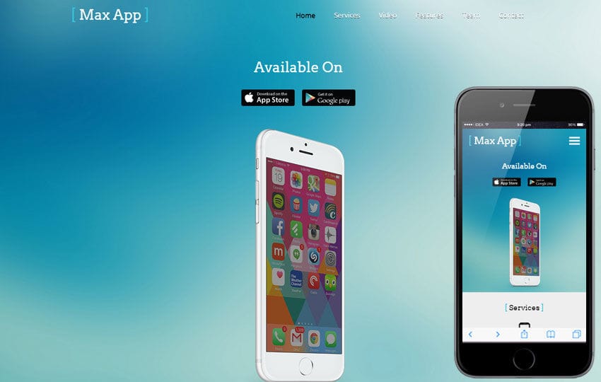
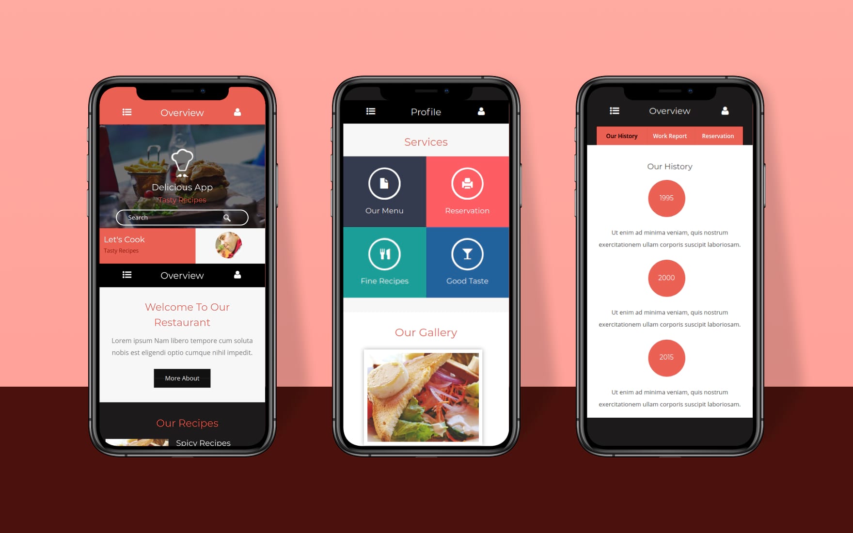
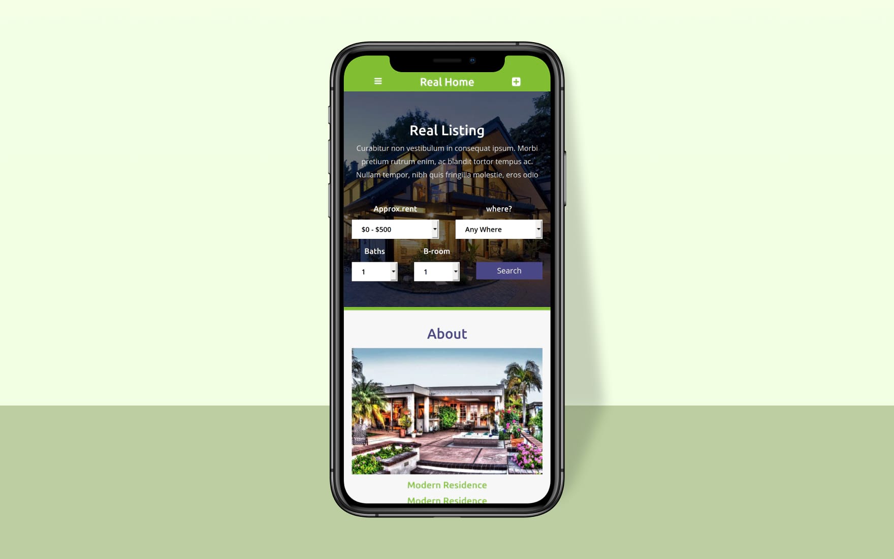
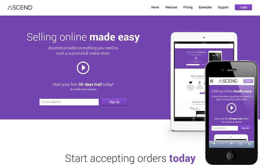
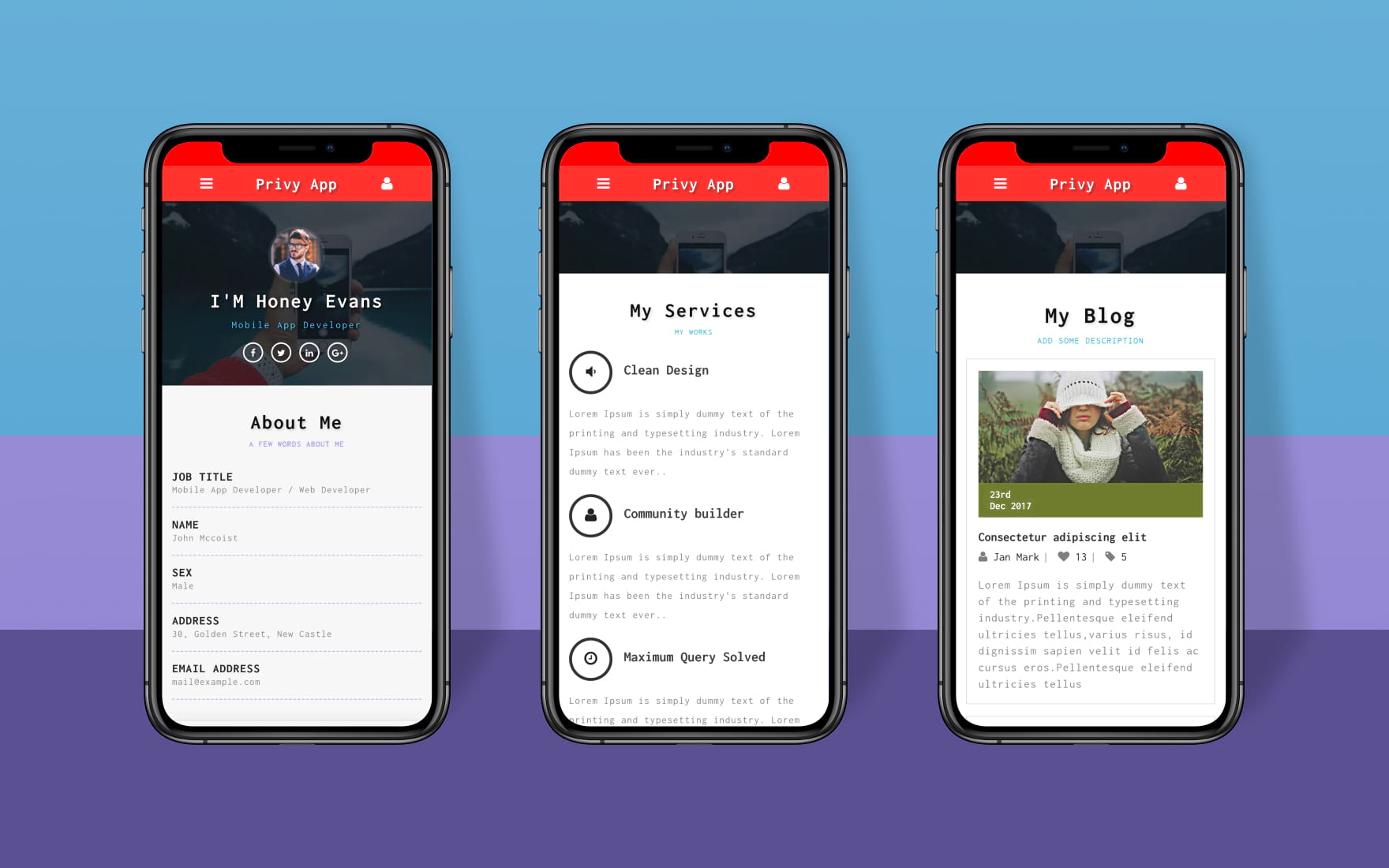
Max App a Mobile App based Flat Bootstrap Responsive Web Template
Max App a Flat Style Mobile App based template designed by W3layouts. You can use this template for any type of product based websites. Max App is a cross-browser compatible i.e., this template fits browsers like Chrome, Firefox, Safari, IE and Opera. This web template is built in a Fancy style however it can be used as per the user requirements.
Max App designed with a good color scheme and good grid style of elements. This template is designed using HTML5 and CSS3.These are some strong points to consider if you plan to use this free web design template.
Template Information
Template Name : Max App a Mobile App based Flat Bootstrap Responsive Web Template
Licence: Life Time Free Licence under Creative Commons Attribution 3.0 Unsorted. Unlimited Use, Source files & PSD included, you can help & support us (W3Layouts, a Non-Profit) by donations or you should keep link to our website.
Date Created: Jun 8, 2015
Compatible Browsers: Google Chrome, Firefox, Safari, IE 10, Opera etc..
High Resolution: Yes
Layout: Fluid Responsive Layout
Source Files included: HTML files (.html), Style Sheets (.css), Images (.jpg/png/gif),
JQuery plugins (.js), Photoshop sources (.psd), Fonts (.ttf)
Tags: Free Responsive Template, free responsive templates download, free responsive mobile templates, free HTML5 CSS3 templates, free fluid responsive themes, corporate Responsive web template, cross-browser compatible web template, best responsive template
Max App Flat PSD by Psd Depot’s