

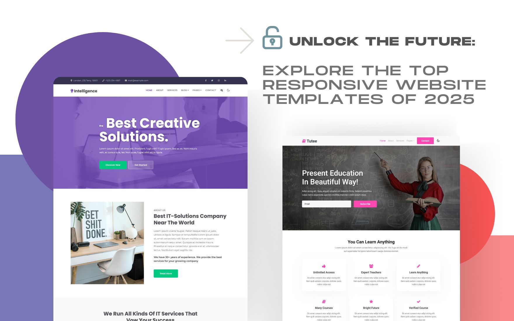
A responsive website is no longer optional in today’s fast-paced digital world. It’s a necessity for businesses, freelancers, and anyone looking to make a significant impact online. As we enter 2025, the demand for cutting-edge responsive website templates is at an all-time high. These templates provide a seamless user experience across devices and help improve search engine rankings. Let’s dive into the top responsive website templates of 2025 that are set to revolutionize the way we design and experience the web.
Why Responsive Design Matters in 2025
Responsive design ensures that a website looks and functions well on all devices, from desktops to smartphones. With mobile internet usage surpassing desktop, it’s crucial to cater to mobile users. A responsive website adapts to the screen size, providing an optimal viewing experience and reducing bounce rates.
Benefits of Using Responsive Website Templates
- Improved User Experience: Responsive templates ensure that users have a smooth experience, regardless of the device they’re using.
- Better SEO Performance: Search engines favor responsive websites, making them rank higher in search results.
- Cost-Effective: Instead of creating multiple versions of a website for different devices, a single responsive template serves all.
- Easy Maintenance: Managing one site is simpler than maintaining separate sites for mobile and desktop.
Top Responsive Website Templates of 2025
1. Fluidity
Fluidity is a versatile template designed for modern businesses. It features a clean, minimalist design with customizable elements that adapt beautifully to all screen sizes. Perfect for startups and corporate websites, Fluidity ensures that your content shines through without distractions.
2. Vista
Vista is tailored for creative professionals. It offers stunning galleries and portfolios that look amazing on any device. With its responsive grid layout, Vista is ideal for photographers, designers, and artists who want to showcase their work elegantly.
3. Neonix
Neonix is a futuristic template that’s perfect for tech companies and startups. Its bold typography and dynamic animations make it stand out. Neonix is fully responsive, ensuring that your innovative ideas are presented in the best possible light, regardless of the device.
4. Serenity
For those in the health and wellness industry, Serenity offers a calming design that resonates with users. Its soft color palette and fluid layout create a soothing user experience, making it perfect for yoga studios, spas, and wellness blogs.
5. EcomMax
EcomMax is the go-to template for e-commerce websites. It’s designed to enhance online shopping experiences with responsive product grids and quick loading times. Whether you’re selling clothes, gadgets, or home decor, EcomMax ensures your store looks impeccable on all devices.
6. EduSphere
EduSphere caters to educational institutions and online learning platforms. With its responsive course grids and user-friendly navigation, EduSphere makes learning accessible and engaging on any device, from smartphones to desktops.
7. UrbanNest
UrbanNest is a chic template designed for real estate agencies. Its responsive design showcases property listings with high-quality images and detailed descriptions, providing potential buyers with a seamless browsing experience.
8. EventPro
EventPro is crafted for event management and conference websites. Its responsive design ensures that event details, schedules, and booking forms are easily accessible on any device, making it convenient for users to stay updated.
9. Travelo
Travelo is the ultimate template for travel blogs and agencies. With its responsive design, beautiful imagery, and interactive maps, Travelo inspires wanderlust and provides users with a smooth browsing experience across all devices.
10. FitLife
FitLife is perfect for fitness enthusiasts and gyms. Its responsive layout, along with features like workout plans and class schedules, makes it easy for users to stay connected and motivated, whether they’re at home or on the go.
How to Choose the Right Template for Your Website
Selecting the right responsive template depends on your website’s purpose and audience. Consider the following factors:
- Target Audience: Choose a template that aligns with your audience’s preferences and needs.
- Design Flexibility: Look for templates that offer customization options to fit your brand identity.
- Performance: Ensure the template is optimized for fast loading times and smooth navigation.
- SEO Friendliness: A template with built-in SEO features will give you a head start in search rankings.
Conclusion
The year 2025 brings a plethora of innovative responsive website templates that cater to various industries and user needs. By choosing the right template, you can provide a superior user experience, enhance your SEO efforts, and stay ahead of the competition. Explore these top templates on W3Layouts and unlock the future of web design today.