Are you searching for unique and modern designed pricing tables for your websites? Pricing tables are a critical part in showcasing your services, prices and overall offerings. By using this Fitness pricing tables, you can build a pricing or features table for your products or services in the easiest way. Pricing tables plays an important role in helping your visitors quickly visualize and compare features your pricing plans offer. This stylish and gorgeous looking pricing table has an attractive image background of a fitness center on which the four colorfully designed pricing tables are beautifully crafted with a flat minimalistic designed signup popup form. These elegantly designed Fitness pricing tables are 100% responsive cross browser pricing tables, compatible on all devices, displayed on all screen sizes. It is entirely built in HTML5, CSS3 and JQuery. Make it yours now by using it, downloading it and please share it.
TEMPLATE INFORMATION:
Template Name : – Fitness Pricing Tables Responsive Widget Template License : – Life Time Free License Under Creative Commons Attribution 3.0 Unported. Unlimited Use, you can help & support us (W3Layouts, a Non-Profit) by donations or you should keep link to our website.
Compatible Browsers: – Google Chrome, Firefox, Safari, IE 10, Opera etc. Source Files included: – HTML files (.html), Style Sheets (.css), Images (.jpg/.png/.gif),
Fonts (.ttf). High Resolution: – Yes.
Cloud Hosting Pricing Table Design Widget Template for your websites makes your website or flat pricing details , product detailing purpose it looks bright on dark background. This widget is designed using web technologies such as HTML5, and CSS3. It is completely free for download and can be used straight away in your website. It has got HTML CSS Flat Social Media Icons Widget which can be used in you web projects.
Template Information
Template Name : Cloud Hosting Pricing Table Design Widget Template
Licence: Life Time Free Licence Under Creative Commons Attribution 3.0 Unsorted. Unlimited Use, Source files & PSD included, you can help & support us (W3Layouts, a Non-Profit) by donations or you should keep link to our website.
Date Created: Mar 06, 2015
Compatible Browsers: Google Chrome, Firefox, Safari, IE 10, Opera etc..
Hostcompare cloud hosting Flat Responsive Mobile website template
HostCompare is a clean and crisp cloud hosting with a Flat Responsive website design. It is inspired by BlazRobar‘s Hostcompare – Free PSD Web Template. This template contains of a floating header, plan selection and price table. Choose the hosting plan and click get quote now button, the pricing table will appear. Use the HostCompare to start or redesign a web cloud hosting provider services website. It is a Mobile smartphone ready your web hosting business is ready reach all the visitors irrespective of their devices and browsers. Change the slide images and other stuff related to your business, a crisp clean Flat Responsive website with Mobile support is ready.
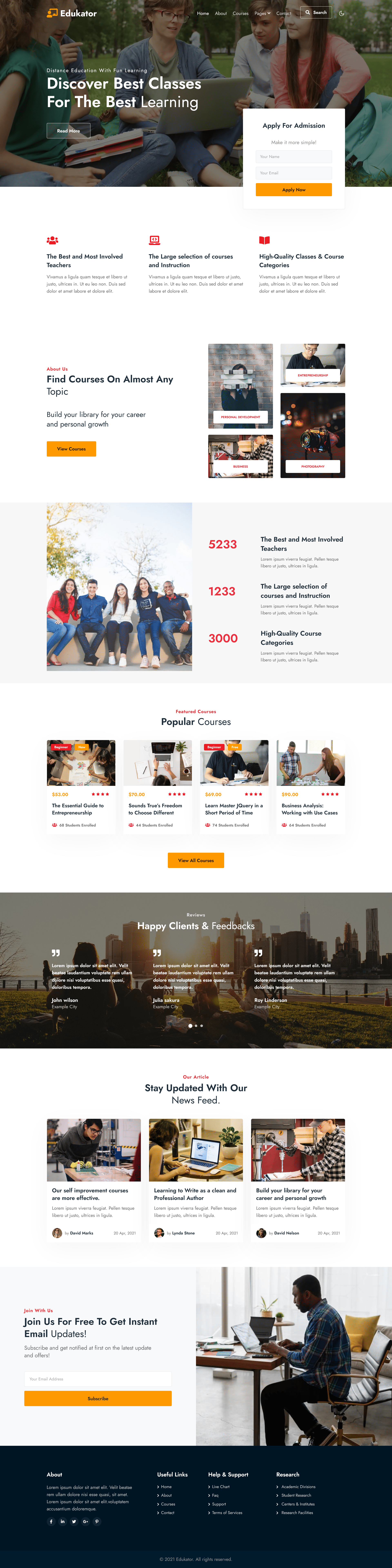
Welcome to Edukator, the premier online education WordPress theme that brings your educational dreams to life. Designed with educators, trainers, and e-learning enthusiasts in mind, Edukator is here to empower you in building a powerful and engaging online learning platform. With its sleek and professional design, Edukator offers a visually stunning and intuitive interface that captivates learners from the moment they land on your website. It combines aesthetics and functionality seamlessly, creating an immersive experience that sparks curiosity and facilitates effective knowledge transfer.
Edukator is packed with comprehensive features specifically crafted for the modern education landscape. From course management and enrollment systems to assessment tools and progress tracking, Edukator provides everything you need to create and manage online courses with ease. Our theme embraces the power of community and interaction, fostering a dynamic learning environment. With discussion forums, messaging capabilities, and social sharing features, Edukator enables students and instructors to engage, collaborate, and support each other, enhancing the overall learning experience.
In addition, Edukator is built to adapt to the needs of today’s learners. With its responsive design and mobile compatibility, your students can access your courses anytime, anywhere, and on any device, ensuring a seamless and uninterrupted learning journey. Edukator seamlessly integrates with popular learning management systems and supports a wide range of e-learning plugins, offering endless possibilities for customization and expansion. The theme is also optimized for search engines, ensuring that your website and courses reach a wider audience.
Dark Theme supported WordPress Theme
Absolutely! The Edukator theme fully supports a dark theme option, allowing you to create a visually stunning and immersive experience for your online education platform. With the dark theme feature, you can provide a sleek and modern interface that enhances the aesthetics and offers a comfortable and eye-friendly browsing experience for your users. Enabling the dark theme option in Edukator is simple and can be done through the theme customization settings. Once activated, your website’s color scheme will transform into a stylish and elegant dark mode, featuring darker backgrounds and contrasting elements that enhance readability and create a captivating atmosphere.
The dark theme option in Edukator not only adds a touch of sophistication to your website but also aligns with the latest design trends. It provides a visually appealing alternative to the traditional light theme, offering users a choice that suits their personal preferences and enhances their overall learning experience. Whether your learners are studying late at night or simply prefer a darker interface, the dark theme in Edukator ensures that your online education platform remains accessible and visually engaging across all devices.
Fully Customizable WordPress Edukator Theme
Yes, the Edukator WordPress theme offers extensive customization options for both text and images, allowing you to personalize and tailor your online education website to your specific needs. With these customization features, you can create a unique and engaging learning environment for your students. Here are some of the customization capabilities typically available in WordPress themes:
Text Customization: The Edukator theme provides options to customize various text elements, such as headings, paragraphs, buttons, navigation menus, and more. You can adjust font styles, sizes, colors, and spacing to match your branding and design preferences.
Image Customization: You can easily customize images in the Edukator theme. This includes uploading your images or selecting from a library of pre-designed graphics. You can also adjust image sizes, add captions, create image galleries, and set featured images for posts and pages.
Page Layouts: Edukator often comes with a selection of pre-designed page templates and layouts that you can choose from or customize. This allows you to create a consistent and visually appealing structure for your website’s pages, such as the homepage, course pages, blog posts, and more.
Color Customization: The theme may offer a color customization panel, allowing you to change the color scheme of various elements throughout your website. This enables you to match your branding or create a visually pleasing color palette that aligns with your educational content.
Widget Areas: Edukator may include widgetized areas where you can add and customize various functional elements, such as contact forms, social media feeds, recent posts, and more. These widgets can enhance the functionality and user experience of your website.
Remember that the specific customization options and features may vary depending on the version and settings of the Edukator theme you are using. It’s recommended to refer to the theme’s documentation or reach out to the theme developer for detailed instructions and guidance on how to customize text and images within the Edukator WordPress theme.
Fully Responsive WordPress Theme
Edukator is a fully responsive WordPress theme, designed to provide an optimal viewing experience across various devices and screen sizes. Whether your users are accessing your website on desktop computers, laptops, tablets, or mobile phones, Edukator ensures that your content is displayed correctly and intuitively. With its responsive design, Edukator automatically adjusts the layout and elements of your website to fit different screen resolutions. This guarantees that your students can access and navigate your online education platform seamlessly, regardless of the device they are using.
Responsive design is essential in today’s digital landscape, as it enhances usability, improves user engagement, and positively impacts search engine optimization (SEO). By offering a consistent and user-friendly experience across all devices, Edukator enables your students to study and interact with your course materials anytime, anywhere. Whether they’re viewing lecture videos, participating in discussion forums, or accessing learning resources, Edukator’s responsive design ensures that your content remains accessible, legible, and visually appealing on any device. This responsiveness contributes to a smooth and enjoyable learning experience, fostering student satisfaction and success.
To ensure your website is fully responsive with the Edukator theme, it’s recommended to follow best practices such as optimizing image sizes, using flexible layouts, and testing your website on various devices. Additionally, staying up-to-date with theme updates and maintaining compatibility with the latest versions of WordPress and plugins will help ensure continued responsiveness.
Overall, Edukator’s fully responsive design empowers you to deliver a seamless learning experience to your students across multiple devices, making education accessible and engaging for all.
Pages and their uses of the Edukator WordPress Theme
The pages available in the Edukator an Education category WordPress Theme are mentioned below. Have a look at the unique features of some pages present in this template.
“Edukator” WordPress Theme Home Page
Edukator WordPress Theme Home Page: The home page of the Edukator WordPress theme is a dynamic and engaging gateway to your online education platform. Designed to captivate visitors and provide a seamless user experience, the home page offers a combination of informative sections and visually appealing elements that showcase the essence of your educational offerings. Upon landing on the Edukator home page, visitors are greeted with a modern and intuitive layout that instantly communicates the value and professionalism of your online education platform. The home page often features a prominent hero section, which may include a compelling banner image or video along with a clear and concise headline that grabs attention and sets the tone for your website.
About Us: The “About Us” section in the Edukator WordPress theme is a vital component of your online education platform’s website. It serves as a dedicated space to provide an in-depth understanding of your platform’s mission, values, and vision. This section plays a crucial role in building trust, establishing credibility, and connecting with your target audience. When visitors navigate to the “About Us” page, they are greeted with a visually appealing and well-structured layout that captures their attention. This section typically begins with a concise and compelling introduction, summarizing the essence of your educational platform and its unique value proposition. It aims to create an immediate connection and generate curiosity in your visitors.
Courses: The courses page displays all the available courses offered by the website, with information on each course, such as the course title, description, instructor, duration, and price. Users can click on any course to learn more about it and enroll in it. The “Courses” section in the Edukator WordPress theme is a central hub where you can showcase your diverse range of educational offerings. Designed to provide an organized and visually appealing presentation of your courses, this section aims to capture the attention and interest of potential students.
The “Courses” section in the Edukator WordPress theme is a central hub where you can showcase your diverse range of educational offerings. Designed to provide an organized and visually appealing presentation of your courses, this section aims to capture the attention and interest of potential students.
Blogs: The “Blogs” section in the Edukator WordPress theme serves as a platform for sharing valuable educational content, insights, and resources with your audience. It provides a dedicated space for blog posts that are relevant to your online education platform, offering a range of informative and engaging articles that cater to the interests and needs of your target audience. When visitors explore the “Blogs” section, they are presented with a visually appealing and organized layout that showcases the latest blog posts. This section typically features a grid or list-style display, allowing visitors to quickly scan through the titles and featured images of each blog post.
404 Error: The 404 Error page in the Edukator WordPress theme is a crucial component that helps enhance the user experience when visitors encounter a page or URL that cannot be found. The 404 Error page is a default page that appears when a visitor clicks on a broken or non-existent link, or when they mistype a URL. The Edukator theme offers a visually appealing and user-friendly 404 Error page to guide and redirect visitors who land on this page. It is designed to provide a seamless navigation experience and keep visitors engaged, even when they encounter a dead end.
Landing Page: The landing page of the Edukator WordPress theme serves as the gateway to your online education platform, making a strong first impression on visitors and enticing them to explore further. Designed to be visually appealing, informative, and conversion-oriented, the landing page showcases the key features and benefits of your platform, encouraging visitors to take action. The Edukator theme offers a variety of layout options for the landing page, allowing you to create a customized and engaging experience. The landing page typically includes a prominent hero section at the top, featuring a captivating image or video along with a concise and compelling headline that immediately grabs the attention of visitors. This section sets the tone and communicates the value proposition of your educational platform.
As visitors scroll down the landing page, they encounter sections that highlight the unique selling points of your platform. These sections may showcase key features such as interactive learning materials, personalized learning paths, instructor support, or any other distinctive elements that set your platform apart. Visual elements, such as icons, images, or graphics, can be utilized to enhance visual appeal and create a memorable experience.
Contact: The contact page in the Edukator WordPress theme provides a dedicated space for visitors to get in touch with you and initiate communication. It serves as a vital point of contact, allowing visitors to ask questions, seek support, or inquire about your educational offerings. The contact page is designed to be user-friendly, informative, and accessible, making it easy for visitors to reach out and connect with your platform. The Edukator theme offers a clean and visually appealing layout for the contact page, ensuring that visitors can quickly locate the necessary information and contact options. The page typically includes essential contact details such as your email address, phone number, and physical address, providing multiple channels for communication. This information helps build trust and legitimacy, assuring visitors they can reach out to a real and responsive entity.
Moreover, the contact page often includes a brief introduction or a message that emphasizes your willingness to assist and engage with visitors. This introduction can provide a warm welcome, outline the types of inquiries you welcome, and assure visitors that their messages will be handled with care and attention. To enhance user experience and provide faster response, the Edukator theme’s contact page may include additional features such as live chat or a chatbot. These features allow for real-time communication, enabling visitors to get immediate answers to their questions or concerns. This interactive element adds an extra layer of convenience and accessibility to the contact page. To enhance user experience and provide faster response, the Edukator theme’s contact page may include additional features such as live chat or a chatbot. These features allow for real-time communication, enabling visitors to get immediate answers to their questions or concerns. This interactive element adds an extra layer of convenience and accessibility to the contact page.
Key Features:
User-Friendly Design
Photo Gallery
Blog Page
Social Media Integration
On scroll-fixed navigation
Awesome Design
100% Responsive design
Bootstrap 4 Framework
Working Contact Form
Clean and modern layout
Easy to Customize
Google web fonts used
And many more…
Theme Details:
Theme Name: Edukator an Education Category WordPress Theme.
Compatible Browsers: Google Chrome, Firefox, Safari, IE 10, Opera, etc.
Edukator a website template for education-related websites
The Edukator template is a modern, professionally-designed website template specifically designed for educational websites. It includes multiple essential pages for an education category website, such as a home page, about page, courses page, blog pages, 404 error page, landing page, email template, elements page, and contact page.
The Edukator an education category website template is not only visually appealing but also highly functional, providing users with a seamless browsing experience. Its responsive design ensures that the website looks great and functions perfectly on all devices, including desktops, tablets, and mobile phones. The template is also fully customizable, allowing website owners to tailor the design to their brand identity and style preferences. With its comprehensive set of features and user-friendly design, the Edukator website template is a great choice for anyone looking to create an education category website that is both engaging and effective.
Fully Responsive Package of Website Template
The Edukator template is a fully responsive, HTML, and Bootstrap-based website template designed specifically for educational websites. It includes a range of pre-designed pages, such as the home page, about page, courses page, blog page, 404 error page, landing page, email template, elements page, and contact page.
The template is built using Bootstrap, a popular front-end development framework that allows for responsive, mobile-first web design. This means that the Edukator template is optimized for all devices and screen sizes, ensuring that your website looks and functions perfectly on desktops, tablets, and mobile phones.
The Edukator HTML and Bootstrap website template is also fully customizable, allowing you to easily tailor the design to your brand identity and style preferences. You can modify the colors, fonts, and other design elements to create a unique look and feel for your website.
One of the benefits of using the Edukator HTML and Bootstrap website template is that it is easy to use, even for those with little or no coding experience. The template includes clear and concise documentation to guide you through the customization process, and you can also find many online resources and tutorials to help you get started.
Overall, the Edukator HTML and Bootstrap website template is a versatile and functional design that is perfect for educational websites, such as e-learning platforms, schools, universities, and online training centers. Whether you are building a new website from scratch or looking to revamp an existing one, the Edukator HTML and Bootstrap website template can help you create a professional and engaging online presence for your educational institution or business.
Bootstrap Framework
Bootstrap is the most popular HTML, CSS, and JS framework for developing responsive, mobile-first projects on the web with the latest bootstrap 5. You can create a great website layout based on Bootstrap with the help of bootstrap CSS. It has a very clean, crisp, and simple design that can easily be adapted and used for a variety of similar niche websites. also, bootstrap in angular plays an important role. Bootstrap includes a wide range of pre-designed CSS and JavaScript components, such as navigation bars, forms, buttons, and models, that can be easily integrated into a website. This allows developers to create a consistent design and layout without having to write all the code from scratch.
Dark Theme Website Template
Dark mode has gained a lot of traction recently like dark mode Facebook, dark mode google chrome, dark mode extension chrome, dark mode windows 10, etc. so, we have implemented almost all the templates to have complete flexibility of dark mode. The first visit of the user is made with a light theme environment and then if they wish to change their theme to dark mode with just one click, we have made it simple, These templates have become increasingly popular in recent years, as they can provide a sleek and modern look for a website and can also help reduce eye strain when viewed in low light environments.
Responsive Web Design
The pages are fully designed with responsive buttons, text, images, etc. which looks pretty cool with almost all windows and devices. Not only the elements present in the website template but also responsive display ads which you placed on your site. All our templates are responsive for mobile with responsive email templates with a responsive HTML table. So, you won’t need to worry about the look of your website on different sizes of screens and build a website for free.
Pages and their uses of the Edukator website template
The pages available in the Edukator an Education category website template are mentioned below. Have a look at the unique features of some pages present in this template.
“Edukator” Website Template Home Page
Edukator Website Template Home Page: The home page of the Edukator template features a full-width header with a call-to-action button that directs users to the courses page. It also includes a featured courses section, a blog section, and a footer with links to other pages on the site.
About Us: The About page provides a brief introduction to the website, its mission, and its team members. It also includes a section for customer testimonials and a call-to-action button that directs users to the courses page.
Courses: The courses page displays all the available courses offered by the website, with information on each course, such as the course title, description, instructor, duration, and price. Users can click on any course to learn more about it and enroll in it.
Blogs: The blog pages of the Edukator template are designed to showcase educational content such as articles, videos, podcasts, and other multimedia. Users can browse the blog pages to learn about the latest news, trends, and tips in their field of interest.
404 Error: The 404 error page is a custom-designed page that appears when a user lands on a broken or nonexistent link on the website. It provides a friendly message, a search bar, and links to other pages on the site to help users find what they are looking for.
Landing Page: The landing page is a standalone page that is designed to capture leads or promote a specific course or product. It includes a hero section, a call-to-action button, and a form for collecting user information.
Contact: The contact page provides users with a form for submitting inquiries, as well as the website’s physical address, phone number, and email address.
Key Features:
User-Friendly Design
Photo Gallery
Blog Page
Social Media Integration
On scroll-fixed navigation
Awesome Design
100% Responsive design
Bootstrap 4 Framework
Working Contact Form
Clean and modern layout
Easy to Customize
Google web fonts used
And many more…
Theme Details:
Theme Name: Edukator an Education Category Website Template.
Compatible Browsers: Google Chrome, Firefox, Safari, IE 10, Opera, etc.
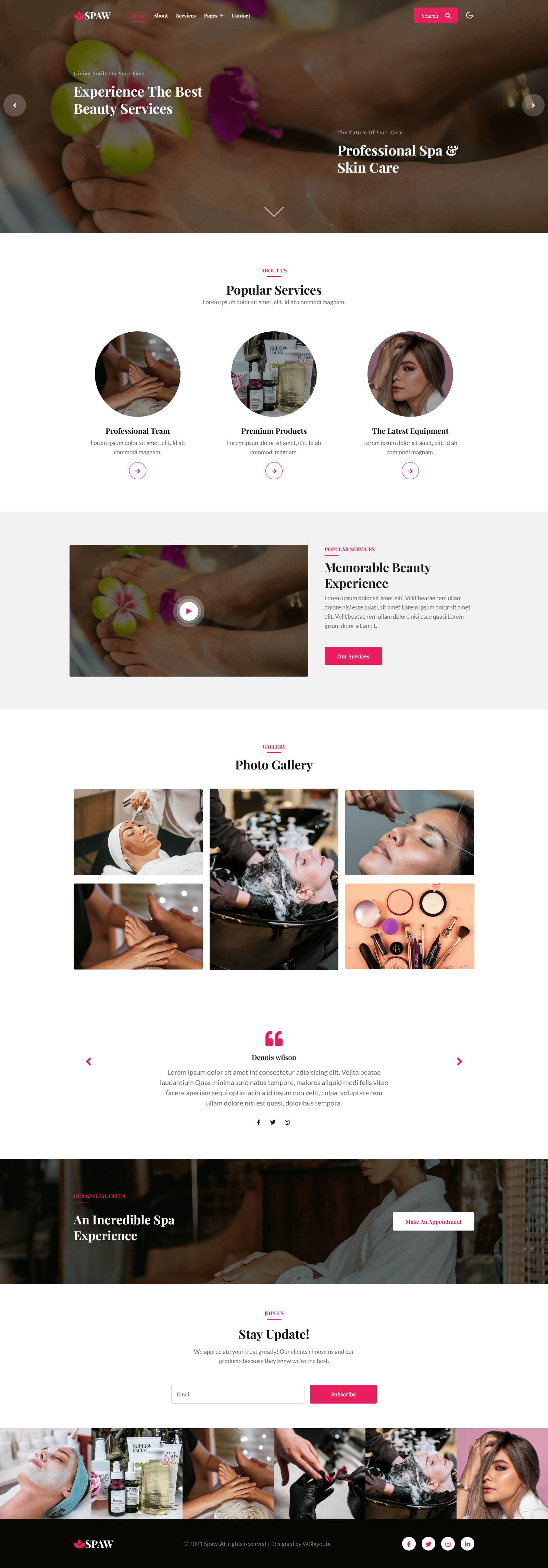
Are you looking to create a stunning website for your spa or wellness-related business? Look no further than “Spaw,” a premium WordPress Theme that offers a sleek and contemporary design while providing all the essential features and functionality necessary for a successful online presence.
One of the key strengths of “Spaw” is its emphasis on visual appeal. The theme features a clean and elegant layout that highlights high-quality images and graphics, helping to showcase your spa’s services and create an immersive online experience for visitors. The theme’s use of muted, calming colors and soothing imagery also perfectly captures the relaxing atmosphere of a professional spa or wellness center.
In addition to its strong emphasis on visual appeal, “Spaw” is highly customizable and user-friendly. The template includes a number of pre-built templates and page layouts, making it easy to create a fully functional website without any coding experience. It also offers a range of customization options, allowing you to easily tweak and fine-tune the design to match your specific brand and style.
What is a spa theme?
A spa theme is a website template designed specifically for spa businesses. A spa theme will typically feature a modern, clean design that evokes relaxation and luxury. The theme usually includes a homepage, contact page, booking page, and gallery page. It also typically includes a blog section and pages for listing spa services and products. Additionally, spa themes are often mobile-responsive, which means they look great on any device.
The primary purpose of a spa theme is to create a website that is visually appealing and easy to navigate. It should also help to create an atmosphere of relaxation and luxury. This will help to create a positive first impression and encourage customers to book an appointment.
Benefits of using a spa theme for your website
Using a spa theme for your website has many advantages. First, it will save you time and money. You won’t have to hire a designer to create a custom website for your business. Instead, you can choose a pre-made template that is designed specifically for spa businesses.
A spa theme also makes it easy to customize your website. You can change colors, fonts, and images to match your brand identity. You can also add custom features to make your website stand out.
Another benefit of using a spa theme is that it will help you create a website that looks great on any device. Many spa themes are mobile-responsive, so they will automatically adjust to any device. This is essential for providing a good user experience and increasing conversions.
Essential elements of a spa theme
When choosing a spa theme for your website, there are several essential elements to consider. First, the theme should be visually appealing and easy to navigate. It should also include a homepage, contact page, booking page, and gallery page. You may also want to include a blog section and pages for listing spa services and products.
It is also important to make sure that the spa theme is mobile-responsive. This will ensure that your website looks great on any device and provides a good user experience. Additionally, the spa theme should be optimized for search engines so that your website is easier to find on search engines.
Finally, you should make sure that the spa theme is easy to customize. This will allow you to make changes to the theme to match your brand identity.
How to choose the best spa theme for your website
When choosing a spa theme for your website, there are several factors to consider. First, you should make sure that the theme is visually appealing and easy to navigate. It should also include all the essential elements such as a homepage, contact page, booking page, and gallery page. Additionally, the theme should be mobile-responsive and optimized for search engines.
You should also make sure that the theme is easy to customize. This will allow you to make changes to the theme to match your brand identity. Finally, you should consider the cost of the theme. Many themes offer free and premium plans, so you can choose the one that best fits your budget.
Creating a soothing website with spa themes is not as difficult as you might think. Here are a few tips to get you started:
Use colors that evoke relaxation and luxury. You can use shades of blue, green, and purple to create an inviting atmosphere.
Use images of nature or spa amenities to create a calming atmosphere.
Use fonts that are easy to read and create a sense of relaxation.
Add music or sound effects to create a more immersive experience.
Include customer testimonials to create a sense of trust.
Focus on creating an inviting atmosphere and easy-to-navigate layout.
Following these tips will help you create a website that is visually appealing and encourages customers to book an appointment. W3layouts provides and follows all the tips to have the best output for the spa website.
There are many great spa website template templates and themes available. Here are a few of the best:
Beauty Skin WordPress Theme: This theme features a modern design with a layout that is optimized for conversions. It includes a homepage, contact page, blog page, and gallery page. It is also mobile-responsive and optimized for search engines.
Beauty Skin Website Template: This website template features a luxurious design with a focus on creating a relaxing atmosphere. It includes a homepage, contact page, blog page, and gallery page. It is also mobile-responsive and optimized for search engines.
Look Fashion Website Template: This website template features an elegant design with a focus on creating a luxurious atmosphere. It includes a homepage, contact page, booking page, and gallery page. It is also mobile-responsive and optimized for search engines.
Several services are available if you don’t have the time or knowledge to create your own spa website. Here are a few of the best:
Spa Website Design: This service offers custom website design for spa businesses. They will create a website that is visually appealing and easy to navigate. They will also use spa themes to make your website stand out.
Responsive Spa Website Design: This service offers mobile-responsive website design for spa businesses. They will create a website that looks great on any device and is optimized for search engines.
Custom Spa Website Design: This service offers custom website design for spa businesses. They will create a website from scratch and use spa themes to speed up the process. They will also customize your website to match your brand identity.
Bootstrap Framework
Bootstrap is the most popular HTML, CSS, and JS framework for developing responsive, mobile-first projects on the web with the latest bootstrap 5. You can create a great website layout based on Bootstrap with the help of bootstrap CSS. It has a very clean, crisp, and simple design that can easily be adapted and used for a variety of similar niche websites. also, bootstrap in angular plays an important role. Bootstrap includes a wide range of pre-designed CSS and JavaScript components, such as navigation bars, forms, buttons, and models, that can be easily integrated into a website. This allows developers to create a consistent design and layout without having to write all the code from scratch.
Dark Theme Website Template
Dark mode has gained a lot of traction recently like dark mode Facebook, dark mode google chrome, dark mode extension chrome, dark mode windows 10, etc. so, we have implemented almost all the templates to have complete flexibility of dark mode. The first visit of the user is made with a light theme environment and then if they wish to change their theme to dark mode with just one click, we have made it simple, These templates have become increasingly popular in recent years, as they can provide a sleek and modern look for a website and can also help reduce eye strain when viewed in low light environments.
Responsive Web Design
The pages are fully designed with responsive buttons, text, images, etc. which looks pretty cool with almost all windows and devices. Not only the elements present in the website template but also responsive display ads which you placed on your site. All our templates are responsive for mobile with responsive email templates with a responsive HTML table. So, you won’t need to worry about the look of your website on different sizes of screens and build a website for free.
Pages and their uses of the Spaw WordPress Theme
The pages available in the Spaw a beauty and spa category website template are mentioned below. Have a look at the unique features of some pages present in this template.
“Spaw” WordPress Theme Home Page
Spaw WordPress Theme Banner: A spa website template banner is typically a large, eye-catching image or slideshow located at the top of the website’s homepage. The banner can be designed to highlight the spa’s brand and services and can be used to showcase the spa’s facilities, treatments, and promotions.
Spa services: The service section of a spa website is an important area that provides information about the spa’s offerings, including the types of treatments and services available, the price range, and the benefits of each treatment. This section should be easy to navigate and well-organized, with clear and concise descriptions of each service. The service section can also include images or videos to help visitors get a better understanding of what each service entails. Additionally, the service section can offer the option for customers to book appointments online, either directly through the website or through a third-party booking system. It is also important for the service section to be regularly updated to reflect any changes in the spa’s offerings. A well-designed service section can help to build credibility with potential customers and increase the likelihood of them making a booking.
Popular Salads: A “Popular Salads” section with photos of salads would be a great addition to a food and restaurant website template. This section could be used to showcase the most popular salads on the menu, and would likely include high-quality images of each salad. The potential features of this template would be with this template like High-quality images of each salad, Detailed information about each salad, including ingredients and nutritional information, Reviews and ratings from customers, Option to place an order for a specific salad directly from the section, Responsive design that looks great on all devices, and an Interactive functionality such as hover effect to see a larger image of the salad.
Photo Gallery of “Spaw”: The photo gallery section of the spaw website template is a visual showcase of the spa’s facilities, services, and treatments. This section should include high-quality images that accurately represent the spa and provide a glimpse into what visitors can expect when they arrive. The photo gallery should be easy to navigate, with a clear and intuitive organization of images, and the option to view images in full-screen mode. Visitors should be able to see a variety of images, such as interior and exterior shots of the spa, images of specific treatments and services, and images of the spa’s staff in action. The photo gallery can also include captions or descriptions to provide additional information about each image. By giving visitors a visual representation of the spa, the photo gallery section can help to increase their level of interest and encourage them to make a booking.
Testimonials Section: The testimonials section of a spa website template is an area that showcases feedback from previous customers about their experience with the spa. This section can be used to build credibility with potential customers and increase trust in the spa. The testimonials should be short and concise, highlighting specific experiences or treatments and the results achieved. To maximize their effectiveness, testimonials should include the full name and location of the reviewer, along with a profile picture if possible. The testimonials section should be easy to navigate and well-organized, with options for filtering by specific services or treatments. By highlighting positive experiences, the testimonials section can provide potential customers with social proof of the spa’s quality and encourage them to book an appointment.
Key Features:
User-Friendly Design
Photo Gallery
Blog Page
Services and Treatments Information
Social Media Integration
On scroll-fixed navigation
Awesome Design
100% Responsive design
Bootstrap 4 Framework
Working Contact Form
Clean and modern layout
Easy to Customize
Google web fonts used
And many more…
Theme Details:
Theme Name: Spaw a Beauty and Spa Category WordPress Theme.
Compatible Browsers: Google Chrome, Firefox, Safari, IE 10, Opera, etc.
Spaw is a modern website template that grabs the attention of your clients who need to promote their spa services with premium-looking pages for displaying their main benefits. Are you looking for ways to make your spa business stand out? It is essential to create an inviting website that captures your customers’ attention and encourages them to book an appointment.
One of the best ways to do this is to use a spa theme for your website. In this blog, we will look at the benefits of using a spa theme for your website, essential elements of a spa theme, inspiring examples of spa themes, how to choose the best spa theme for your website, tips for creating a relaxing website with spa themes, the best spa templates and themes, courses for creating stunning spa websites, and services for creating spa websites.
A spa category website template typically includes features such as a clean and modern design, a homepage displaying information about the spa’s services and treatments, an online booking system, a gallery showcasing images of the spa’s facilities, and a blog or news section for updates and promotions. The website may also include pages for the spa’s staff and contact information. The template should be responsive and mobile-friendly, allowing users to access the website on their devices easily. Additionally, the website should be optimized for search engines to increase visibility and attract more customers.
What is a spa theme?
A spa theme is a website template designed specifically for spa businesses. A spa theme will typically feature a modern, clean design that evokes relaxation and luxury. The theme usually includes a homepage, contact page, booking page, and gallery page. It also typically includes a blog section and pages for listing spa services and products. Additionally, spa themes are often mobile-responsive, which means they look great on any device.
The primary purpose of a spa theme is to create a website that is visually appealing and easy to navigate. It should also help to create an atmosphere of relaxation and luxury. This will help to create a positive first impression and encourage customers to book an appointment.
Benefits of using a spa theme for your website
Using a spa theme for your website has many advantages. First, it will save you time and money. You won’t have to hire a designer to create a custom website for your business. Instead, you can choose a pre-made template that is designed specifically for spa businesses.
A spa theme also makes it easy to customize your website. You can change colors, fonts, and images to match your brand identity. You can also add custom features to make your website stand out.
Another benefit of using a spa theme is that it will help you create a website that looks great on any device. Many spa themes are mobile-responsive, so they will automatically adjust to any device. This is essential for providing a good user experience and increasing conversions.
Essential elements of a spa theme
When choosing a spa theme for your website, there are several essential elements to consider. First, the theme should be visually appealing and easy to navigate. It should also include a homepage, contact page, booking page, and gallery page. You may also want to include a blog section and pages for listing spa services and products.
It is also important to make sure that the spa theme is mobile-responsive. This will ensure that your website looks great on any device and provides a good user experience. Additionally, the spa theme should be optimized for search engines so that your website is easier to find on search engines.
Finally, you should make sure that the spa theme is easy to customize. This will allow you to make changes to the theme to match your brand identity.
How to choose the best spa theme for your website
When choosing a spa theme for your website, there are several factors to consider. First, you should make sure that the theme is visually appealing and easy to navigate. It should also include all the essential elements such as a homepage, contact page, booking page, and gallery page. Additionally, the theme should be mobile-responsive and optimized for search engines.
You should also make sure that the theme is easy to customize. This will allow you to make changes to the theme to match your brand identity. Finally, you should consider the cost of the theme. Many themes offer free and premium plans, so you can choose the one that best fits your budget.
Tips for creating a relaxing website with spa themes
Creating a soothing website with spa themes is not as difficult as you might think. Here are a few tips to get you started:
Use colors that evoke relaxation and luxury. You can use shades of blue, green, and purple to create an inviting atmosphere.
Use images of nature or spa amenities to create a calming atmosphere.
Use fonts that are easy to read and create a sense of relaxation.
Add music or sound effects to create a more immersive experience.
Include customer testimonials to create a sense of trust.
Focus on creating an inviting atmosphere and easy-to-navigate layout.
Following these tips will help you create a website that is visually appealing and encourages customers to book an appointment. W3layouts provides and follows all the tips to have the best output for the spa website.
The best spa website templates and themes of W3layouts
There are many great spa website template templates and themes available. Here are a few of the best:
Beauty Skin WordPress Theme: This theme features a modern design with a layout that is optimized for conversions. It includes a homepage, contact page, blog page, and gallery page. It is also mobile-responsive and optimized for search engines.
Beauty Skin Website Template: This website template features a luxurious design with a focus on creating a relaxing atmosphere. It includes a homepage, contact page, blog page, and gallery page. It is also mobile-responsive and optimized for search engines.
Look Fashion Website Template: This website template features an elegant design with a focus on creating a luxurious atmosphere. It includes a homepage, contact page, booking page, and gallery page. It is also mobile-responsive and optimized for search engines.
Services for creating spa websites
Several services are available if you don’t have the time or knowledge to create your own spa website. Here are a few of the best:
Spa Website Design: This service offers custom website design for spa businesses. They will create a website that is visually appealing and easy to navigate. They will also use spa themes to make your website stand out.
Responsive Spa Website Design: This service offers mobile-responsive website design for spa businesses. They will create a website that looks great on any device and is optimized for search engines.
Custom Spa Website Design: This service offers custom website design for spa businesses. They will create a website from scratch and use spa themes to speed up the process. They will also customize your website to match your brand identity.
Bootstrap Framework
Bootstrap is the most popular HTML, CSS, and JS framework for developing responsive, mobile-first projects on the web with the latest bootstrap 5. You can create a great website layout based on Bootstrap with the help of bootstrap CSS. It has a very clean, crisp, and simple design that can easily be adapted and used for a variety of similar niche websites. also, bootstrap in angular plays an important role. Bootstrap includes a wide range of pre-designed CSS and JavaScript components, such as navigation bars, forms, buttons, and models, that can be easily integrated into a website. This allows developers to create a consistent design and layout without having to write all the code from scratch.
Dark Theme Website Template
Dark mode has gained a lot of traction recently like dark mode Facebook, dark mode google chrome, dark mode extension chrome, dark mode windows 10, etc. so, we have implemented almost all the templates to have complete flexibility of dark mode. The first visit of the user is made with a light theme environment and then if they wish to change their theme to dark mode with just one click, we have made it simple, These templates have become increasingly popular in recent years, as they can provide a sleek and modern look for a website and can also help reduce eye strain when viewed in low light environments.
Responsive Web Design
The pages are fully designed with responsive buttons, text, images, etc. which looks pretty cool with almost all windows and devices. Not only the elements present in the website template but also responsive display ads which you placed on your site. All our templates are responsive for mobile with responsive email templates with a responsive HTML table. So, you won’t need to worry about the look of your website on different sizes of screens and build a website for free.
Pages and their uses of the Spaw website template
The pages available in the Spaw a beauty and spa category website template are mentioned below. Have a look at the unique features of some pages present in this template.
“Spaw” Website Template Home Page
Spaw Website Template Banner: A spa website template banner is typically a large, eye-catching image or slideshow located at the top of the website’s homepage. The banner can be designed to highlight the spa’s brand and services and can be used to showcase the spa’s facilities, treatments, and promotions.
Spa services: The service section of a spa website is an important area that provides information about the spa’s offerings, including the types of treatments and services available, the price range, and the benefits of each treatment. This section should be easy to navigate and well-organized, with clear and concise descriptions of each service. The service section can also include images or videos to help visitors get a better understanding of what each service entails. Additionally, the service section can offer the option for customers to book appointments online, either directly through the website or through a third-party booking system. It is also important for the service section to be regularly updated to reflect any changes in the spa’s offerings. A well-designed service section can help to build credibility with potential customers and increase the likelihood of them making a booking.
Popular Salads: A “Popular Salads” section with photos of salads would be a great addition to a food and restaurant website template. This section could be used to showcase the most popular salads on the menu, and would likely include high-quality images of each salad. The potential features of this template would be with this template like High-quality images of each salad, Detailed information about each salad, including ingredients and nutritional information, Reviews and ratings from customers, Option to place an order for a specific salad directly from the section, Responsive design that looks great on all devices, and an Interactive functionality such as hover effect to see a larger image of the salad.
Photo Gallery of “Spaw”: The photo gallery section of the spaw website template is a visual showcase of the spa’s facilities, services, and treatments. This section should include high-quality images that accurately represent the spa and provide a glimpse into what visitors can expect when they arrive. The photo gallery should be easy to navigate, with a clear and intuitive organization of images, and the option to view images in full-screen mode. Visitors should be able to see a variety of images, such as interior and exterior shots of the spa, images of specific treatments and services, and images of the spa’s staff in action. The photo gallery can also include captions or descriptions to provide additional information about each image. By giving visitors a visual representation of the spa, the photo gallery section can help to increase their level of interest and encourage them to make a booking.
Testimonials Section: The testimonials section of a spa website template is an area that showcases feedback from previous customers about their experience with the spa. This section can be used to build credibility with potential customers and increase trust in the spa. The testimonials should be short and concise, highlighting specific experiences or treatments and the results achieved. To maximize their effectiveness, testimonials should include the full name and location of the reviewer, along with a profile picture if possible. The testimonials section should be easy to navigate and well-organized, with options for filtering by specific services or treatments. By highlighting positive experiences, the testimonials section can provide potential customers with social proof of the spa’s quality and encourage them to book an appointment.
Key Features:
User-Friendly Design
Photo Gallery
Blog Page
Services and Treatments Information
Social Media Integration
On scroll-fixed navigation
Awesome Design
100% Responsive design
Bootstrap 4 Framework
Working Contact Form
Clean and modern layout
Easy to Customize
Google web fonts used
And many more…
Theme Details:
Theme Name: Spaw a Beauty and Spa Category Website Template.
Compatible Browsers: Google Chrome, Firefox, Safari, IE 10, Opera, etc.
Real Houzing is a well-designed website template with all the features available for the real estate listing website template. Grab this website template for the best output for your real estate property listing with high-quality grids and images. Real Houzing is a real estate listing website template that helps you to promote your business online.
Real Estate Agent Website Templates Free
This real houzing can be used by real estate agents for their property sale promotions online so grab this amazing website template if you are an agent this will be the best opportunity to build your website for sales.
Real Estate Company Website Template Free
An estate company must maintain their websites for promoting or reaching their property sites to people, for a startup project or a company can have a try on our company website template for free. so why late grab this amazing estates website template for your upcoming sales.
Bootstrap Framework
Bootstrap is the most popular HTML, CSS, and JS framework for developing responsive, mobile-first projects on the web with the latest bootstrap 5. You can create a great website layout based on Bootstrap with the help of bootstrap CSS. It has a very clean, crisp, and simple design that can easily be adapted and used for a variety of similar niche websites. also, bootstrap in angular plays an important role.
Dark Theme Website Templates
Dark mode has gained a lot of traction recently like dark mode Facebook, dark mode google chrome, dark mode extension chrome, dark mode windows 10, etc. so we have implemented almost all the templates to have complete flexibility of dark mode. The first visit of the user is made with a light theme environment and then if they wish to change their theme to dark mode by just one click we have made it simple, our themes are predesigned with dark mode which make the eyes relax from brighter screens.
Responsive Web Design
The pages are fully designed with responsive buttons, text, images, etc. which looks pretty cool with almost all windows and devices. Not only the elements present in the website template but also responsive display ads which you were placed on your site. All our templates are responsive for mobile with responsive email templates with a responsive HTML table. So, you won’t need to worry about the look of your website on different sizes of screens and build a website for free.
Pages and their uses of Real Houizng Website Template
The pages available in Real Houzing a real estate category website template are mentioned below. Have a look at the unique features of some pages present in this template.
Real Houzing Home Page
Real Houzing Banner: This banner is made unique with its real estate property images and the quote on it the creativity of the new world that makes it look more attractive and grab the buyer’s attention.
Services categories: Here are all the details about the services they provide are mentioned with categorized formate like buying a new home, renting a home, selling your property, living space, etc.
Offers by your company: here all the benefits are mentioned which you will be getting after owning a property form your real estate business company. The EMI options and the interest-discount prices are also displayed here.
You are in the right place: here the company vies displayed with their new vision of changing the way of estate business and property selling techniques with an application of their new ideology.
Testimonials: Testimonials of a real houzing website template are designed in the most attractive form like pictures of clients are arranged randomly around the actively displayed testimonial from those randomly arranged pictures we can select one of them to read their testimonial by activating their response.
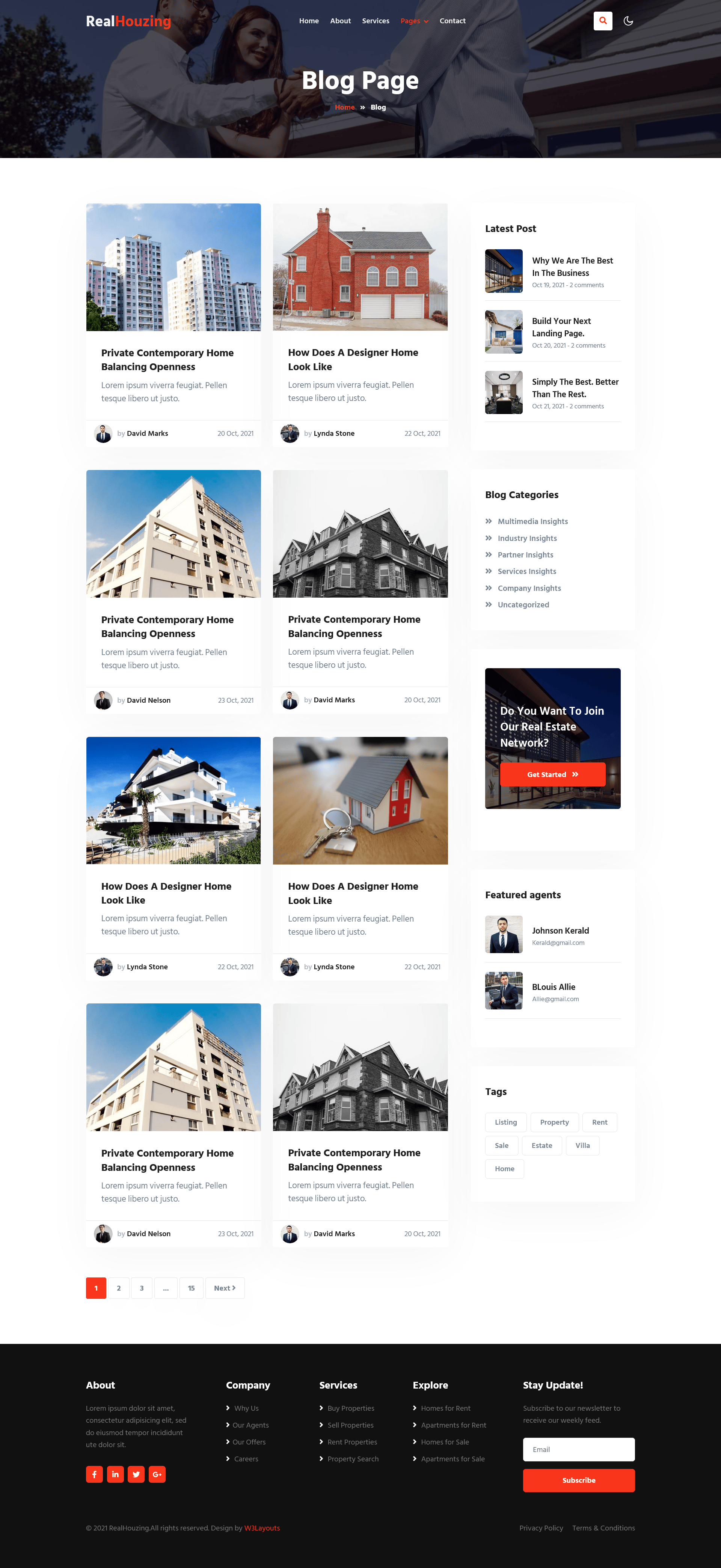
Blogs Page of real houzing Website Template
Blogs: Here is the best deal for you as you’ll get this amazing blog page with the real estate website template package where you can post daily updates and details about the newly happened works or tie-ups. The blog cards are designed elegantly with an image and date of posting.
Key Features:
10 Html Pages
Education website template
Light and Dark mode switch
On scroll fixed navigation
Awesome Design
100% Responsive design
Bootstrap 5 Framework
Working Contact Form
Clean and modern layout
Easy to Customize
Google web fonts used
Theme Details:
Theme Name: Real Houzing a Real Estate Category Website Template.
Compatible Browsers: Google Chrome, Firefox, Safari, IE 10, Opera, etc.
Useful Formulas in Your MS Word Invoice Template that Will Surely Save You Time, Money, and Energy
Doing math might not be the first thing you think about when using Microsoft Word. However, this program has some great formula options that are ideal for helping you to create professional, slick invoices. This goes a long way towards boosting the overall impression of your businessand enriching the customer experience.
Why Formulas Will Help Your Invoicing
When you use an invoice template for Microsoft Word and set up some of these simple formulas, you get a range of benefits, such as:
You save time as calculations are automatically completed
You reduce your risk of computation errors as you don’t have to manually add up your invoice items
It becomes easier to create and send out invoices to clients
Your invoices look professional
How To Insert A Formula Into A Word Document
You can use formulas in Word on normal lines and within tables. For an invoice, inserting a table and then setting up your formulas is the best way to go. You can create a professional layout from scratch or you can use one of the many free invoice templates available. From there, it’s a case of building formulas that make sense for your invoice.
The most common formulas you’ll use in an invoice are going to be multiplication—the price of a line item multiplied by the quantity to get that subtotal—and addition; adding up each line item total to create a subtotal, then adding on tax and shipping where applicable for your final total.
To insert a formula into your Word document, use the following steps:
Select the cell on the table where you want the result of your formula to appear.
Go to the Layout tab for your table and select Formula.
A window will appear, which will be populated with options for your formula. Word will try to work out what formula you require and give you the most likely option first, but you can always change this if you want a different formula.
Once you have the formula you want for that cell, select OK and the result will automatically appear in the cell.
The Options And Syntax For Formulas
Now let’s look at what formulas you can use in Word and what those will look like.
Formulas in a Word table work the same way as they do in Excel, by referencing numbers in other cells. The first column in the table is automatically labeled A, the second B, and so on. The rows are also automatically numbered, starting at the top with 1 and moving down the table.
Word also uses the same basic arithmetic operators as Excel:
+ for addition
– for subtraction
* for multiplication
/ for division
= to start all formulas
The common functions that you get for Word formulas that you’ll probably want to use for an invoice template are:
SUM
AVERAGE
MIN
MAX
COUNT
IF
Different Ways To Write Out Your Formulas
Select individual cells – If your formula needs to take into account several different cells that aren’t next to each other, you can indicate to Word which ones to use like this: =A1+A5. Alternatively, you can go =SUM(A1, A5). This will add those two cells together. Obviously, the first way of writing out the formula works best if you are doing more than simply adding up the contents.
Select a consecutive range of cells – To add up consecutive cells, you also have a few options. If you use =SUM(A1:A5) Word will add up the amounts in cells A1, A2, A3, A4, and A5. You can get the same results if you put the following formula in cell A6, =SUM(ABOVE). It will automatically add up the cells that sit above it. Another option is to use =SUM(BELOW), =SUM(LEFT) or =SUM(RIGHT). You can combine these options and do something like =SUM(ABOVE, LEFT).
Set Rules Based On Amounts – The IF function is incredibly useful to do things like add shipping onto your invoice if the total is under a certain amount. This is great for eCommerce and online selling. Essentially, you can put in a rule that tells Word that if your subtotal is over or equal to $100 (for example), then the shipping cell should be zero, but if it’s under $100, then the figure should be $20 for shipping. For this example, the formula would look like this: =IF(A6>=100,0,20).
Remember To Update Your Calculations
One of the most important things to remember about using MS Word formulas is that you need to manually update the calculations whenever you change information in the reference cells. This is unlike Excel, where the calculations automatically recompute each time you make a change.
Your actual formula doesn’t need to get created all over again. You simply need to tell Word to redo the calculations. To do this, you simply select the affected area on the table and press F9 on your keyboard.
If only one formula gets impacted, simply select the cell where that formula is and update it. If more than one formula on the table gets impacted, select the whole table and press F9 to update all of them at once.
Save Your Invoice Template
One of the major advantages of using an invoice template Word document is that once it’s set up with your details and formulas, you can save it. Thereafter, you can use it over and over again. This will save you plenty of time and effort, and ensure that your invoices and your business always look professional.
Once you have your template, it’s a case of opening it up and saving it as a new invoice in your series, completing your customer details, and inputting the data for that specific invoice. Once all the figures are in place, update your formulas and you’re ready to send.
Top tip: if you have clients that you regularly invoice, save templates for them individually with their details already in place.
Meta Title: Time Saving Formulas For MS Word Invoice Templates | W3 Layouts
Meta Description: Saving time saves your business money. Use these simple yet effective formulas for your MS Word invoice templates to make them more efficient.

