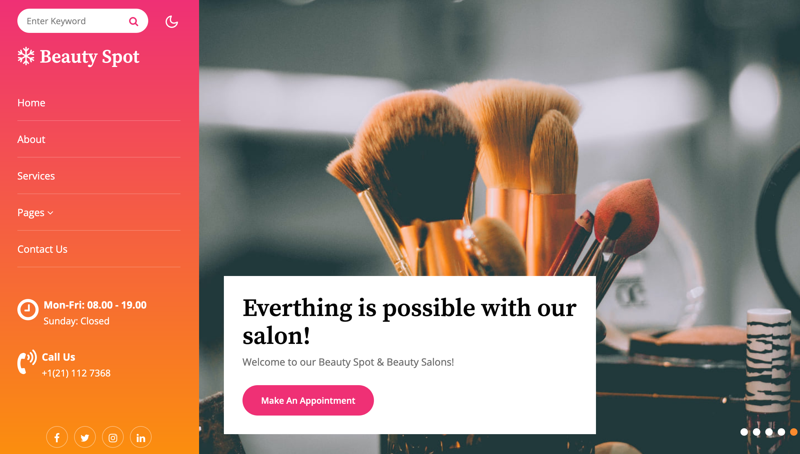
Introducing “Beauty Spot” – an exceptional website template designed for the Beauty & Spa and Fashion categories, meticulously crafted to enhance your online presence and attract your target audience. Let’s delve into the key features, plans, and pages offered by Beauty Spot to optimize your SEO strategy.
Key Features:
9 HTML Pages: Tailored for Beauty & Spa and Fashion websites, ensuring a seamless and customized user experience.
Light and Dark Mode Switch: Enhance user engagement and visual appeal with the option to switch between light and dark modes.
Left Navigation: Intuitive navigation for visitors to explore different sections of your website effortlessly.
Modern Design: Stylish and elegant design elements that align with the sophistication of your brand, creating a lasting impression.
Starter Plan (Beauty & Spa):
Home: A captivating homepage featuring sliders or featured content to showcase your spa services, treatments, or beauty products.
About: Share your spa’s story, mission, and unique offerings to establish trust and connect with potential clients.
Services: Highlight your range of spa services, treatments, packages, or beauty products with compelling descriptions and visuals to entice visitors.
Contact: Provide multiple contact options such as contact forms, phone numbers, and social media links for easy communication and appointment bookings.
Liberty Plan (Beauty & Spa):
Home: Engage visitors with an interactive homepage featuring galleries, testimonials, or special offers to attract and retain clients.
About: Provide comprehensive information about your spa, team, expertise, certifications, and awards to build authority and trust.
Services: Showcase a diverse range of spa services, wellness programs, beauty treatments, or skincare products with detailed descriptions and pricing information.
Blog: Establish thought leadership and connect with your audience by sharing beauty tips, wellness insights, product reviews, and industry trends through engaging blog posts.
Blog Single: Dive deeper into beauty and wellness topics with well-researched and SEO-optimized blog articles that resonate with your target audience.
Contact: Optimize your contact page with relevant keywords, location details, and a user-friendly contact form for enhanced visibility and accessibility.
Landing Single Page: Create targeted landing pages for seasonal promotions, spa events, bridal packages, or new product launches to drive conversions and capture leads.
404: Customize your 404 error page with helpful navigation links, search functionality, and brand messaging to retain visitors and reduce bounce rates.
Appointment: Streamline appointment booking and management for spa services, consultations, beauty treatments, or wellness sessions with an easy-to-use appointment booking system.
By leveraging the versatile features and comprehensive plans offered by Beauty Spot for Beauty & Spa categories, you can enhance your SEO strategy, improve your website’s visibility, engagement, and conversion rates, and establish a strong online presence in the competitive beauty and wellness industry. Elevate your spa’s digital presence and create a memorable user experience that resonates with your target audience with Beauty Spot today!
Key Features:
User-Friendly Design
Blog Page
Social Media Integration
On scroll-fixed navigation
Awesome Design
100% Responsive design
Bootstrap 4 Framework
Working Contact Form
Clean and modern layout
Easy to Customize
Google web fonts used
And many more…
Theme Details:
Theme Name: Beauty Spot a Beauty and Spa Category Website Template.
Compatible Browsers: Google Chrome, Firefox, Safari, IE 10, Opera, etc.
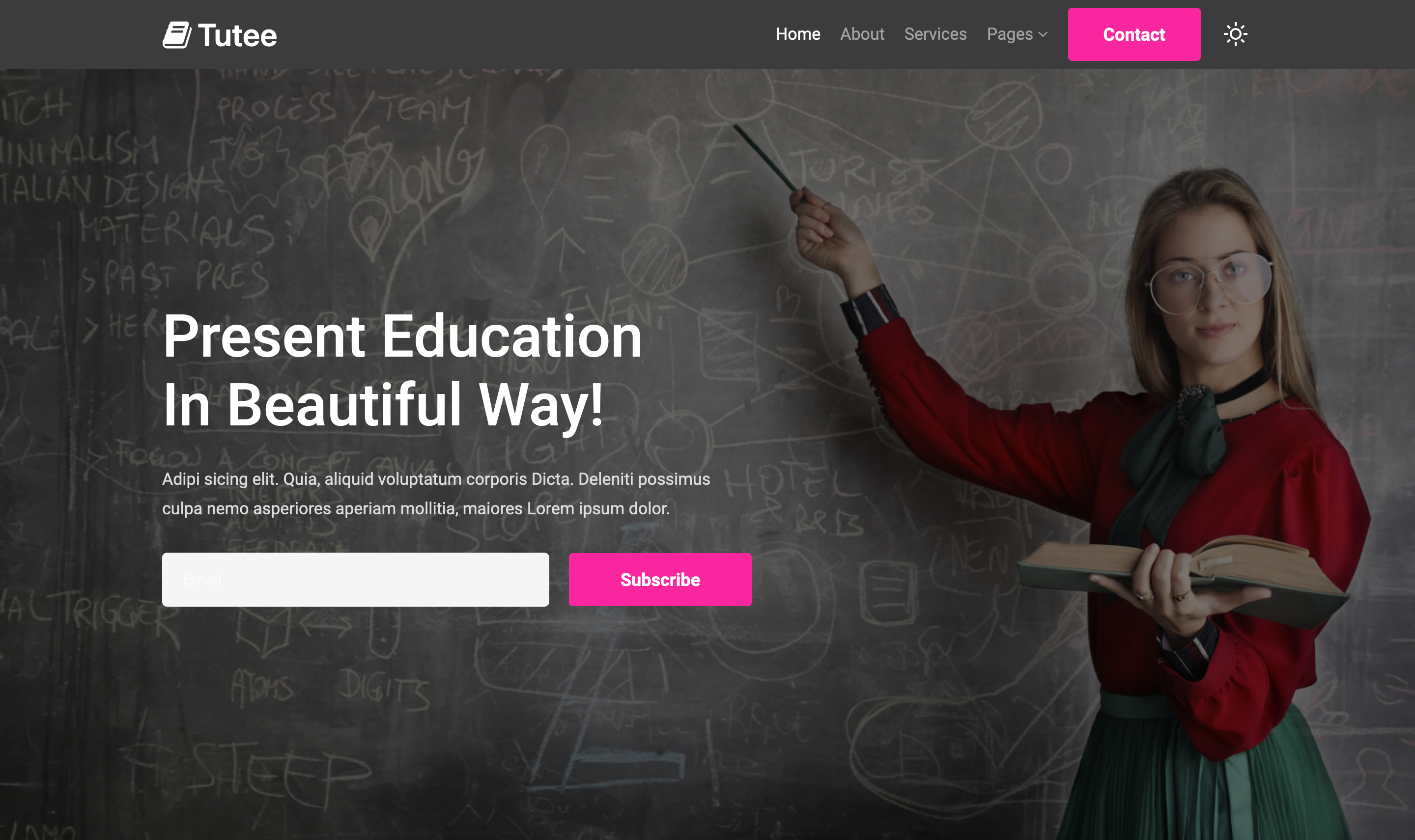
The “Tutee” template is an educational website template that features multi-page support and multi-screen size compatibility, ensuring a fully responsive experience on every device. It includes a dark mode option, easily activated by a switch in the template’s right corner, allowing users to toggle to a darker theme for enhanced visual comfort and modern aesthetics. This template is ideal for educational platforms looking for a versatile and user-friendly design solution.
Services of tutee
The “Tutee” educational template offers services like customizable learning modules, interactive course designs, and integrated testing platforms. It supports a wide range of educational activities, from online classes to resource sharing and student assessments. The template’s responsive design ensures smooth access on various devices, enhancing the learning experience for users.
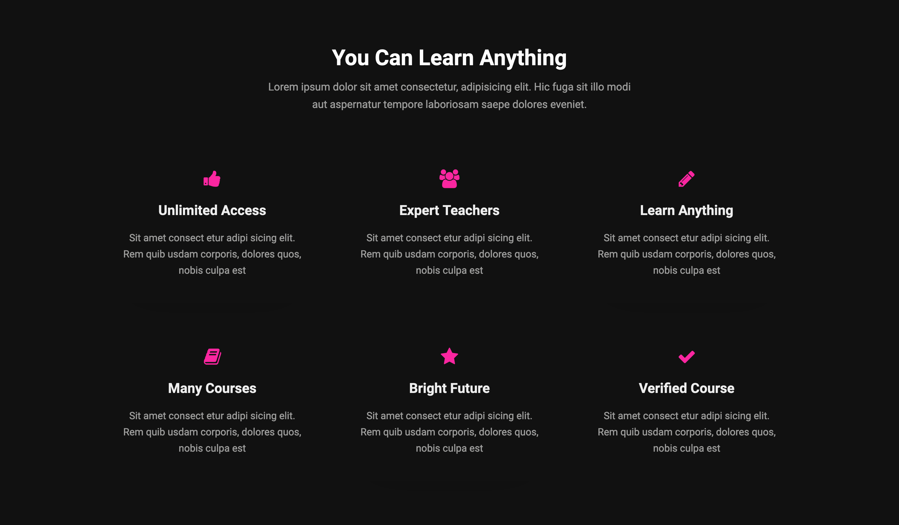
You Can Learn Anything
The “You Can Learn Anything” section of the Tutee template emphasizes the potential for users to acquire knowledge across various fields using the platform. It’s designed to inspire and motivate learners by showcasing the wide range of courses and resources available, highlighting the template’s commitment to educational accessibility and empowerment.
Dark Mode Enabled
The “Tutee” template includes a dark mode feature, which can be enabled by clicking on a toggle located in the right corner of the template. This feature switches the template’s appearance to a darker color scheme, reducing eye strain in low-light conditions and offering a modern, sleek look that can improve the user experience and focus.
Multiple Pagesh
The “Tutee” educational website template features multiple pages designed to accommodate various educational needs. These pages might include sections for course catalogs, about us, contact information, student testimonials, and educational resources, each tailored to create an engaging and comprehensive online learning environment.
Fully Responsive
The “Tutee” template is fully responsive, meaning it adjusts seamlessly to fit the screen size of various devices, from desktops to tablets and smartphones. This ensures a consistent and accessible user experience, making it easy for students and educators to interact with the educational content and features of the website regardless of the device used.
Key Features:
User-Friendly Design
Photo Gallery
Blog Page
Social Media Integration
On scroll-fixed navigation
Awesome Design
100% Responsive design
Bootstrap 4 Framework
Working Contact Form
Clean and modern layout
Easy to Customize
Google web fonts used
And many more…
Theme Details:
Theme Name: Tutee an Education Category Website Template.
Compatible Browsers: Google Chrome, Firefox, Safari, IE 10, Opera, etc.
Modernizing Industrial Presence: The Factorship WordPress Theme Overview
The Factorship WordPress theme is specifically designed to meet the needs of industrial businesses, blending modern design elements with functionality. It focuses on providing a robust online presence for sectors that demand a professional and adaptive digital footprint. With features like dark mode, responsive design, and ease of customization without the need for coding skills, it ensures businesses can effectively showcase their services and projects across all devices. This theme is an ideal choice for industries looking to enhance their online visibility and engagement.
Key Features:
Dark Mode Integration: Enhances visual comfort and reduces eye strain, making the website appealing in various lighting conditions.
Ease of Customization: Offers a user-friendly interface for personalizing layouts, colors, and fonts without coding knowledge.
Responsive Design: Ensures optimal viewing experience across all devices, from desktops to mobiles.
SEO Optimized: Built to be search engine friendly, improving visibility and ranking.
High-Quality Image Support: Allows for the incorporation of high-resolution images to showcase services and projects vividly.
Cross-Browser Compatibility: Ensures consistent performance and appearance on all major web browsers.
Fast Loading Speed: Optimized for speed to enhance user experience and reduce bounce rates.
Comprehensive Documentation: Detailed guides and customer support for easy setup and customization.
Customization Made Easy:
The Factorship WordPress theme simplifies customization for users without coding knowledge through a user-friendly interface. With intuitive controls, users can easily adjust layout designs, color schemes, and typography to fit their brand identity. This approach allows for significant personalization of the website’s appearance and functionality, enabling businesses to tailor their site to their specific needs and preferences, ensuring that even novices can achieve a professional and unique online presence.
Responsive and Mobile-Friendly Design:
The Factorship WordPress theme boasts a responsive and mobile-friendly design, ensuring optimal performance across all devices. This adaptability enhances user engagement by providing a seamless viewing experience whether on a desktop, tablet, or smartphone. Integrating dark mode offers benefits like reduced eye strain and power saving for OLED and AMOLED screens, making the website comfortable to use in low-light conditions. Additionally, dark mode contributes to a distinct branding aesthetic, allowing businesses to stand out with a modern and stylish interface.
Using Dark Mode:
Dark mode enhances user experience by reducing eye strain in low-light conditions, which can improve browsing comfort and duration. It’s also beneficial for power saving on devices with OLED or AMOLED screens. For branding, dark mode offers a sleek and modern look, allowing businesses to project a cutting-edge image. It aligns with contemporary design trends, setting a website apart from its distinctive aesthetic.
Conclusion:
Exploring the Factorship WordPress theme could be the key to elevating your industrial business’s online presence. With its modern design, ease of customization, and responsive layout, it’s tailored to meet the needs of businesses aiming for a standout digital footprint. Consider how its features, including dark mode, can enhance your branding and user experience. Dive into this theme to discover its potential to transform your website into a professional and engaging online hub.
Theme Details:
Theme Name: Factorship an Industrial Category WordPress Theme.
Compatible Browsers: Google Chrome, Firefox, Safari, IE 10, Opera, etc.
Factorship: Revolutionizing Industrial Web Presence with Modern Design & Functionality
Introducing Factorship, a cutting-edge industrial category website template that redefines the digital presence for businesses in the industrial sector. Crafted meticulously with HTML, CSS, and Bootstrap, Factorship boasts an innovative design that captivates at first glance. The vibrant use of yellow and orange colors not only grabs attention but also conveys energy and innovation, making your website stand out in the crowded digital landscape.
Factorship’s design philosophy is rooted in modern aesthetics, employing flat design principles that elevate its visual appeal. The template’s updated flat layers ensure a contemporary look that’s both clean and striking, avoiding the stale and outdated feel of traditional industrial websites. This fresh approach to design emphasizes clarity and focus, directing visitors’ attention precisely where you want it.
Moreover, Factorship is not just about showcasing your business. It also includes a range of additional pages designed to support your content strategy and enhance user engagement. With a dedicated blog page and a blog single page, you can share insights, news, and updates about your industry, establishing your expertise and keeping your audience informed. The landing page is designed to convert visitors into leads, while the email page facilitates direct communication. Even in the event of a mishap, the stylish 404 error page maintains a positive user experience, guiding visitors back to relevant content.
In summary, Factorship is not just a website template; it’s a comprehensive solution for industrial businesses looking to make a significant impact online. With its elegant design, attention-grabbing colors, and user-centric features, Factorship is poised to set a new standard for industrial category websites.
Vibrant Color Scheme: The striking combination of yellow and orange colors not only captivates attention but also injects vitality into your website’s design, making it stand out in the industrial sector.
Modern Flat Design: Embracing the latest in flat design trends, Factorship presents an updated and clean look that is both eye-catching and efficient, ensuring your website remains at the forefront of design innovation.
Responsive Bootstrap Framework: Built on the robust Bootstrap framework, Factorship guarantees a seamless viewing experience across all devices, enhancing user engagement and accessibility.
Dark Mode Switch: A user-friendly dark mode toggle allows visitors to switch to a darker theme for a more comfortable viewing experience, especially in low-light conditions, reflecting the latest web usability trends.
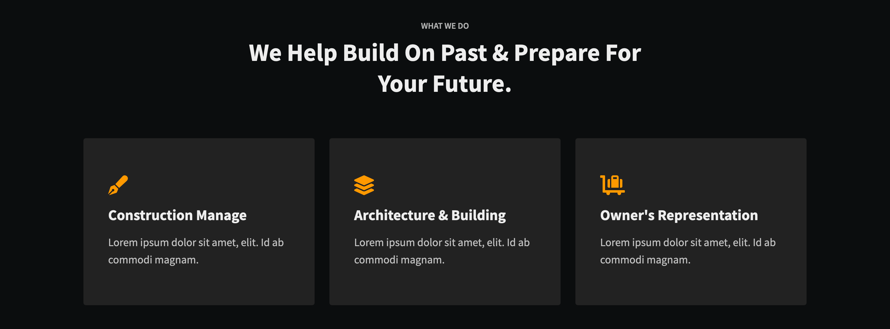
Comprehensive Industrial Sections: Tailored specifically for industrial businesses, Factorship includes dedicated sections for showcasing projects in a gallery, detailing company and industry work in the about section, highlighting services, and facilitating contact through a well-designed form.
Engaging Blog Platform: With a dedicated blog page and blog single page, Factorship enables you to share industry insights, news, and updates, establishing your authority and keeping your audience engaged.
Conversion-Focused Landing Page: The landing page is meticulously designed to convert visitors into leads, featuring compelling call-to-actions and engaging design elements.
Direct Email Page: Enhance communication with your audience through a dedicated email page, making it easier for clients and prospects to reach out directly.
Elegant 404 Error Page: Even when visitors encounter a dead end, the stylish 404 error page keeps the user experience positive, gently guiding them back to the main content.
Extensive Footer Section: Factorship’s comprehensive footer section offers additional navigation options, contact information, and quick links to important sections of your website, ensuring ease of access.
Customizable and Versatile: This template is designed to be fully customizable, allowing you to tailor it to your specific industrial needs and brand identity, making your website truly unique.
SEO Optimized: Factorship is crafted with SEO best practices in mind, ensuring that your website ranks well on search engines and reaches your target audience effectively.
High Performance and Speed: Optimized for speed and performance, Factorship ensures your website loads quickly, providing an excellent user experience and reducing bounce rates.
Factorship is the ultimate industrial website template, combining design excellence with functionality to help your business not just participate but stand out in the digital era.
Key Features:
User-Friendly Design
Photo Gallery
Blog Page
Social Media Integration
On scroll-fixed navigation
Awesome Design
100% Responsive design
Bootstrap 4 Framework
Working Contact Form
Clean and modern layout
Easy to Customize
Google web fonts used
And many more…
Theme Details:
Theme Name: Factorship an Industrial Category Website Template.
Compatible Browsers: Google Chrome, Firefox, Safari, IE 10, Opera, etc.
Shipper a Transportation and Logistics WordPress Theme
“Introducing Shipper, a versatile and high-quality WordPress theme designed exclusively for transportation and logistics services. Available on W3Layouts, Shipper is your go-to solution for creating a professional, engaging online presence. Its user-friendly design, free-licensed high-quality images, and compatibility with WordPress blocks make it perfect for building or editing your website effortlessly.”
Features:
Easy Installation and Customization: With WordPress blocks, Shipper offers a straightforward installation process and easy customization to suit your specific needs.
Versatile Page Layouts:
Home Page: Craft a welcoming first impression with a dynamic home page.
About Page: Share your company’s story, mission, and values.
Services Page: Detail your transportation and logistics services.
Blog & Blog Single: Engage your audience with informative content.
Landing Single: Perfect for targeted marketing campaigns.
Elements (HTML & CSS Components): Customize your site with unique elements.
404 Error Page: A user-friendly error page to guide lost visitors.
Email Newsletter: Integrated solutions for your email marketing needs.
Contact Page: Easy for clients to connect with you.
SEO-Optimized: Shipper is crafted with SEO best practices in mind, ensuring your site ranks well on search engines.
Responsive Design: Optimized for all devices, providing a seamless user experience on desktops, tablets, and mobiles.
Free Licensed Images: Enhance your site’s visual appeal with high-quality, royalty-free images included in the theme.
Comprehensive Documentation: Detailed guidance for building or editing your website, making Shipper user-friendly for both novices and experts.
Conclusion: “Shipper is more than just a WordPress theme; it’s a comprehensive tool for establishing your online presence in the transportation and logistics industry. With its SEO-friendly structure, easy customization, and array of features, Shipper on W3Layouts is the ideal choice for businesses seeking to elevate their online visibility and engage effectively with their audience.”
SEO Keywords:
Transportation WordPress Theme
Logistics Website Template
Responsive Transportation Theme
SEO-friendly Logistics Template
W3Layouts Premium Themes
Easy-to-Use WordPress Themes
Customizable Transport Website
WordPress Theme with Free Images
Shipper Theme Documentation
Theme Details:
Theme Name: Shipper an Autos and Transportation Category WordPress Theme.
Compatible Browsers: Google Chrome, Firefox, Safari, IE 10, Opera, etc.
Introducing Shipper – Your Ultimate Cargo Transportation Solution
Welcome to Shipper, the ultimate website template for businesses in the cargo transportation sector. With its exceptional design centered around ship transports, Shipper is not just a template; it’s a robust platform to showcase your transportation services with style and efficiency.
Key Features:
Multi-Page Layout: Tailored to the needs of transportation businesses, offering dedicated pages for services, about us, contact, and more.
Stunning Ship Transport Design: A UI that captivates! Every element is crafted to resonate with shipping and cargo transportation themes.
Dark Mode Toggle: A seamless switch between light and dark modes, catering to user preferences and enhancing accessibility.
SEO Optimized: Integrated with essential keywords like ‘cargo transport,’ ‘shipping services,’ ‘logistics,’ and ‘marine transport,’ ensuring better visibility on search engines.
Responsive and User-Friendly: A fluid experience across all devices, ensuring your website is accessible to a wider audience.
Engaging User Interface: Designed to grab attention and guide visitors through your services with ease.
Shipper is more than just a visual treat; it’s a tool to transform your online presence. Whether your focus is on local or international shipping, this template provides a solid foundation to build upon.
More about Shipper:
Effortless Navigation & Layouts: The Shipper’s intuitive navigation structure ensures that visitors can easily find what they’re looking for. From service descriptions to contact information, the template guides users through a seamless journey on your site.
Customizable Design Elements: Tailor your website to match your brand identity. With Shipper, you have the flexibility to customize colors, fonts, and layouts, ensuring that your website stands out in the competitive shipping industry.
Interactive Content Features: Engage your audience with interactive elements such as sliders, galleries, and video integration. Show off your fleet, cargo handling processes, and customer testimonials dynamically and engagingly.
Fast Loading Speeds: Recognizing the importance of loading speed for both user experience and SEO, Shipper is optimized for quick load times, ensuring your visitors don’t bounce due to delays.
Comprehensive Documentation & Support: Get started easily with detailed documentation and access to customer support. Whether you’re a web development novice or a seasoned professional, Shipper provides the resources you need for a smooth setup and customization process.
Regular Updates & Security: Stay up-to-date with the latest web standards and security measures. Shipper receives regular updates to ensure compatibility with the newest browser versions and protection against online threats.
Built for Conversion: Every element in Shipper is designed with conversion in mind. From prominent call-to-action buttons to clear service listings, the template helps you turn visitors into clients.
Cross-Browser Compatibility: Shipper functions flawlessly across all major web browsers, ensuring a consistent experience for all your visitors, regardless of their browser choice.
Multilingual & RTL Support: Reach a global audience with Shipper’s multilingual capabilities and right-to-left (RTL) text support. This feature is particularly beneficial for businesses operating in multiple countries or regions.
Key Features:
Multiple Html pages
Transportation website template
Light and Dark mode switch
On scroll fixed navigation
Awesome Design
100% Responsive design
Bootstrap 4 Framework
Working Contact Form
Clean and modern layout
Easy to Customize
Google web fonts used
And many more…
Theme Details:
Theme Name: Shipper a Transport and Cargo Category Website Template.
Compatible Browsers: Google Chrome, Firefox, Safari, IE 10, Opera, etc.
Elevate your corporate presence with Kodeal, the ultimate WordPress theme tailored for business excellence. Designed meticulously for corporate entities, Kodeal blends cutting-edge features with unparalleled ease of use, setting your business apart in the digital realm.
Sophisticated Design for Modern Businesses: Kodeal’s sleek and professional design epitomizes corporate elegance. Its intuitive layout and aesthetic appeal resonate with modern business ethos, providing an immediate sense of credibility and trust to your visitors.
Feature-Rich, Multi-Page Layout: Expanding beyond the one-page norm, Kodeal offers a multi-page structure, allowing for a comprehensive showcase of your business services, products, and team. Each page is crafted to maintain thematic consistency while providing unique content spaces.
Dark Mode for Enhanced User Experience: In an era where screen time is ever-increasing, Kodeal prioritizes user comfort. The innovative dark mode toggle, situated at the top right, ensures zero eye strain, offering viewers a visually comfortable experience, regardless of browsing time.
SEO-Optimized for Maximum Visibility: Kodeal isn’t just about aesthetics; it’s built with SEO in mind. From its coding to its content layout, every aspect is optimized to ensure your business ranks high in search engine results, increasing visibility and driving organic traffic.
Responsive and Mobile-Friendly: Understanding the importance of mobile traffic, Kodeal guarantees a seamless experience across all devices. Its responsive design adapts flawlessly to different screen sizes, ensuring your site always looks its best.
Customizable to Your Brand’s Needs: Kodeal is highly customizable, allowing you to align the theme with your brand identity. From color schemes to font choices, tailor every aspect to create a website that is uniquely yours.
E-commerce Ready: Integrate your online store effortlessly with Kodeal. Its e-commerce compatibility means you can easily set up a shop and start selling products or services directly from your site.
High-Speed Performance: In the digital world, speed is key. Kodeal is optimized for high-speed performance, ensuring your site loads quickly, enhancing user experience, and aiding in SEO ranking.
Regular Updates and Support: Our commitment to Kodeal extends beyond its launch. Regular updates keep the theme compatible with the latest WordPress versions, and our dedicated support team is always ready to assist you.
Integrations and Plugins: Kodeal supports a wide range of popular plugins and integrations, enhancing its functionality. From social media widgets to SEO tools, everything you need to boost your site’s performance is at your fingertips.
Secure and Reliable: Security is paramount, and Kodeal is built with top-notch security features to protect your site and data. Regular security updates ensure you are safeguarded against the latest digital threats.
User-Friendly Admin Panel: Manage your site with ease using Kodeal’s user-friendly admin panel. Whether you’re a WordPress novice or an expert, you’ll find site management to be a breeze.
Innovative Features for Tomorrow’s Business: Kodeal is not just about meeting today’s standards but setting tomorrow’s. Continuous innovation ensures that Kodeal stays ahead, providing features and functionalities that future-proof your business.
Conclusion
Kodeal is more than just a WordPress theme; it’s a comprehensive tool for business growth and online presence. With its blend of style, functionality, and user-centric design, it sets the standard for corporate business websites. Choose Kodeal to craft a digital space that reflects the prestige and professionalism of your business.
Key Features:
User-Friendly Design
Blog Page
Social Media Integration
On scroll-fixed navigation
Awesome Design
100% Responsive design
Bootstrap 4 Framework
Working Contact Form
Clean and modern layout
Easy to Customize
Google web fonts used
And many more…
Theme Details:
Theme Name: KoDeal a Corporate Business Category WordPress Theme.
Compatible Browsers: Google Chrome, Firefox, Safari, IE 10, Opera, etc.
KoDeal a Corporate Business Category Website Template
In today’s fast-paced digital landscape, businesses require a robust online platform to ensure they stand out from the competition. Enter the Kodeal Business Category Website Template – an all-in-one solution designed for modern corporate entities aiming to make a significant impact in their respective sectors. Crafted meticulously with SEO and user engagement in mind, this template provides the perfect foundation for a corporate business eager to achieve digital excellence.
Key Features and Benefits
SEO-Optimized Design: Every aspect of the Kodeal template is infused with best practices in Search Engine Optimization. From meta tags to image optimization, every component is geared towards propelling your website to the top of search engine results.
User-Centric Layout: The Kodeal Business template boasts a design that prioritizes user experience. Navigating through the website is intuitive, ensuring visitors remain engaged and reducing bounce rates.
Mobile Responsiveness: Recognizing the dominance of mobile browsing, this template is fully responsive, ensuring a seamless experience across devices of all sizes.
Conversion-Oriented Components: Integrated Call-to-Action (CTA) buttons, testimonial sections, and portfolio showcases are strategically placed to drive user actions and promote trust.
Integrated Blog Section: Content marketing is vital for SEO and engagement. The Kodeal template offers a sleek blog section, allowing businesses to share industry insights, news, and updates, further enhancing their digital authority.
Dark Theme Website Templates
Dark mode has gained a lot of traction recently like dark mode Facebook, dark mode Google Chrome, dark mode extension Chrome, dark mode Windows 10, etc. so, we have implemented almost all the templates to have complete flexibility of dark mode. The first visit of the user is made with a light theme environment and then if they wish to change their theme to dark mode with just one click, we have made it simple, our themes are predesigned with dark mode which makes the eyes relaxed from brighter screens.
Responsive Web Design
The pages are fully designed with responsive buttons, text, images, etc. which looks pretty cool with almost all windows and devices. Not only the elements present in the website template but also responsive display ads which you placed on your site. All our templates are responsive for mobile with responsive email templates with a responsive HTML table. So, you won’t need to worry about the look of your website on different sizes of screens and build a website for free.
Building Dreams into Digital Realities
The corporate world is more than just products, services, and transactions. It’s about visions, missions, and values. The Kodeal Business Category Website Template isn’t just a digital framework; it’s a canvas, awaiting your unique brand story. This template is a stepping stone, facilitating the transformation of your business dreams into palpable digital realities.
Increased Engagement and Visibility
Engagement isn’t just about visual aesthetics; it’s about creating an environment where visitors feel compelled to interact, explore, and ultimately, convert. With its combination of strategic layout, SEO enhancement, and user-centric design elements, the Kodeal template fosters an ecosystem of heightened engagement.
Moreover, in the realm of digital visibility, the template’s SEO-forward design ensures that your corporate website becomes a beacon, attracting a steady stream of organic traffic from search engines.
In Conclusion
The Kodeal Business Category Website Template is more than just a digital design; it’s a strategic tool for corporate businesses ready to dominate the online arena. With its emphasis on SEO, user engagement, and adaptability, it provides businesses with a foundation that’s both resilient and forward-thinking. Dive into the future of corporate digital presence with Kodeal, and watch your business dreams materialize into digital success stories.
Key Features:
Multiple Html pages
Corporate website template
Light and Dark mode switch
On scroll fixed navigation
Awesome Design
100% Responsive design
Bootstrap 4 Framework
Working Contact Form
Clean and modern layout
Easy to Customize
Google web fonts used
And many more…
Theme Details:
Theme Name: KoDeal a Corporate Category Website Template.
Compatible Browsers: Google Chrome, Firefox, Safari, IE 10, Opera, etc.
Curate Your Digital Presence with Our Top Picks: WordPress and HTML, CSS, Bootstrap Website Templates Showcase
In the expansive universe of web design, the right template can be the cornerstone of a stunning digital presence. Explore our curated showcase of WordPress and HTML, CSS, and Bootstrap website templates, handpicked to empower you with a diverse range of options for your online ventures. From sleek portfolios to robust e-commerce platforms, this comprehensive article serves as your go-to resource for discovering and implementing the perfect templates to elevate your website.
Chapter 1: The Power of Website Templates
Understanding Website Templates
Explore the fundamentals of website templates and how they serve as the foundation for a well-designed and functional website.
Advantages of Using Templates
Discover the myriad benefits of using pre-designed templates, including time and cost savings, consistent design, and ease of customization.
Chapter 2: WordPress Templates Showcase
Sleek Portfolio Designs
Uncover WordPress templates designed to showcase your portfolio with elegance and style. From photographers to freelancers, find the perfect fit.
Dynamic Business Themes
Explore business-centric WordPress themes that combine professionalism with cutting-edge design, suitable for startups, agencies, and corporate entities.
eCommerce Excellence
Dive into the world of e-commerce with WordPress templates tailored for online stores. Discover features, aesthetics, and functionality that elevate your products.
Chapter 3: HTML, CSS, and Bootstrap Templates Showcase
Responsive HTML Templates
Explore a collection of responsive HTML templates that ensure your website looks stunning on devices of all sizes. Perfect for a wide range of projects.
CSS Elegance
Discover CSS templates that bring elegance and visual appeal to your website. From minimalistic designs to bold aesthetics, find a style that suits your brand.
Bootstrap Brilliance
Unleash the power of Bootstrap with templates that combine flexibility and functionality. Dive into a variety of designs compatible with the latest Bootstrap version.
Chapter 4: How to Choose the Right Template
Assessing Your Needs
Understand your website’s requirements and goals to determine the type of template that best suits your project.
Customization Tips
Learn how to effectively customize templates to align with your brand, ensuring a unique and personalized online presence.
Chapter 5: Where to Find and Implement Templates
Trusted Marketplaces
Explore reputable marketplaces for WordPress and HTML templates. Discover platforms that offer a wide selection and reliable support.
Installation and Setup
Get step-by-step guidance on how to install and set up your chosen templates, ensuring seamless integration with your WordPress website or HTML project.
Chapter 6: Responsive Design Across Devices
Mobile-First Approach
Explore templates that embrace a mobile-first design philosophy, ensuring a seamless and engaging user experience on smartphones and tablets.
Cross-Browser Compatibility
Discover templates that prioritize cross-browser compatibility, ensuring consistent and reliable performance across various web browsers.
Chapter 7: SEO-Friendly Templates
Optimized Code Structure
Understand the importance of SEO-friendly templates with clean and optimized code structures. Learn how well-structured code positively impacts search engine rankings.
Schema Markup Integration
Explore templates that incorporate Schema Markup to provide search engines with additional context about your content, improving the visibility of your website in search results.
Chapter 8: Template Customization for Branding
Color Schemes and Branding
Learn how to customize color schemes and branding elements within templates to align with your brand identity, fostering brand recognition and consistency.
Logo Integration
Discover best practices for seamlessly integrating your logo into different template designs while maintaining a professional and cohesive look.
Chapter 9: Template Performance Optimization
Image Optimization
Explore techniques for optimizing images within templates to enhance page loading times, user experience, and SEO performance.
Caching and Speed Enhancement
Learn about caching mechanisms and speed enhancement techniques to ensure optimal performance for your website built on WordPress or HTML templates.
Chapter 10: Template Updates and Support
Regular Updates
Explore the importance of choosing templates that receive regular updates to stay compatible with the latest WordPress versions, HTML standards, and web technologies.
Support Channels
Understand the significance of templates that come with reliable support channels, ensuring assistance in case of issues or questions during and after implementation.
Chapter 11: Integrating Multimedia Elements
Video Integration
Explore templates that seamlessly integrate video elements, enhancing the visual appeal and engagement potential of your website.
Image Sliders and Galleries
Discover templates with built-in support for image sliders and galleries, allowing you to showcase your visual content in a dynamic and compelling manner.
Chapter 12: Accessibility and Inclusivity in Templates
ADA Compliance
Learn about templates that adhere to ADA (Americans with Disabilities Act) standards, ensuring accessibility and inclusivity for users with disabilities.
Responsive Typography
Explore templates with responsive typography features, allowing font sizes and styles to adapt based on the user’s device and preferences.
Conclusion:
As you embark on the journey of selecting and implementing WordPress and HTML, CSS, and Bootstrap website templates, consider the additional facets of responsive design, SEO-friendliness, customization for branding, performance optimization, ongoing support, and the seamless integration of multimedia elements. By prioritizing these aspects, you not only enhance the visual appeal of your website but also ensure optimal functionality, user experience, and long-term success in the digital landscape. Browse, customize, and transform your online presence with templates that go beyond aesthetics, providing a foundation for excellence.
Introducing “Living” – Your All-in-One WordPress Template for Stylish Living and Home Maintenance
Unleash the full potential of your website with “Living” – a feature-rich WordPress template designed to elevate your online presence in the Living, Interior, and Home Maintenance categories. “Living” offers a seamless blend of style, functionality, and convenience, providing a comprehensive solution for your digital space.
Key Features:
Multiple Pages for Comprehensive Content
“Dive into the versatility of “Living” with multiple pre-designed pages that cover every aspect of stylish living and home maintenance. Whether you’re sharing decor inspirations, providing DIY maintenance guides, or creating a community hub, “Living” has you covered.
Two Versions for Your Flexibility
1. Multiple Pages Liberty Version (Paid): Unlock the full potential of “Living” with our Liberty Version. Enjoy unlimited pages, premium features, and customization options to tailor your website to perfection.
2. Limited Pages Starter Version (Free): Start your journey with our free Starter Version. Ideal for those just getting started, this version provides essential pages for stylish living and home maintenance. In return, we request backlinks for commercial use.
Dark Mode for Enhanced Experience
“Dive into the sophistication of “Living” with the Dark Mode feature. Switch seamlessly between light and dark themes with a simple toggle button located at the top right corner. Give your visitors the freedom to choose a mode that suits their preferences.
Responsive Design for Any Device
“Living” is built with a responsive design, ensuring your website looks stunning and functions flawlessly on any device – from desktops to tablets and smartphones. Reach your audience wherever they are.
Easy to Edit and Customize
Edit and customize your website effortlessly with “Living’s” user-friendly interface. No coding skills are required. Tailor your content, images, and colors to match your brand and vision.
Versatile Use for Interior and Home Maintenance
Whether you are in the interior design business or providing expert home maintenance tips, “Living” caters to both worlds seamlessly. Showcase your portfolio, share DIY guides, and engage your audience with ease.
Grow Your Community
Engage with your audience through community forums, DIY challenges, and expert consultations. “Living” isn’t just a template; it’s a hub for like-minded individuals passionate about stylish living and home maintenance.
Get Started with “Living” Today
Transform your online presence with “Living.” Choose the version that aligns with your goals, harness the power of dark mode, and deliver a sophisticated experience for your audience. Elevate your website with “Living” now!
Note: Free Starter Version requires backlinks for commercial use.
Key Features:
User-Friendly Design
Blog Page
Social Media Integration
On scroll-fixed navigation
Awesome Design
100% Responsive design
Bootstrap 4 Framework
Working Contact Form
Clean and modern layout
Easy to Customize
Google web fonts used
And many more…
Theme Details:
Theme Name: Living a Home Maintenance and Interior Category Website Template.
Compatible Browsers: Google Chrome, Firefox, Safari, IE 10, Opera, etc.
Are you in search of a cutting-edge WordPress theme that perfectly suits your financial agency’s needs? Look no further than FinAgenc, the ultimate WordPress theme designed exclusively for financial professionals, agencies, and consultants. With its sleek design and powerful features, FinAgenc is your gateway to a stunning and functional online presence.
Key Features:
Responsive Design: FinAgenc is fully responsive and mobile-friendly, ensuring your website looks impeccable on all devices, from desktops to smartphones. Reach your audience wherever they are.
SEO Optimized: Boost your search engine rankings with FinAgenc’s SEO-optimized code, ensuring your financial services are easily discoverable by potential clients.
Customization: Tailor your website effortlessly with the intuitive theme customizer. Choose from a range of color schemes, fonts, and layout options to match your brand’s identity.
Drag-and-Drop Page Builder: Build stunning pages with ease using the included drag-and-drop page builder. No coding skills are required, unleash your creativity.
Finance-Centric Widgets: FinAgenc comes with a selection of finance-centric widgets, including livestock market tickers, currency converters, and financial news feeds, keeping your visitors informed and engaged.
Portfolio Showcase: Display your success stories and case studies in style with the portfolio showcase feature. Highlight your expertise and build trust with potential clients.
Appointment Booking: Allow clients to book consultations or meetings directly through your website with the integrated appointment booking system. Streamline your workflow and save time.
Blog Integration: Share your financial insights and industry knowledge through the integrated blog. Establish yourself as an authority in your niche.
Testimonials: Showcase client testimonials and build credibility. Let your satisfied clients speak for your excellence.
24/7 Support: Our dedicated support team is available around the clock to assist you with any questions or issues you may encounter.
FinAgenc is the ideal WordPress theme for financial advisors, investment firms, accounting agencies, and anyone in the financial sector looking to establish a professional online presence. With its feature-rich toolkit and user-friendly design, you can attract new clients, enhance your credibility, and grow your business.
Don’t miss out on the opportunity to elevate your financial agency’s online presence. Get started with FinAgenc today and take your financial services to the next level. Explore our demo and experience the power of FinAgenc for yourself!
Additional Features:
Multiple Page Templates: FinAgenc offers a variety of pre-designed page templates to suit different aspects of your financial agency. Whether you need a service page, team page, or a dedicated contact page, you can easily create a cohesive and professional website with our diverse template options.
SEO-Friendly Structure: Boost your online visibility with FinAgenc’s SEO-friendly structure. The theme is built with clean code, schema markup, and optimized page speed to ensure search engines can crawl and rank your site effectively. Improve your search engine rankings and attract more organic traffic.
Dark Mode Enabled: Stay on-trend with the dark mode feature. FinAgenc allows users to switch between light and dark modes, enhancing user experience and reducing eye strain, especially during late-night browsing sessions.
Custom Widgets: Access a collection of custom widgets tailored to financial agencies. These widgets enable you to showcase key financial data, recent blog posts, testimonials, and more, providing valuable information to your visitors.
Multiple Header and Footer Styles: Choose from various header and footer styles to create a unique look for your website. Customizing these elements adds to the overall aesthetics and user experience.
In-Depth Documentation: FinAgenc comes with comprehensive documentation, guiding you through the theme setup, customization, and troubleshooting. You’ll have the resources you need to get your website up and running smoothly.
Cross-Browser Compatibility: Ensure your website looks and functions perfectly across different web browsers, including Chrome, Firefox, Safari, and Edge, guaranteeing a consistent experience for all visitors.
Lifetime Updates and Support: Enjoy lifetime updates and dedicated customer support to keep your website running smoothly and up to date with the latest web standards and WordPress developments.
FinAgenc is the ultimate solution for financial agencies looking to establish a robust online presence. Its rich feature set, SEO optimization, dark mode option, and multipage capabilities make it the perfect choice for showcasing your financial services with style and professionalism. Get started with FinAgenc today and watch your agency thrive in the digital landscape.
Key Features:
User-Friendly Design
Blog Page
Social Media Integration
On scroll-fixed navigation
Awesome Design
100% Responsive design
Bootstrap 4 Framework
Working Contact Form
Clean and modern layout
Easy to Customize
Google web fonts used
And many more…
Theme Details:
Theme Name: FinAgenc a Corporate Business Category WordPress Theme.
Compatible Browsers: Google Chrome, Firefox, Safari, IE 10, Opera, etc.
In today’s digital age, where smartphones and tablets have become an integral part of our lives, the importance of mobile optimization for WordPress websites cannot be overstated. With an increasing number of users accessing the web through mobile devices, failing to optimize your website for mobile can result in missed opportunities and a significant loss in potential traffic and conversions. In this comprehensive guide, we’ll delve into why mobile optimization is crucial for your WordPress website’s success and explore actionable tips to ensure your site thrives in the mobile era.
Chapter 1: The Mobile-First Era
The Dominance of Mobile Devices
The 21st century has witnessed an unprecedented proliferation of mobile devices. Smartphones, tablets, and even wearables have become ubiquitous, changing the way we interact with the digital world. Today, more people access the internet through their mobile devices than ever before. This shift in user behavior has profound implications for website owners and marketers alike.
Mobile devices have become an indispensable part of our daily lives, providing us with instant access to information, entertainment, and social connections. From shopping online and checking emails to navigating with GPS and consuming multimedia content, mobile devices have revolutionized how we engage with the online world.
Google’s Mobile-First Indexing
In response to the mobile revolution, Google, the world’s leading search engine, introduced a significant change in its ranking and indexing approach. This change is known as “mobile-first indexing.” But what exactly does this mean for website owners?
In the past, Google primarily used the desktop version of a website to evaluate its relevance and quality when determining search rankings. However, with the dominance of mobile usage, Google has shifted its focus to the mobile version of websites. This means that Googlebot, Google’s web crawler, predominantly crawls and indexes the mobile version of your site to determine its position in search results.
This shift in Google’s approach underscores the critical importance of mobile optimization for SEO. Websites that are not mobile-friendly or lack mobile optimization may experience a decline in search engine rankings and visibility.
Chapter 2: User Experience Matters
Responsive Design
In the quest for optimal mobile optimization, one term stands out: responsive design. A responsive website design is an approach that aims to provide a consistent and user-friendly experience across a wide range of devices, screen sizes, and resolutions.
With responsive design, your website adapts seamlessly to different screens, whether it’s a smartphone, tablet, laptop, or desktop computer. The layout, images, and text reconfigure themselves to fit the screen, ensuring that visitors have an enjoyable and visually appealing experience regardless of the device they use.
Responsive design is not just a design philosophy; it’s a fundamental component of mobile optimization. Here are some key aspects of responsive design that contribute to an improved mobile user experience:
Fluid Grids:
Responsive design employs fluid grids, which are based on relative units (such as percentages) rather than fixed units (like pixels). This allows web elements to adapt flexibly to various screen sizes.
Media Queries:
Media queries are CSS (Cascading Style Sheets) techniques that enable you to apply different styles or layouts based on specific screen characteristics. With media queries, you can target different devices and adjust the design accordingly.
Flexible Images:
Images are often a critical part of web content. Responsive design ensures that images are appropriately scaled and optimized for different devices, reducing load times and improving the overall user experience.
Mobile-First Approach:
To truly excel in mobile optimization, many web designers and developers adopt a “mobile-first” approach. This means that they begin the design process by creating a mobile-friendly version of the website and then progressively enhance it for larger screens. A mobile-first approach ensures that the core content and functionality are optimized for mobile users.
When you implement responsive design on your WordPress website, you enhance the user experience for mobile visitors. They can easily navigate your site, read content, and interact with your offerings, resulting in higher engagement and, ultimately, increased conversions.
Faster Loading Times
Mobile users are known for their impatience when it comes to website loading times. Research shows that even a one-second delay in page load times can result in a significant increase in bounce rates. In the world of mobile browsing, where users are often on the go and looking for quick answers, speed is of the essence.
Fast-loading web pages are not only essential for retaining visitors but also for SEO. Google considers page speed as a ranking factor, and faster-loading websites are more likely to appear higher in search results.
Here are some strategies for optimizing your website’s loading speed for mobile devices:
Image Compression:
Images are often the largest files on a webpage and can contribute significantly to slow loading times. Use image compression techniques to reduce file sizes without sacrificing quality. There are several WordPress plugins available that can automate this process.
Minimize HTTP Requests:
Every element on a webpage, such as images, scripts, and stylesheets, requires an HTTP request to the server. Minimize the number of requests by combining files and using asynchronous loading for non-essential elements.
Content Delivery Networks (CDNs):
CDNs are networks of servers distributed across the globe. They store cached copies of your website’s content and deliver it from the server closest to the user. This reduces latency and speeds up page loading.
Browser Caching:
Browser caching allows you to store static files (like CSS, JavaScript, and images) on a user’s device. When a user revisits your site, the browser can load these cached files instead of downloading them again, leading to faster load times.
Mobile-Friendly Code:
Ensure that your website’s code is clean and optimized for mobile devices. Minimize unnecessary code and scripts, and use efficient HTML and CSS practices.
By optimizing your website’s loading speed for mobile devices, you not only provide a better user experience but also improve your chances of ranking higher in search engine results. Users are more likely to stay engaged with your content when they don’t have to wait for pages to load, leading to lower bounce rates and increased conversions.
Chapter 3: SEO Benefits of Mobile Optimization
Improved Search Rankings
Search engine optimization (SEO) is a complex and ever-evolving field, and mobile optimization has become an integral part of it. Google, being the dominant search engine, has a significant influence on SEO best practices. As Google prioritizes mobile-first indexing, mobile optimization has a direct impact on your website’s search rankings.
Here’s how mobile optimization can lead to improved search rankings:
Mobile-Friendly Algorithm:
Google has its mobile-friendly algorithm, which is designed to reward websites that provide a great user experience on mobile devices. Websites that pass Google’s mobile-friendly test are more likely to rank higher in mobile search results.
Reduced Bounce Rates:
Bounce rate is a metric that measures the percentage of visitors who navigate away from your site after viewing only one page. High bounce rates are often associated with poor user experiences, such as slow loading times or non-responsive designs. By optimizing your site for mobile, you can reduce bounce rates, which is a positive signal to search engines.
Enhanced User Engagement:
When users find your website easy to use and visually appealing on their mobile devices, they are more likely to engage with your content, spend more time on your site, and explore multiple pages. Increased user engagement can contribute to improved search rankings.
Mobile-First Indexing:
As mentioned earlier, Google’s mobile-first indexing means that Google predominantly uses the mobile version of your site to determine its search
Conclusion
Mobile optimization is no longer an option but a necessity for WordPress website owners. In a mobile-first world, providing an exceptional user experience on smartphones and tablets is paramount for SEO success, user engagement, and conversions. By following the best practices outlined in this guide, you can ensure that your WordPress website thrives in the mobile era, attracting and retaining visitors across all devices. Don’t miss out on the vast opportunities offered by mobile optimization – start optimizing your site today for a brighter online future.

