Notebook Landing Page Flat Responsive web template
Notebook Landing page Flat Responsive web design template is a unique creation from W3layouts.. You can use this template for any type of Mobile Apps searching website, Product Launching websites and more. This web template is built in a Fancy style however it can be used as per the user requirements.
Highlights
As the name suggests, Notebook Landing Page Flat Responsive web template has the image of someone writing on a notebook with a pencil on a table top. This blurred image gives anyone a feeling of nostalgia.
Over this image you can display the ads of a few of your latest products with a custom order now button.
Below this you can add the description of your next product, thus inducing a sense of anticipation in your customers.
A mobile application searching website or product launching websites will not be complete without displaying a few of your previous services. So provide the template samples at ‘works in any browser’.
The attractive pricing table, which is divided into three sections, professional, forever free and enterprise gives an array of choice for the customers to choose from, making notebook, the best responsive template for mobile apps searches.
It has a compelling contact us form designed on a gey background.
This HTML5 CSS web template is also comprises a Home, Team, our story, blog dropdown menus.
Notebook is a cross-browser compatible responsive mobile template.
To see the demo click on the Demo button or click the download button to download the template.
Template Information
Template Name: Notebook, Landing Page Flat Responsive web template
Licence: Life Time Free Licence under Creative Commons Attribution 3.0 Unported. Unlimited Use, Source files & PSD included, you can help & support us (W3Layouts, a Non-Profit) by donations or you should keep link to our website.
Creted date: April 10, 2014
Last Updated: 24th April 2014
Compatible Browsers: Google Chrome, Firefox, Safari, IE9, Opera etc
Aqual Single page Flat Responsive Web Template Free
Aqual Single page Flat Responsive web is a mobile webdesign used for agency, portfolios, corporate, and non-corporates. Aqual is one such web template which is ready to meet your needs. It is a flat, modern singlepage template. You will find clean and minimal flat ui design in this web template. This is an all build which is editable and fully Responsive built with web technologies using HTML5 and CSS3.
404 “Page not found” is an error page template that gets displayed when someone asks for a page that is not available on your website. The cause for this could be a wrong URL or removal of a page from your website. Such circumstances the web server sends a page that simply says 404 “Page not found”.
This template is designed using web technologies such as HTML5 & CSS3. This is a Free Responsive web design template. Irrespective of whether your visitors use a desktop, notebook, tablet, or mobile phone to view your site, this template will scale and adjust to give them an optimal experience – completely automatically and without any additional work on your part. We have built this we template in a glossy blurred background image. This Free Responsive HTML5 web template is being developed to suite any mobile and desktop browsers right from Chrome to Firefox to Safari to Opera till IE9.
Highlights
Designed using web technologies HTML5 & CSS3
It is a free and responsive template
Built on glossy blurred background image
You can use this template for any kind of web and mobile websites.
Loved the design of this template? Do you want to put your own spin on it? No problem — this template includes sliced Photoshop source files (.psd) you can work with in Adobe Photoshop (version CS3 and up).
Need help with this template? Get in touch with us by email or Twitter, Facebook and we’ll be right there to help you on your way — no scripts, no robotic responses, and no giving you the runaround.
Template Information
Template Name: 404 Error Page Responsive web Template
Licence: Life Time Free Licence under Creative Commons Attribution 3.0 Unported. Unlimited Use, Source files & PSD included, you can help & support us (W3Layouts, a Non-Profit) by donations or you should keep link to our website.
Creation date: Feb 12, 2014
Last Updated: March 15 2014
Compatible Browsers: Google Chrome, Firefox, Safari, IE9, Opera etc
Bloom portfolio Single page Responsive website template
Bloom is a portfolio based single page Responsive website. This template is used for personal portfolio website, corporate or product showcase website. One can change the images and data in the template and make it fit to their needs. Bloom has been designed using web technologies such as HTML5 and CSS3 to make it responsive device friendly. Bloom comes in three versions Responsive Web template, Smatphone web template and Mobile Web Template. Download the template you need.
Don’t forget to share the template.
Download PSD : Here
You have toiled through the nights with strained eyes perfecting every detail of your website, but if it is not responsive enough, you will not generate effective traffic. And, then you will end up blaming your destiny for the failure of your ambitious dreams!
What is a Responsive Website?
In the last 10 years, the number of people using the internet on smartphones has increased by 10% globally. According to the statistics, more than 2 billion users access the internet through their smartphones.
These staggering numbers say it loud and clear that your website must not only load swiftly on smartphones but also adjust itself according to the screen size. The web designers and developers call it ‘responsiveness’ of the website and the technology used to build the website is ‘Responsive Web Design’
In order to reach your customers, your website must rank at the top in google search. One of the most important criteria for Google to rank your website is its page load speed and responsive web design. So, it must at the top of your priority list to make your website responsive and give users a pleasing experience.
Responsive web design
Responsive web design makes sure that the contents on your website are optimized according to the screen size of the device on which it is opened. It adjusts the size of the images, buttons, grids, without compromising on the user interface.
Download Our Free Responsive Website templates
We understand your passion to pursue dreams. You may want to start an eCommerce business with an online store, online education service, a restaurant for online delivery or even a portfolio to show your creativity in travel and photography.
We have more than 500 responsive website templates in a wide range of categories right from online education, school to restaurants and construction business. And, no need to spend even a single penny for it. All of it is free! You can just download and use them the way you want.
Website Templates Available in Different Types of Categories for Download
We have responsive website templates for all types of businesses. You or your client may be in any type of business. Our templates are closely designed to maneuver the choices of wider user base. We have thoughtfully devised the color templates so that they can meet most of the audience preferences.
Below mentioned are some of the categories of templates we have,
Ecommerce
With the ever-increasing growth of internet users, there is also a surge in the number of users buying and selling things online. And why should it not be? If your favorite earphones, a skirt, or a showpiece is being delivered to you at almost no extra cost, while you are busy planting saplings in your backyard, life is at its best.
The range of ECommerce templates we offer will suit all your business needs. The templates with light and breezy color tones can go very well for your online clothing store. And, you can use the ones with funky colors and sharp-edged buttons for your electronic store.
You can have a glance across the templates by clicking here
Education
The best way to do serve society is by giving the right education to the children who will be the citizens of the future. The right website for your educational institution will give you enough space to put forward your idea of good education and show your infrastructure to your prospective students.
It may be a kindergarten, high-school, college, university, online learning center, or any kind of information sharing website. We have educational website templates that are responsive as well as customizable. The themes are catchy with vibrant colours and corporate style fonts, demonstrating the fact that education must be fun and methodical at the same time.
Selling properties is a challenging business. Your prospective buyer will think a million times before investing his hard-earned money on your property. He will visit your house or piece of plot, do all sorts of reiki, consult an astrologer or a tarot card reader, ask his family members, show it to his friends, and then decide if he should go with it or not. And every time he calls you up for anything, you must be at his service
But, if you have a responsive website, where all your properties are arranged in an order, your job becomes easy. It helps you to display high-resolution photos of your luxury homes, giving your buyers a clear idea even before they visit the property. It also helps you to get connected to the folks looking for a dream house at an affordable cost.
The free responsive templates available for real estate businesses will help you to build an efficient website for selling or renting out homes, office spaces, vacation homes, penthouses, or any type of property.
Restaurant
The real craving for food starts from the eyes. Once you launch your restaurant, building an appetizing website savouring your menu must be your priority. Delicious hot and spicy burgers, pizzas, juicy barbequed meat garnished with fresh vegetables, your website should bring an irresistible craving to your audience.
And, this you can successfully achieve by using our restaurant website templates. The sleekly designed drop-down menus and filters will make it convenient for your users to browse their favourite dish. Using our templates, you can also link your website with a payment gateway and start an online food delivery service.
We have a variety of templates to meet your needs.
Portfolio
Portfolios act as the resumes for professional artists. You are a travel photographer, painter, model, actor, jewelry designer, fashion designer, or anyone who is into visual arts. Every creation of an artist absorbs a lot of time and painstaking efforts.
A photographer takes more than a hundred shots to get that perfect light in a photograph, scrapped hundreds of designs to get that perfect shade on a gown or torn away hundreds of canvases to get that right emotion in a painting.
A perfectly build a website with quick loading time and perfectly optimized user interface for different screen sizes will accelerate your professional growth. Infact, a website is the most ideal way to showcase your high-end skills.
Apart from there are many more templates you can find. Just type down your requirement in the search bar and press ‘enter’. Your favorite free website templates are just a click away to download.
Take your first step to building a trendy website. And, if you need any help, don’t hesitate even for a second and write to us at our support
Free Fuel 404 pagenot found template for company websites, Portfolio websites, Personal websites. If url is not available in server this template will be shown as automatically. Its for free to download web, Iphone and Highend mobile web template. Here we are using google webfonts for font styling. lets cheer with new fuel. 404 mobile template, 404 free web template, 404 stylish web mobile template
Please keep the backlink to w3layouts.com, if you are downloading the template for free. If you are using the website template for commercial purpose consider buying a Liberty License.
Design by <a href="http://w3layouts.com">w3layouts.com</a>
DigitMarketing – Elevate Your Corporate Presence with Versatile WordPress Solutions
Discover DigitMarketing, a premium corporate WordPress theme with multiple pages, a dark mode toggle, easy customization, and a no-change environment. Perfect for showcasing your business online. Elevate your corporate presence with DigitMarketing today!
Introduction: DigitMarketing is a top-tier corporate WordPress theme designed to enhance your online presence and engage with your target audience effectively. This theme is perfect for modern businesses looking to establish a strong, professional online presence. With a range of features and an intuitive interface, DigitMarketing ensures a seamless experience for your website visitors.
Key Features:
Multiple Pages:
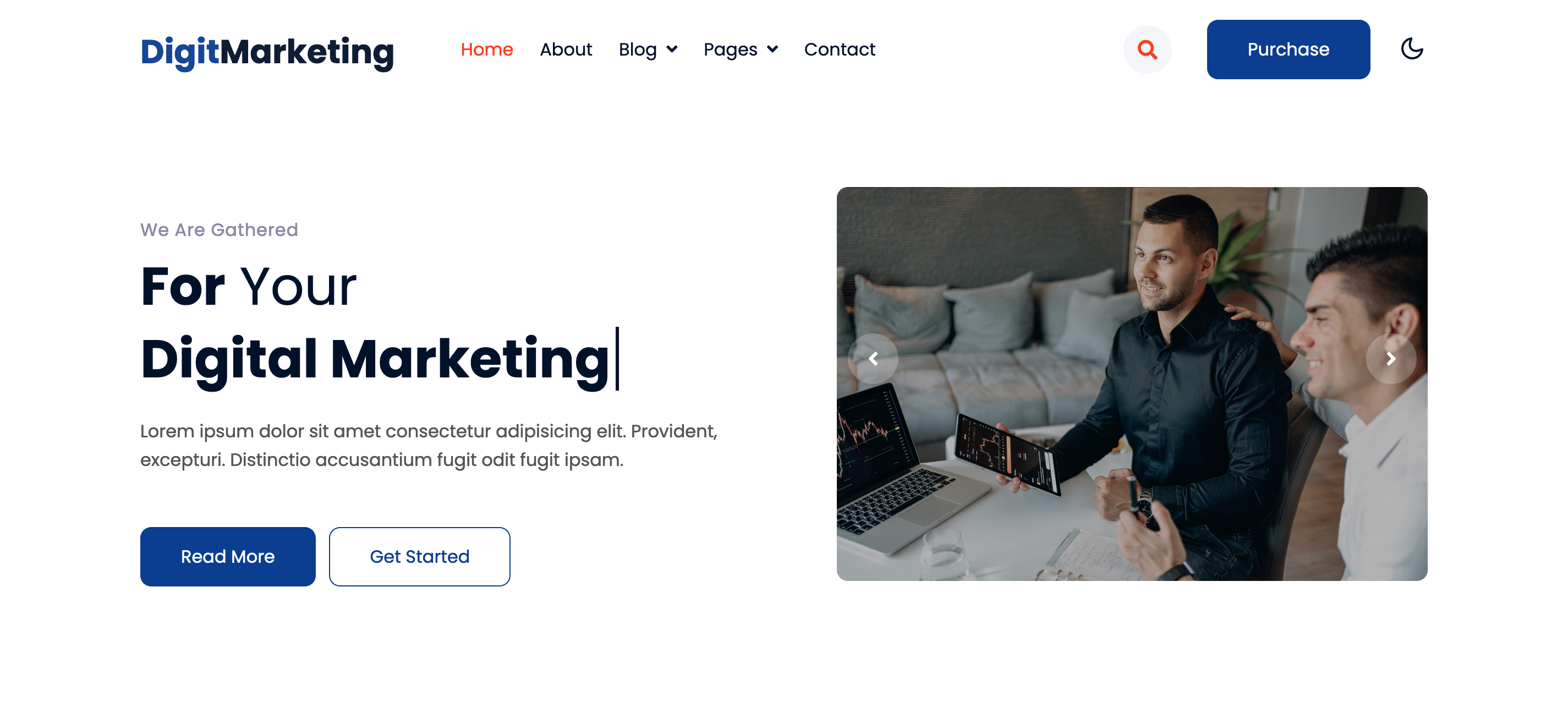
Home: Welcome your visitors with a captivating homepage that highlights your key services, testimonials, and call-to-action buttons.
About: Share your company’s story, mission, vision, and values to build trust and connect with potential clients.
Services: Showcase a comprehensive list of your services with detailed descriptions and visuals to attract and inform your audience.
Blogs (Dropdown with Sidebar Options): Engage your audience with insightful blog posts. The dropdown menu includes options for blogs with a left or right sidebar and no sidebar, catering to different reading preferences.
Blog Single: Detailed individual blog posts that offer in-depth information and insights, optimized for SEO.
404 Page: A customized 404 error page that keeps your visitors engaged and guides them back to your main content.
Email Template: Professionally designed email templates for consistent and branded communication with your clients.
Landing Page: Dedicated landing pages for special promotions, events, or new product launches, designed to drive conversions.
Shortcodes Page: A reference page for shortcodes, making it easy to add various elements to your content without coding.
Contact Page: Multiple contact options, including contact forms, phone numbers, and social media links, ensure easy communication.
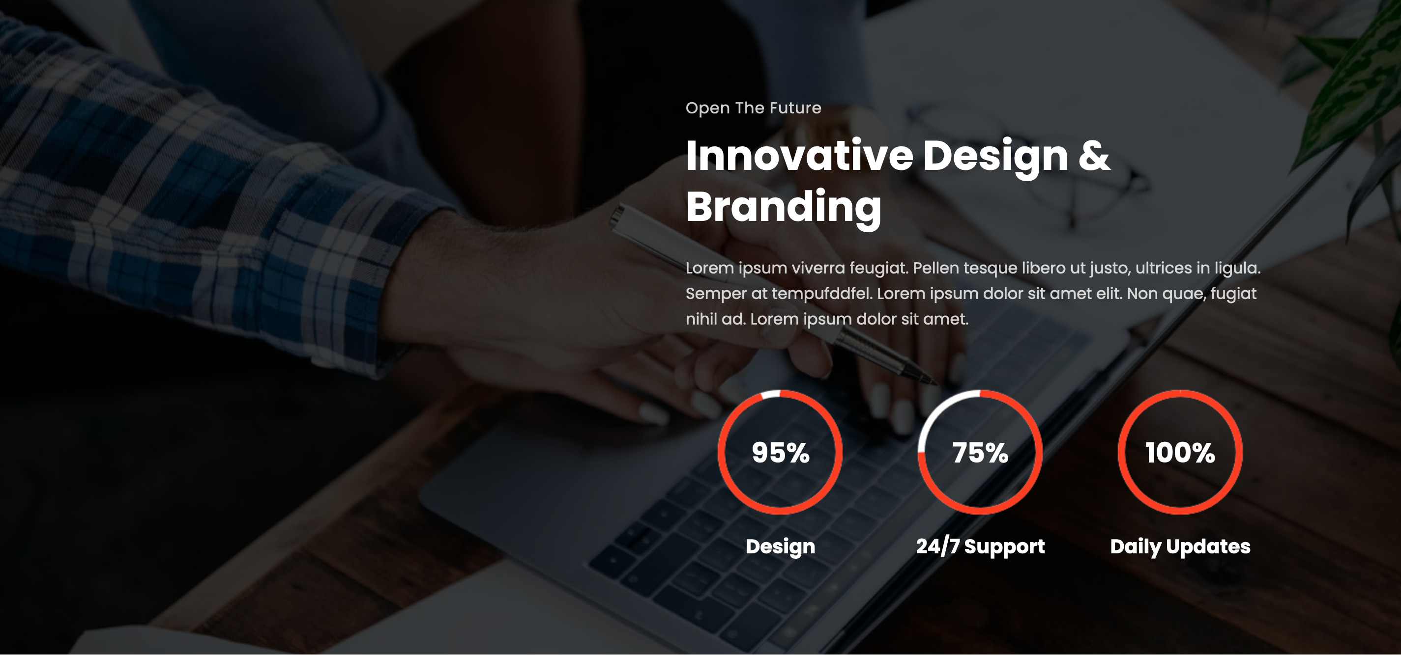
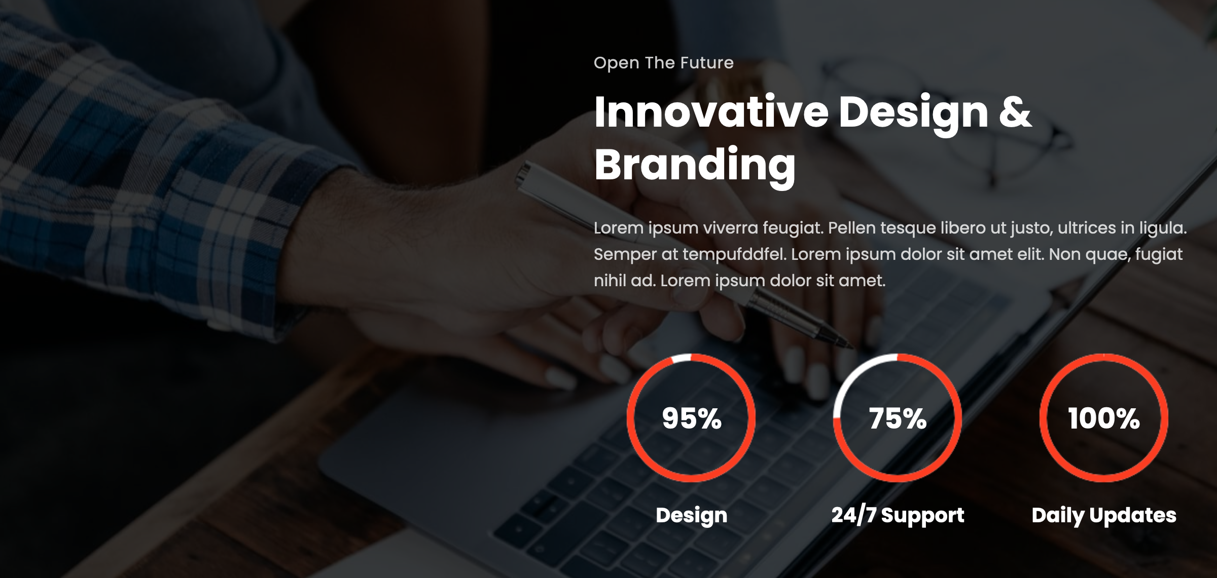
Dark Mode Toggle:
Enhance user experience with a dark mode toggle feature, promoting visual comfort and modern aesthetics. Located at the top right corner, users can easily switch between light and dark modes based on their preference.
Easy Customization:
DigitMarketing offers easy customization options, allowing you to tailor the theme to reflect your unique brand identity and business goals. Change colors, fonts, and layout elements effortlessly without needing any coding skills.
Eye-Catching Blue Theme:
The theme comes with a simple yet eye-catching blue color scheme that adds a touch of elegance and professionalism to your website. This visually appealing theme helps to capture and retain visitor attention.
Stats Section:
Display key statistics about your business, such as the number of clients served, projects completed, and other relevant metrics. This section helps to showcase your achievements and build credibility with your audience.
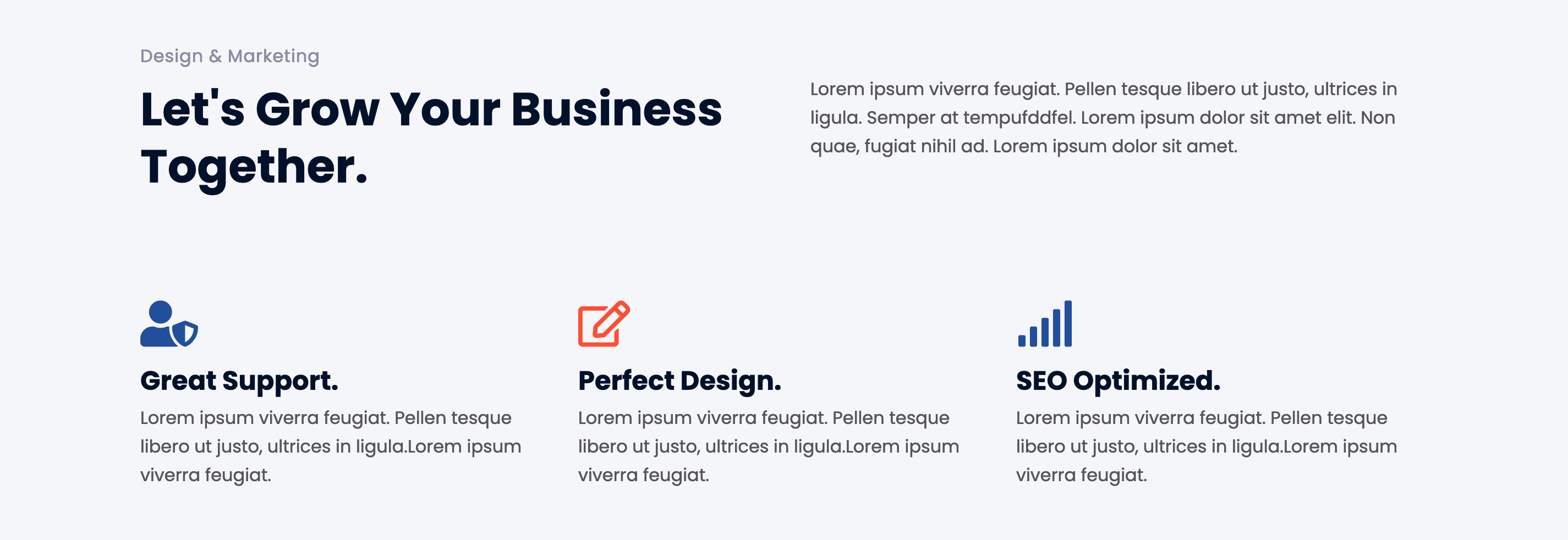
Popular Services Display:
Highlight your most popular services on the homepage, making it easy for visitors to find and navigate to the information they are looking for. This feature enhances user engagement and encourages exploration of your offerings.
No-Change Environment:
Provide a stable and reliable environment for your corporate website with a no-change policy, ensuring consistency and reliability in the online experience. This feature is crucial for maintaining trust and satisfaction among your clients and visitors.
Conclusion: DigitMarketing is more than just a WordPress theme; it’s a powerful tool designed to elevate your corporate presence, enhance user experience, and showcase your business’s strengths. With its comprehensive features, easy customization, and modern design, DigitMarketing is the perfect choice for businesses looking to make a lasting impression online. Empower your online presence and achieve your business goals with DigitMarketing today!
Key Features:
User-Friendly Design
Blog Page
Social Media Integration
On scroll-fixed navigation
Awesome Design
100% Responsive design
Bootstrap 4 Framework
Working Contact Form
Clean and modern layout
Easy to Customize
Google web fonts used
And many more…
Theme Details:
Theme Name: DigitMarketing a corporate business Category WordPress theme.
Compatible Browsers: Google Chrome, Firefox, Safari, IE 10, Opera, etc.
DigitMarketing a corporate category website template
Designed to meet the diverse needs of corporate sectors and online corporate business platforms. With a range of features and a user-friendly interface, Digitmarketing provides a seamless experience for business mans, startups, and administrators alike.
Comprehensive Pages for Enhanced User Experience: Digitmarketing includes a range of essential pages such as Home, About, Blogs (dropdown with sidebar options), Blog Single, 404 Page, Email Template, Landing Page, Shortcodes Page, and Contact Page. This ensures that your website is fully equipped to showcase your institution’s offerings and engage with visitors effectively.
Dark Mode Toggle for Enhanced Visual Comfort: With the dark mode toggle feature, digit marketing promotes visual comfort and modern aesthetics. Users can switch between light and dark modes based on their preference, enhancing their overall experience on the website.
Easy Customization for Brand Identity: Digitmarketing offers easy customization options, allowing you to tailor the website to reflect your unique brand identity and corporate goals. Whether it’s changing colors, fonts, or layout elements, customization is intuitive and hassle-free.
Eye-Catching Blue Theme: The simple yet eye-catching blue theme of digit marketing adds a touch of elegance and professionalism to your website. It creates a visually appealing environment that resonates with your audience and reinforces your institution’s credibility.
Stats Section for Insightful Analytics: Displaying statistics such as designed projects, 24/7 support, and other key information helps showcase your organization’s success and achievements. The stats section adds credibility and transparency, instilling trust in potential corporates and stakeholders.
No-Change Environment for Stability and Reliability: Digitmarketing provides a no-change environment for corporate companies, ensuring stability, reliability, and consistency in the corporate sector experience. This reliability is crucial for maintaining trust and satisfaction among clients and employees.
In summary, DigitMarketing is more than just a website template – it’s a powerful tool for empowering corporate business, enhancing user experience, and showcasing your institution’s strengths. Customize, innovate, and empower with DigitMarketing today!
Key Features:
User-Friendly Design
Blog Page
Social Media Integration
On scroll-fixed navigation
Awesome Design
100% Responsive design
Bootstrap 4 Framework
Working Contact Form
Clean and modern layout
Easy to Customize
Google web fonts used
And many more…
Theme Details:
Theme Name: DigitMarketing a corporate business Category Website Template.
Compatible Browsers: Google Chrome, Firefox, Safari, IE 10, Opera, etc.

