Whether you’re a freelance web developer or an SMB, website templates are bliss for you. Website templates eliminate the need for a UI/UX designer to some extent and help you cut down your overhead costs. The team at W3layouts works hard to make sure each and every template caters to the specific needs of web developers. We are elated to see the huge number of downloads month over month and so here we are with a list of 10 most downloaded website templates in July 2019.
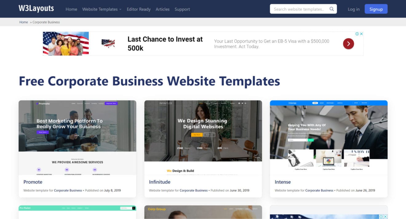
Corporate Business Website Templates
Online presence is key for every business nowadays and corporate businesses are not different. Corporate business websites need not look boring and unappealing. From marketing agencies to a local camping business, we have got you covered. Our corporate website templates are built with almost every business in mind. These HTML templates are fully responsive and stunningly designed to give your website that extra edge. The following are the most downloaded Corporate Business website templates in July 2019.
Building an online store is hard and we understand the difficulties one might face while doing the same. While you, as a developer, need to take care of the intricacies of the site; we have taken care of the design. We have designed some beautiful E-commerce website templates that will give your online store’s design the much-needed edge. From grocery online store to fashion to electronics, we have designs for all kinds of e-commerce. The following are the most downloaded online store website templates in July 2019.
Creating dashboards is not only hard, but it can also get quite intimidating sometimes. Let’s be honest, analytics dashboards are a necessity these days and not just an option. It’s true that there are free tools like Google Analytics, but having your own dashboards and data analytics gives you more control of that business funnel as well as helps in product enhancement. Our admin dashboard templates are made keeping in mind all kinds of data that a business needs to track. Not only that, we’ve picture-perfected each dashboard to suit all forms of products and businesses. The dashboards are sleek, clean and beautifully designed so that you stay on top of your data all the time! The following are the most downloaded admin dashboard templates in July 2019.
Developing web templates for such a category is tricky as the content is very delicate. Our team, at W3layouts, has created some beautiful HTML website templates which cater to Non-profits, NGOs, Healthcare sites, etc. The designs are responsive, clean, on-point and address the categories clearly. For this list, we have one bonus template which belongs to the Society & People webs template category and has been one of the most downloaded this month. It has been designed specifically to cater to childcare/ baby center websites.
Our developers have worked hard to nail these designs and we’ll be eager to see what you create with these themes. Whether you are building an e-commerce store or a childcare website, the possibilities are endless with W3layouts’ HTML web templates. Do check out the Demo & Edit features for each design which will give you more control over how you want the final design to look like. Also, we recently launched Contact forms for static websites that require no coding whatsoever; so make sure you check that out also.
Delog is developed for professional bloggers and web designers to build a website that has a lightning-fast navigation speed. Unlike our other templates, Delog is built on an entirely different framework. You can easily access the coded backend of the template.
Basic customization is so simple that you can just follow the steps given in the ‘Read Me’ document. With Knowledge of CSS/SCSS you can change the color scheme.
Built with GatsbyJS and Netlify CMS
The blazing speed is made possible by Gatsby, an open-source framework for developing static websites. The website is then hosted in Netlify, which lets to deploy your website in a single click. The deadly combination of these two technologies is something you must have never witnessed on W3Layouts before.
Result? A website navigating at the speed of light!
Simple Layout
The layout and text are right on the mark. No wasting time in anything that deviates the visitor. It starts with a concise introduction of yourself with a ‘Contact’ CTA button followed by a series of blog posts. What else you need when your work is out there to speak!
Complete Access to CMS
Editing your blog posts is as easy as doing it on your word document. You can change whatever you want, at any time. The content space comes with lines, code boxes, strikethroughs, lists, tables, images, and different plugins. You can write any form of content you want.
Build your new website with Delog and take it to live in a single click. You can download the source code directly from GitHub.
How to host a website with delog
If you are not familiar with GatsbyJS and Netlify, you can follow the steps and take your website live
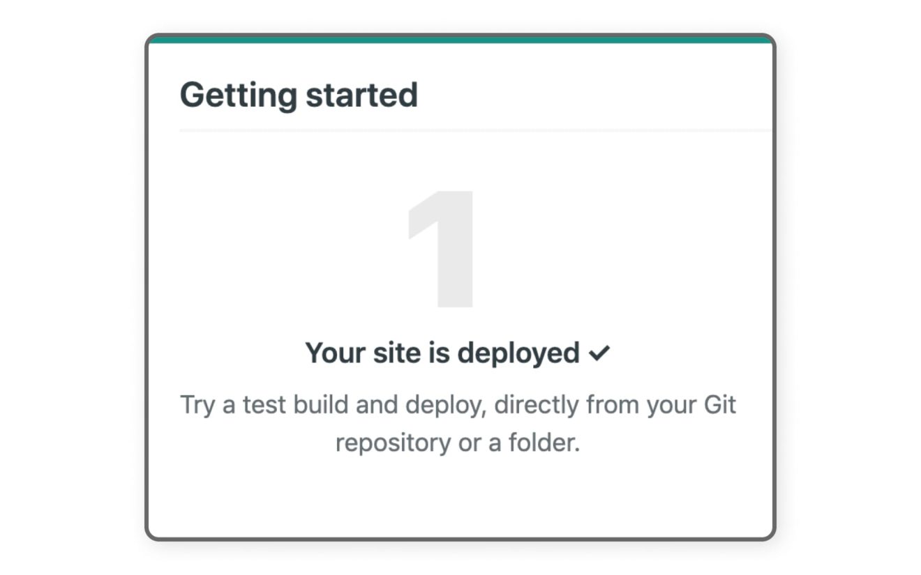
Step 1 – Deploying my site on Netlify?
I am built with Gatsbyjs to give you lightning navigation speed and unbound flexibility to be creative with your design.
To begin with, you need to deploy me to Netlify.
Click on ‘Deploy Netlify’
You will be taken to the Netlify website and will be asked to connect it with Github. Click on ‘Connect to Github’
You will be asked to enter a repository name. After entering the name (say xyz), click ‘Save & Deploy’
Your site deploying process will start.
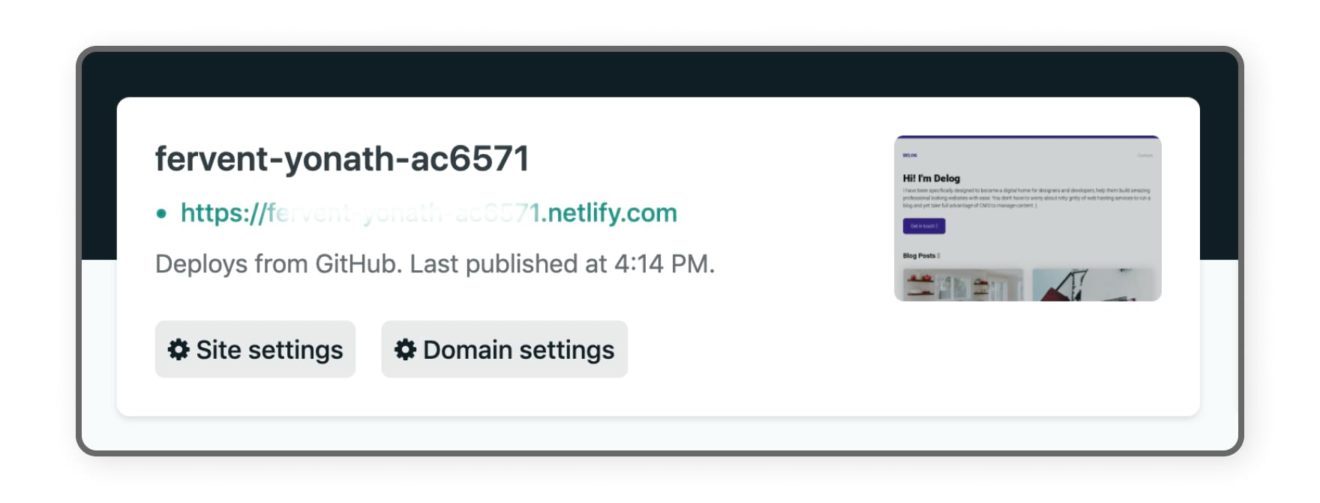
After say 5 mins, the site deploying process will be done and it will be live.
You can click on the random link generated at the top left of the page.
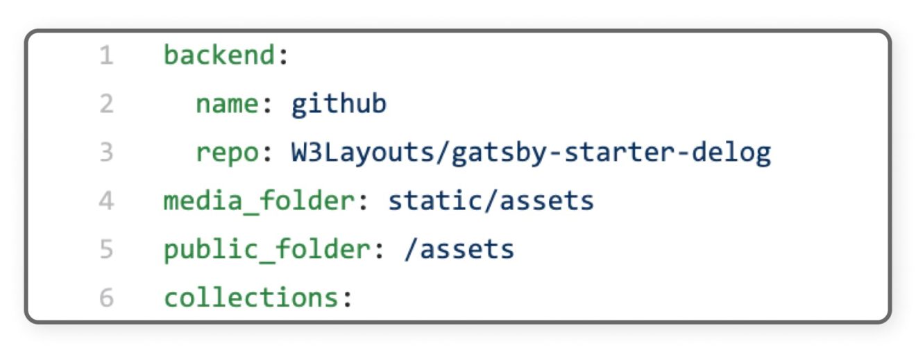
The next step is to change your repository URL so that Netlify can show you the changes made on the site.
Step 2 – Changing the repository URL for Netlify CMS access
Go to your GitHub repository and open config.yml by following the path, delog/static/admin/config.yml.
Change ‘repo’ to your username/repository name
After doing this change, click on ‘Commit Changes’
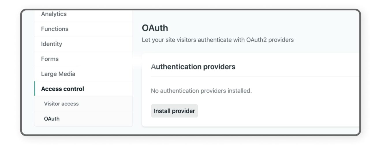
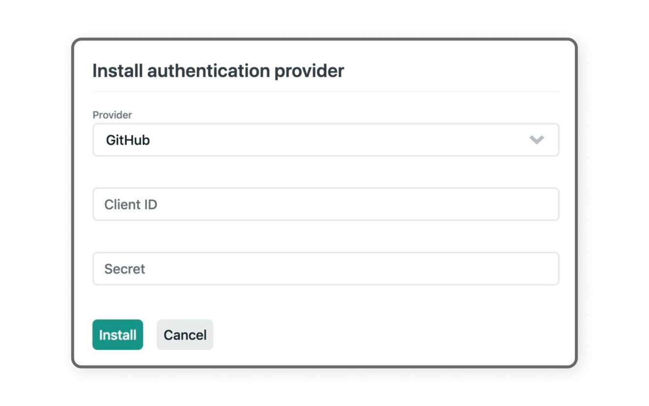
This will allow you to make changes to your site, but you are not done yet. You need to make sure that all gates at netlify are open. It gives access to GitHub. For that to happen, you need to move to the next step and create an OAuth Client ID in Github.
So you’re done building your website with our website templates and now you cannot wait to take it live. Well, there are a few more steps before you can see your stunning site live. To put it in simple words, all you have to do is upload your file to the cPanel.
What is a cPanel you ask?
cPanel is basically a Linux based web hosting control panel. Thanks to its simple GUI (graphic user interface) and automation tool, cPanel makes for a fairly easy process of web hosting. The control Panel successfully creates an environment for an easy execution of handling the administration of a website and the server via a web browser. Let’s not dive more into the complexity of how cPanel manages to do this. Instead, let’s look at how you can make your website live with the control Panel.
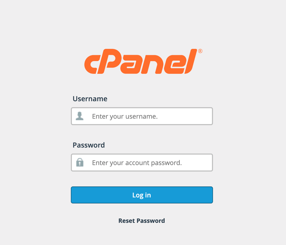
Visit your cPanel portal at https://{IP address}/cPanel. For this example, we are using a sample domain 1w3.in. So, our URL for cPanel is http://1w3.in/cpanel.
Enter your Login details and click the Login button.
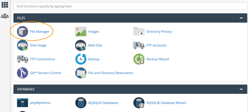
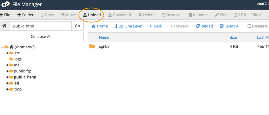
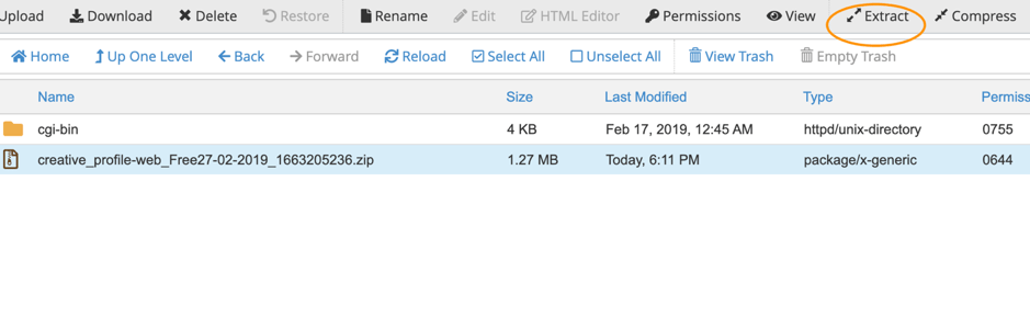
Once Logged in, Click on the File Manager. You will be using the File Manager interface to manage and edit your files.
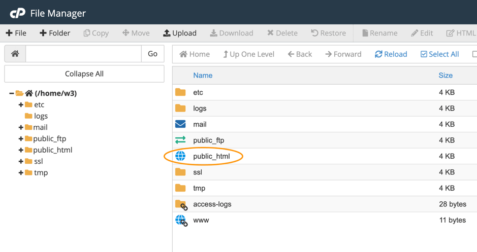
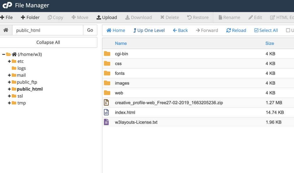
You will see the below screen after clicking the File Manager icon. Double click on public_html. You will need to upload your zip folder to public_html, which is the root folder of your hosting account.
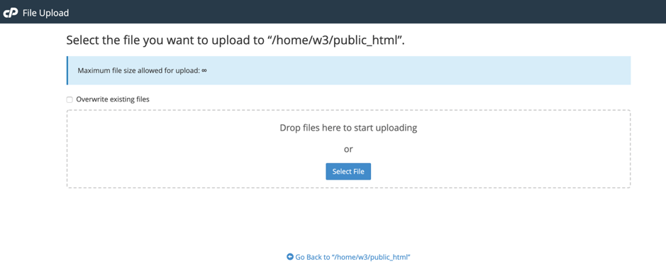
After clicking public_html, you will see the below screen. Click the upload button from the top bar as shown in the picture.
Now upload the downloaded template zip or Edited template zip file from this Upload screen.
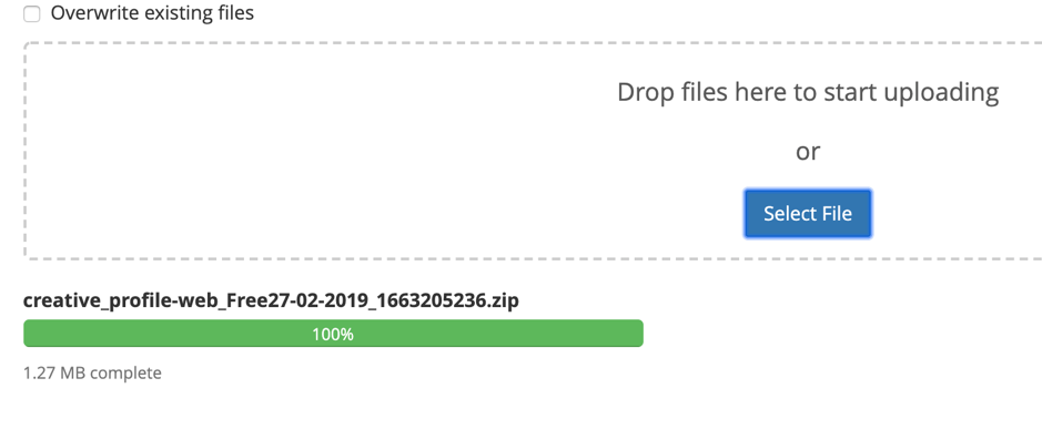
Upload done.
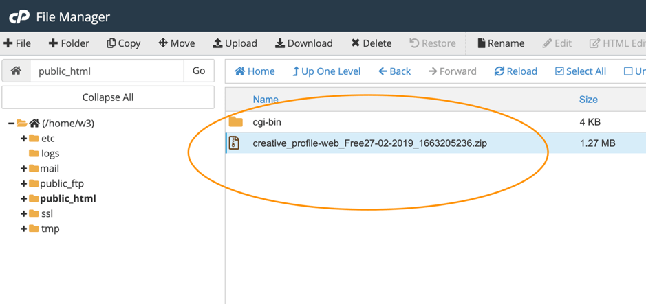
Once the file is uploaded, close the upload tab and go to the File Manager tab. If the zip file doesn’t appear on this screen, refresh/reload the tab till you see a new zip file that has been uploaded.
Select the zip file by clicking on it. Then click the Extract button from the top bar as shown in the picture below.
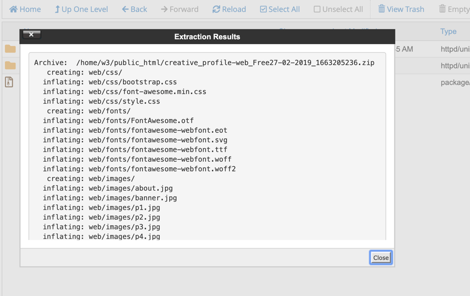
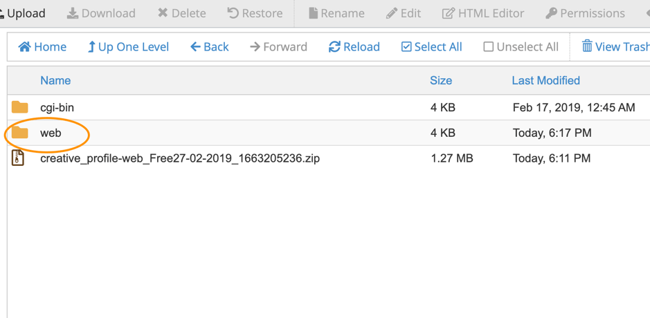
Now, the file in the zip folder will be extracted to a web folder. You will have to move all the files under this web folder to public_html. Close the Extraction Results window when done.
Open the web folder by double-clicking on it.
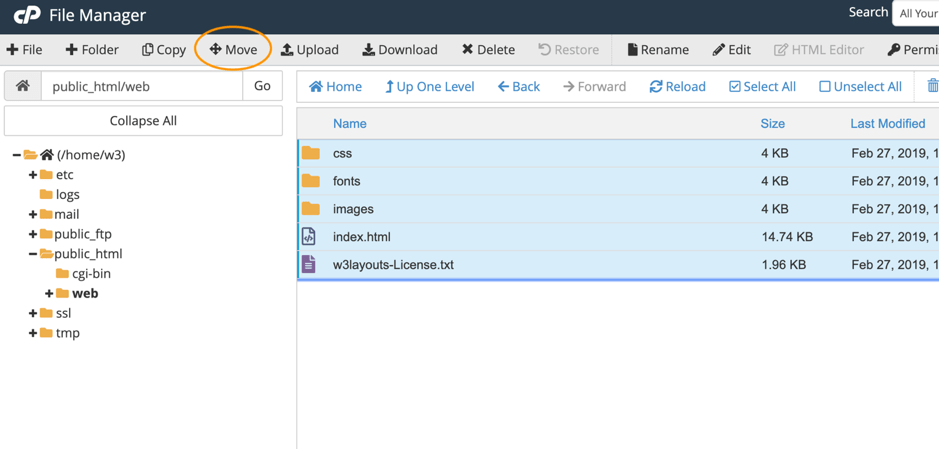
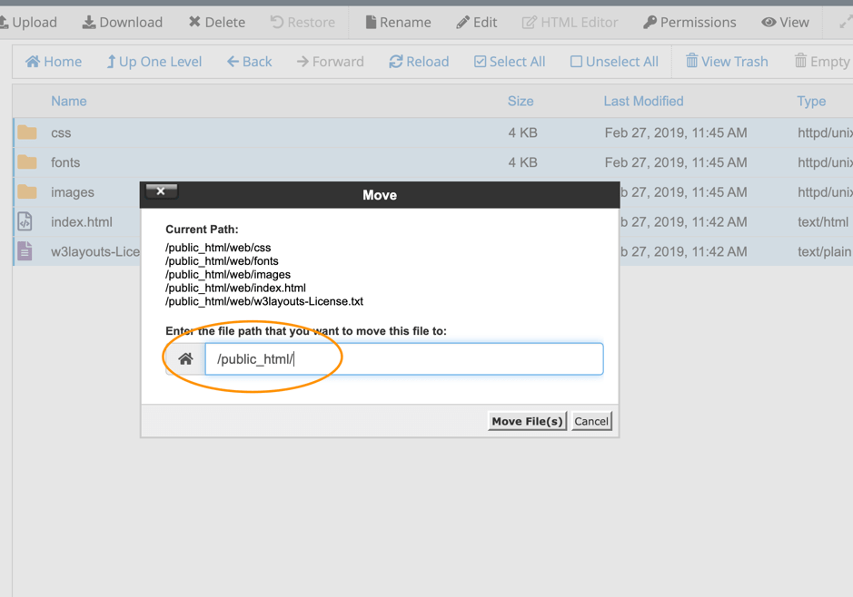
Select all the files in the web folder and click the move button from the top bar as shown in the image below.
After clicking on the move button, you will see a popup where you’ll have to change the destination of files to public_html. Once the files have been moved, the directory will become empty. Check once if the files have moved to public_html or not by navigating back to public_html.
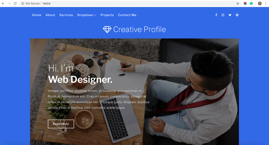
Once all the files have moved to public_html and index.html file is placed, visit your domain or IP.
Now visit your domain and see your website live. In our case, it is 1w3.in
Congratulations, now you’ve successfully launched your website using the cPanel. Make the most of your live website and keep using W3Layouts!
Creating a website is no easy task you need a free website builder. There a lot of things to be handled like design, development, and content (both textual and visual). A web designer has to design a website, then a web developer has to deal with HTML documents and style sheets.
To prevent all the fatigue, W3Layouts Team has been creating amazing website templates for many years now. However, a lot of you had trouble editing the templates so we have a free website builder to build your website with ease.
Owing to the abundance of requests we were getting each week for help, we started working on a game-changing tool that can help you maximize the impact of each template on our website.
After working on this tool for countless days and nights, we have finally launched our website builder that can help you design the website of your dreams.
It is an intuitive drag & drop based tool that allows you to edit any template on our website. When we say any template, we mean literally every single one currently available on our website.
An online presence is the single most important factor to help your brand keep up with the changing landscape. Businesses that fail to maintain a digital presence are the ones that get left behind. However, it can be a mountain of a task for the average person to build a website from scratch.
We made the tool with the average person in mind. Someone who doesn’t know how to code but wants a great looking website. If this sounds like you, our latest innovation is precisely the right one for you.
In this guide, we will cover everything you need to know to design and publish a gorgeous web page or website using our brand new tool. Simplicity is at the core of our design so do not worry if you are not a tech-savvy person.
What Makes Our Online Editor A Game Changer?
Before we get into the how, let’s talk about the why. You heard us call this editor a game changer and you might be wondering why.
Our template editor is not just some random page builder that’s good for nothing. On the contrary, here are some of the most fantastic ways our editor could take your online presence to the next level:
1). Mobile First Design
Mobile First is the ideology we adopted when we started W3Layouts many years ago. The founder, Hidayath Shaik, had a vision from day one to make the internet mobile-friendly. This was long before the competitors made a push for the same.
When developing this tool, we kept true to our vision of promoting a mobile-first internet and this is reflected in the core design of our editor.
Any websites made using the online editor are responsive web design friendly and will work across all devices used by your audience. This includes, but is not limited to mobile phones, tablets, desktops, and large screens.
2). Lightning Fast
Any website made using our website editor runs at a lightning pace thanks to the pure HTML export.
How? Since your website is made using HTML, you don’t need to run any heavy functions like a database or even PHP. Your website will be a static website.
3). Simplicity
As mentioned earlier, simplicity was of utmost priority during the design of our editor. Our efforts have paid off well in the form of a simple platform that even your grandmother could use. No guarantees on that last statement though 🙂
How simple is it? You don’t need to install any complex software or even touch a single line of code. No more staying up late at night trying to make that background the color you want!
Our drag & drop design makes everything intuitive. Want to change a headline? Just click on it and type away!
4). Accessible To Everyone
We know how some of you are just starting with a humble budget. Here at W3Layouts we deeply respect people like yourself and we always strive to help our customers.
While we could charge a premium like almost any other business on the internet, we have decided to give out our amazing software for nothing but your good wishes. You do not have to pay us anything to use it.
However, for those of you who would like to support what we are building here, you can always pay a small price to do so. You get to remove the links from the footer on in addition to our gratitude.
Launching The W3Layouts Online Website Builder
Just like all things W3Layouts, it is quite easy to launch our editor. Just follow these steps to begin using the editor:
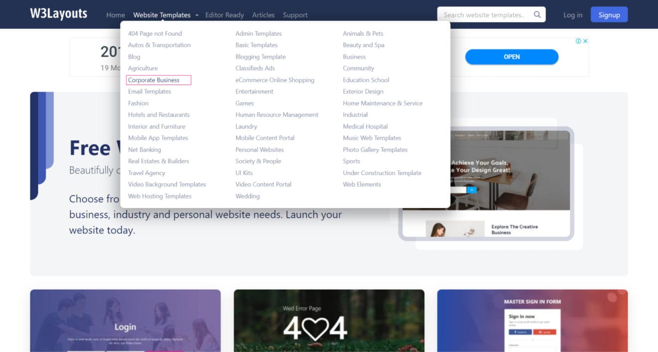
Browse through our wide selection of templates available freely on our website. We have categorized everything in dozens of different categories with a huge variety of templates in each. For example, there are dozens upon dozens of templates in the 404 Pages category alone.
Once you have found a category you like, click on it to visit the details page.
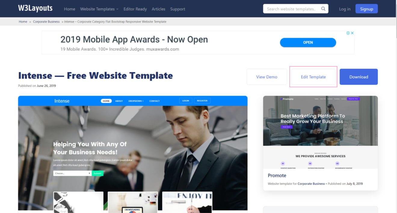
On the template details page, you will see an aptly titled button called “Edit Template”. Simply click on it to launch the editor.
You will have to sign-in to your W3Layouts account at this point. In case you don’t have one, it is actually quite simple. You just need to enter your email and choose a password.
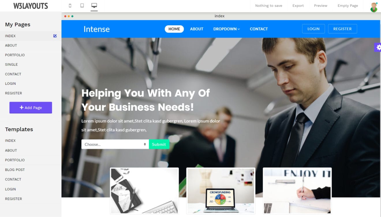
Voila! Our innovate builder should be shining bright on your screens now with your selected template loaded already.
A Comprehensive List of Features You Should Check Out
You’ve launched the editor with a template of your choice. Now it’s time to mold that template into the website you have always dreamed of.
The first thing you will notice is that every part of the template is divided into sections. You will see a thin red border around each element once you hover over it.
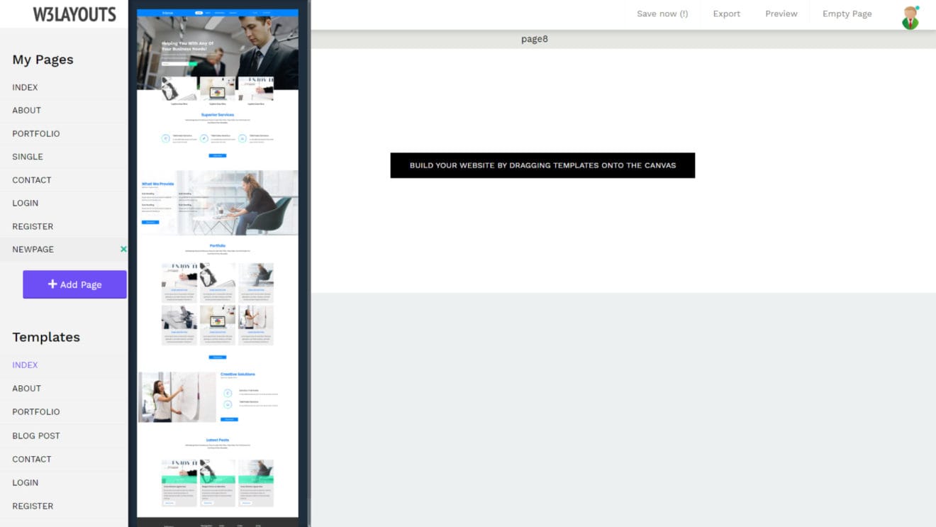
1). Drag & Drop
Following is a comprehensive list of features to help you customize your template in a breeze:
Owing to the Drag & Drop nature of our editor, you can simply grab a template from the left panel and drop it onto the canvas. This will bring up the whole template in the page view.
You can easily edit anything using our intuitive controls. Just click on an element to bring up the editing properties. You will see different properties load up in the left panel and the selected element get highlighted with a thin red border around it. This way you’ll always know what you’re editing.
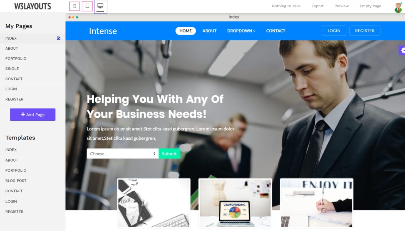
2). Multi platform Views
Consumers are rapidly moving towards browsing the internet using a variety of devices including smartphones and tablets. Have you wondered how your website might look across the many devices used by your audience? Well, you don’t have to wonder anymore.
Have you noticed the three icons right next to our logo on the top left? In case you can’t tell already, those icons let you switch the view between different devices so you can quickly see how your website will look in other devices.
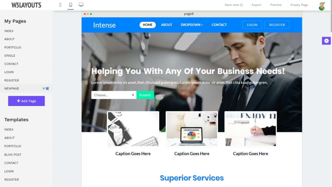
You have three options in total. By default, the desktop view is brought up. You can edit and verify your site’s look on all desktop devices through here.
The other two are tablet and smartphone views. Again, you can switch in the click of a single button and you can see the responsive design of our themes in action instantly.
Tablet View
Mobile View
3). Simple Page Management
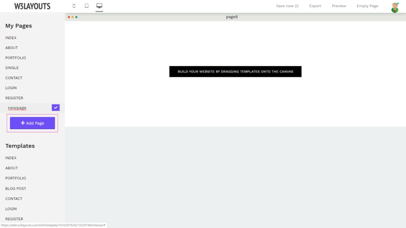
Does your dream website need more than a single page? Do not worry, we have got you covered as well.
Keeping true to our core foundation of intuitive design, you are going to love our simple page management system.
You can create a new page using the aptly named “Add Page” button on the left panel. Once you click on it, you get the option to enter a name for your page. Please do not enter the HTML extension as our tool automatically does that for you.
Simply enter the name you want for the page and click the small “tick” icon button on the right side. A new page is instantly created for you.
Following the above method you can manage your blog posts also.
Note: The name you enter here is the same one we will use when exporting your website in the last step.
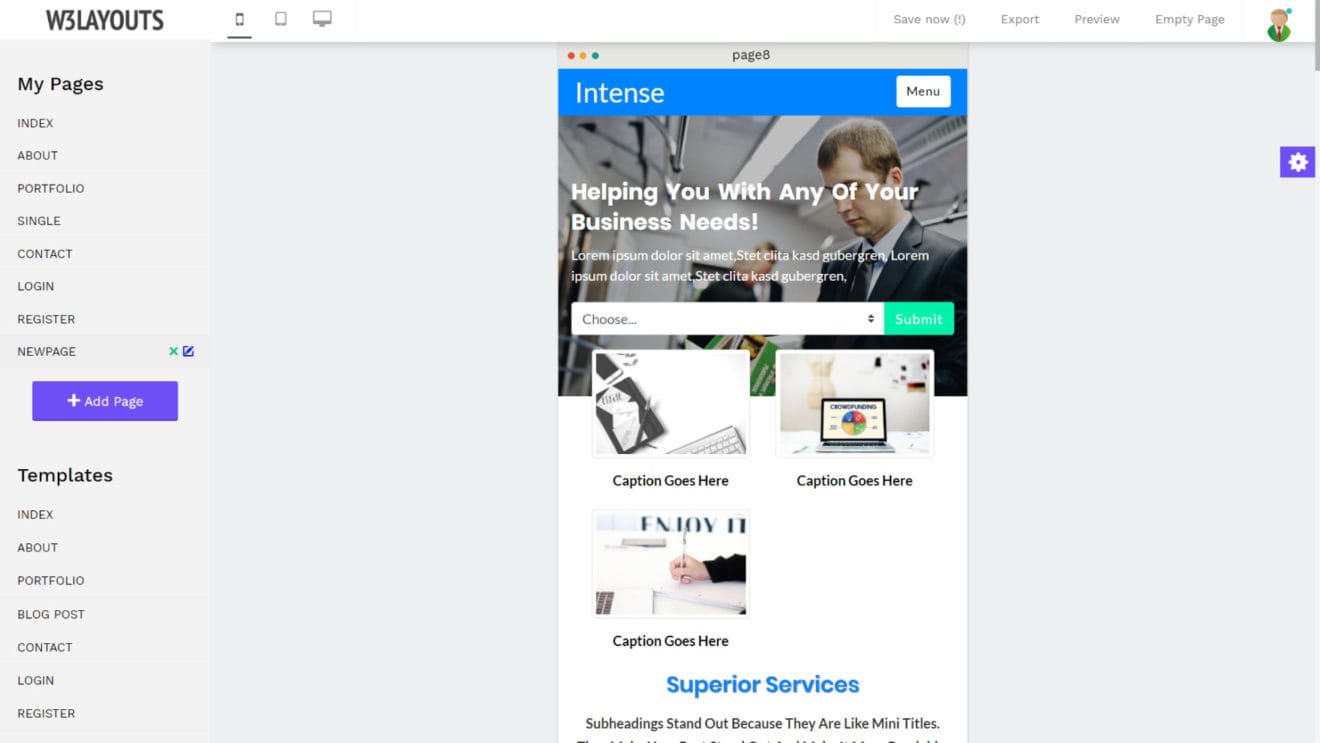
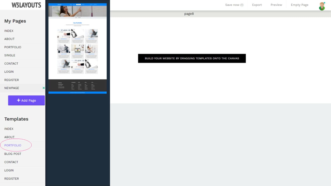
Once you have created a new page, you will notice that the canvas is empty at the moment. Have you noticed the “Templates” section on the left panel? If you look closely, all the templates for your chosen design are shown below it.
To use a template for your newly made page, simply click on the name of the template. This will slide out a quick view of the template so you can be sure you’ve picked the right one.
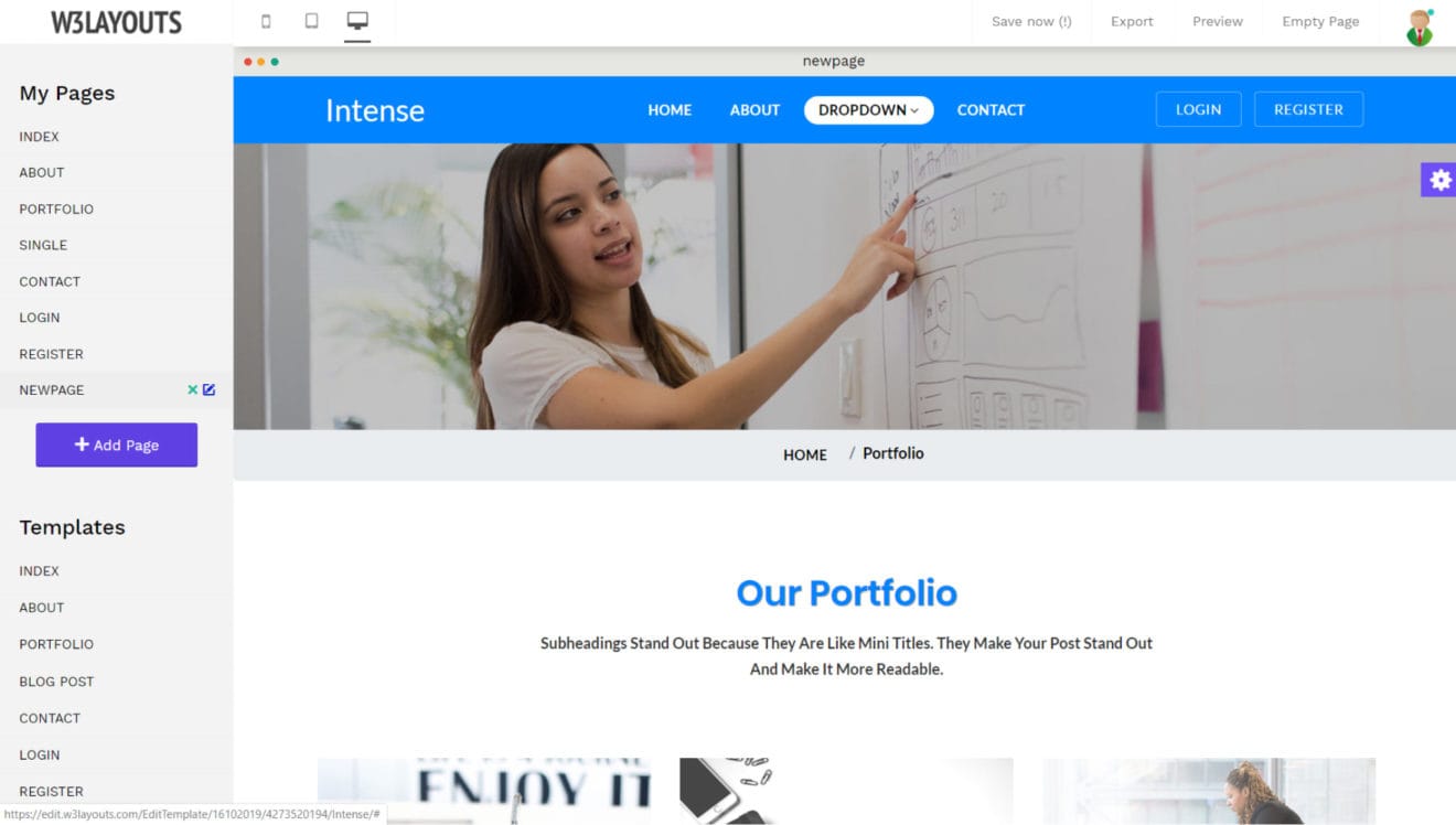
Once you have chosen a page template to use, simply grab it and drop it on the canvas. All the contents will show up in the page view right away. Simple as we promised, right?
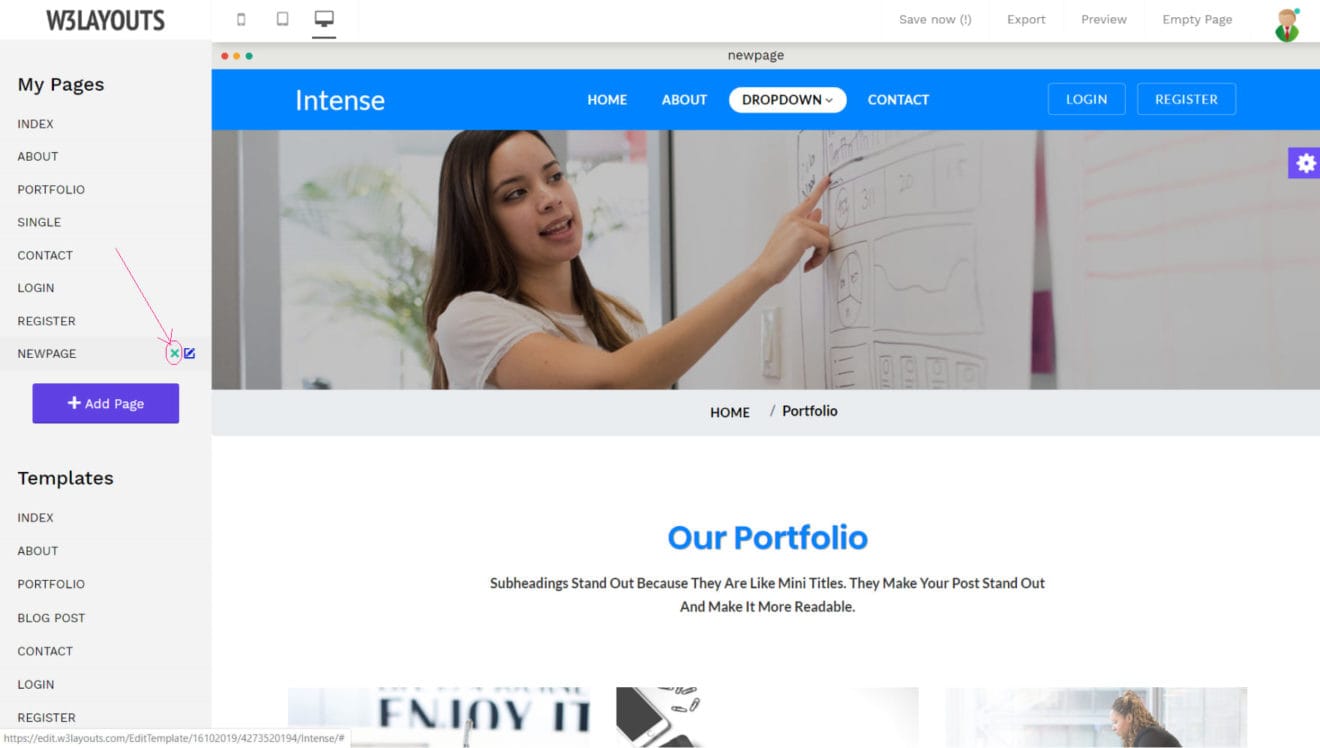
What if you added a page earlier that you want to delete now? Find your page under the “My Pages” section in the left panel. If you click on the page name, you will notice a small “cross” icon next to it.
Once you click on that icon, a confirmation dialogue will be brought. Click on the “Delete Page” button to confirm the same. You may also click on the “Cancel & Close” button if you have decided against it.
4). Page Section Linking
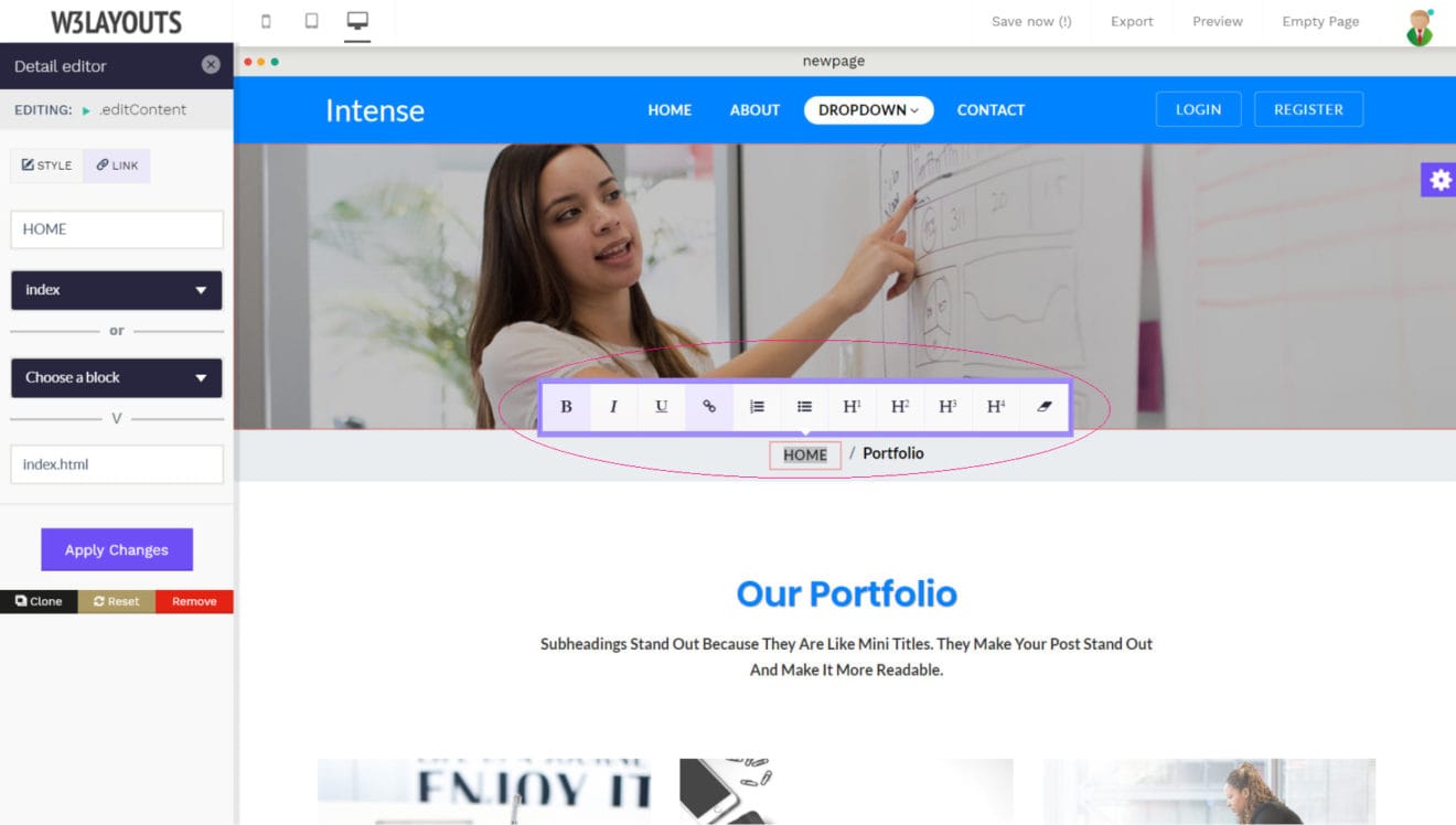
Have you ever wanted to create a Table of Contents section on your website? It is quite easy to make using our editor. You can link to any section on your page by using the link editor.
How? Click on any element that has a link in it. You will see the styling properties popup in the left panel. On the top, there’s a “LINK” pane. You can click on it to bring up the link properties.
You get two options there. You can either link to a separate page or a section within the same page.
For this exercise, we want to create a link to a section within the same page so let’s use the “Choose a block” dropdown. You will see a list of all the available blocks. Click on the one you want to link to and you are done.
Tip: Do not forget to hit the “Apply Changes” button whenever you want to save your changes. Your work will be lost otherwise.
5). Linking A Page
You can just as easily link to a different page as well. Simply bring up the link-editor as explained in the last section. Remember: you need to select an element with a link in it, and then click on “Link” in the style editing panel on the left.
To link to a page, you can use the “Choose a page” dropdown to do so. You can also change the text of the link from here as well.
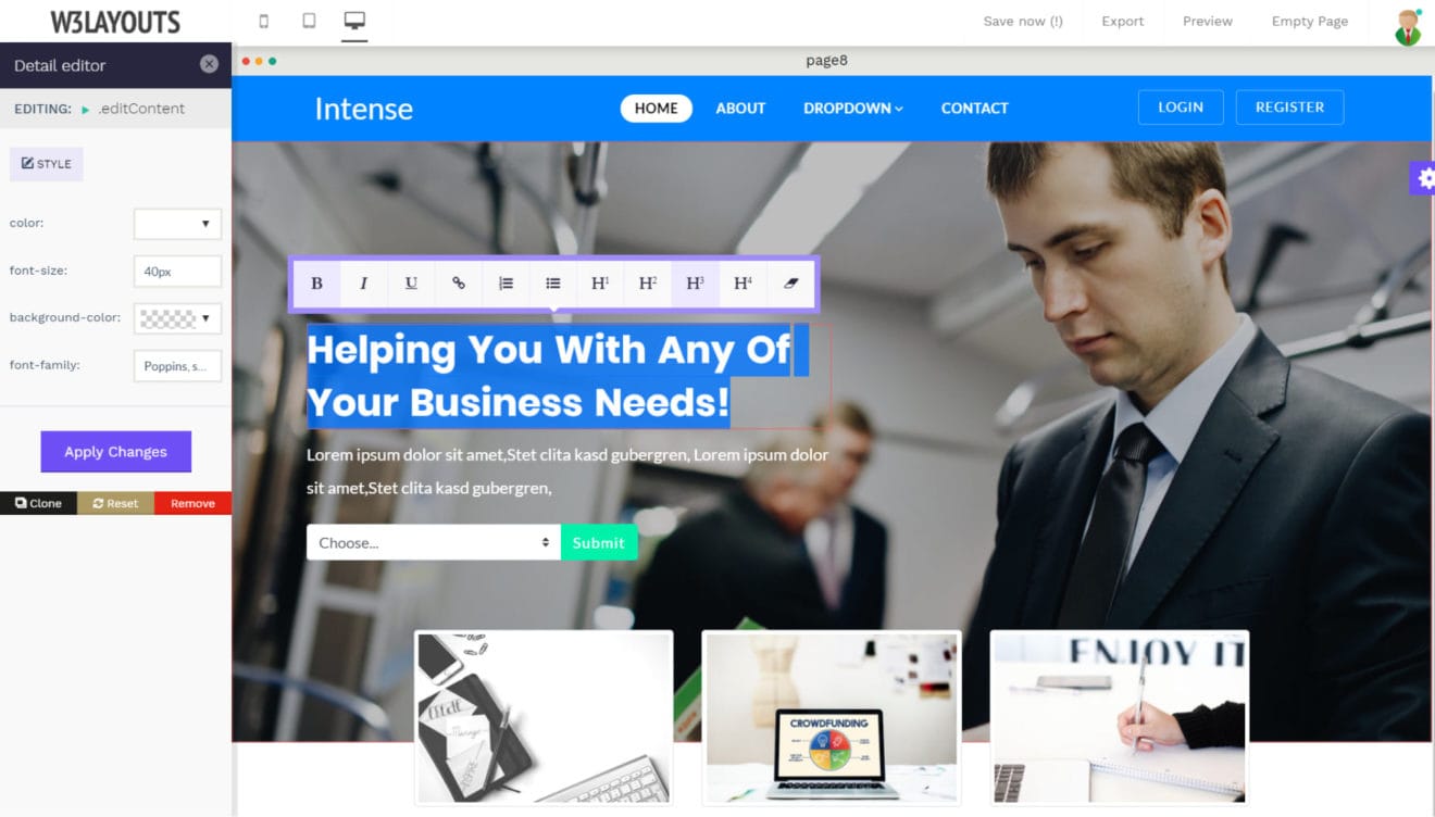
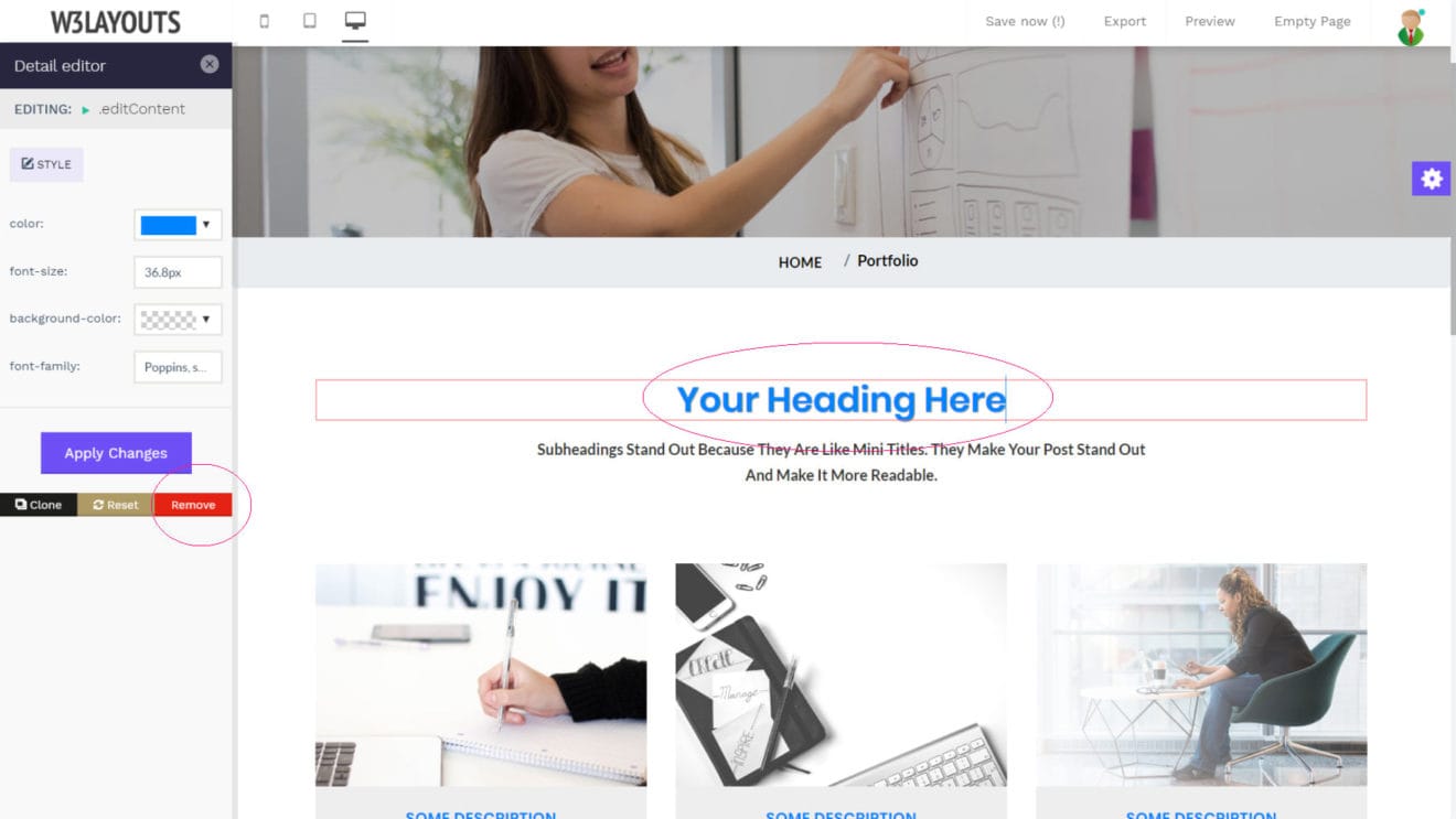
6). Edit Content Like A Pro
Want to edit a heading, a paragraph or any other block of text within your page? Simply click on the element containing the text and the editing features will kick in. You can add, delete, and edit the text the same way you would in any word processor.
W3Layouts HTML site builder comes with a powerful rich text editor so you can style your content on the go.
To bring up the rich text editor, select a block of text by double tapping your mouse. You will see a toolbar popup with a lot of options for you to choose from. Here’s a complete list:
Bold
Italic
Underlined
Add A Link
Numbered List
Bullet Points
Headings (H1 to H4)
Remove Formatting
As with everything else, the rich text editor was made with simplicity in mind. The names of the buttons describe their function right away.
7). Style Editor
Once you select an element, you will notice the Style Editor in the left panel. The available options depend upon your chosen element. For example, if you select a block of text, you will see the options to change the font, size, text color, or the background of the block itself.
The W3Layouts HTML Editor comes with a built-in CSS editor so you can insert your own CSS without going through any daunting source codes. You can also alter the CSS properties set by the template admin. Please note that this feature is for advanced users who actually know how to write CSS. However, if you mess something up, you can always reset the block using the “reset” button on the bottom.
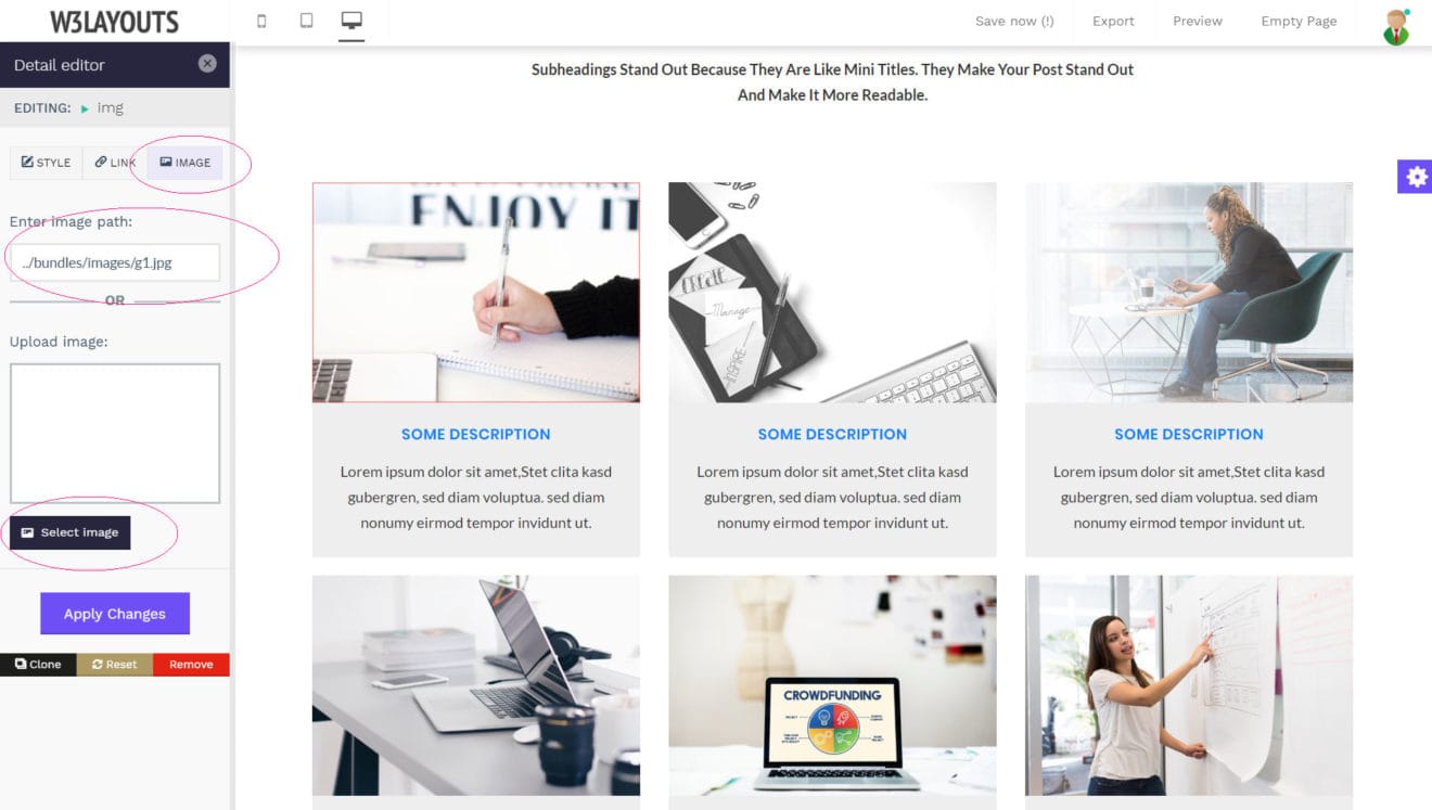
8). Image Manager
The Image Manager allows you to quickly add an image or change an existing one. To bring up the editor, click on any image in your page. You will see a tab titled “IMAGE” on the top of the left panel.
Once you open that tab, the Image Manager will load up. You can change the image in two ways. You can either enter the direct path to the image or upload an image using the “Select image” button.
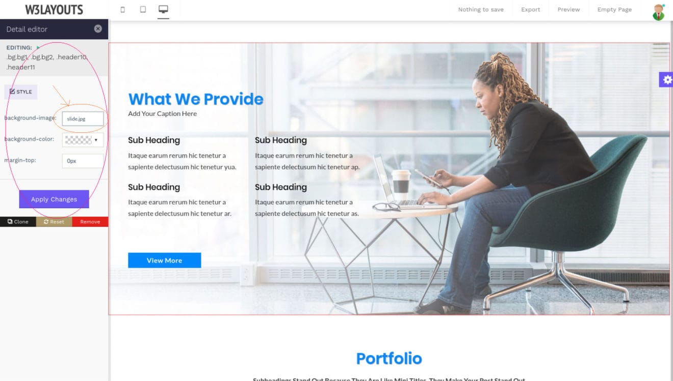
9). Background Image Manager
The Background Image Manager allows you to quickly add an image or change an existing one. To bring up the editor, click on any background image in your page. You will notice the Style Editor in the left panel. There, you will see the options to change the background-image.
To edit the background image, you can click on the background-image option in the left panel and upload an image of your choice.
Once you click the “Apply Changes” button, the background image will update on the page right away.
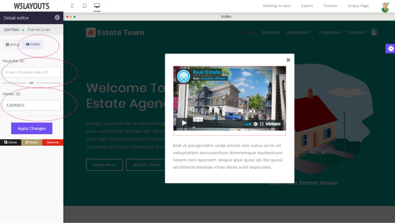
10). Video Manager
The Video Manager allows you to edit a video in a breeze. Simply select a video on your page and the Video Manager will show up in the left panel.
To edit the video, you can enter the Youtube or Vimeo ID for it. Do not worry about choosing the correct one, as the system automatically identifies the right one for you.
Once you click the “Apply Changes” button, the video will update on the page right away.
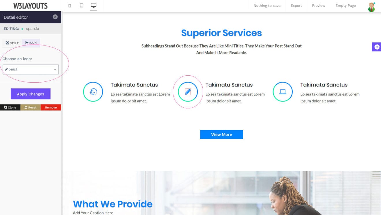
11). Icon Manager
Our Icon Manager works the same as the other managers. Once you click on an icon, you will see a tab called “ICON” in the left panel. You should click on it to open the manager.
The Icon Manager comes with a huge selection of icons from the Font Awesome Collection for you to choose from. Use the dropdown menu to check out all the available icons and then select the one that you like the best. Placing icons doesn’t get any easier than this!
12). Quick Export
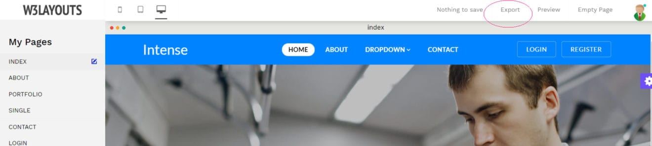
So you have made the website of your dreams. You like what you have and now want to publish it on your live site. You can now quickly export your website using the “Export” button at the top right.
Once you click the export button, a dialogue will pop up allowing you to set the doctype. You don’t want to change it? Just leave it empty and click the “Export Now” button on the right.
Your browser will download a zip archive containing all the files for your website. This includes all HTML, JavaScript, and the images as well. We bundled everything in a single file so you can upload everything to your host easily.
Remember how you named your pages earlier? Our system uses the names you choose when exporting HTML for the page.
Frequently Asked Questions
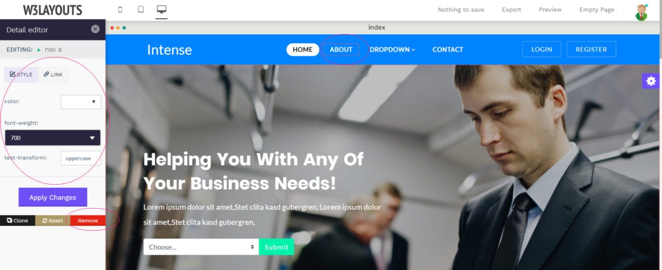
1). How to modify a menu item?
Our drag & drop editor allows you to easily modify or even remove any menu at the click of a few buttons.
Hover your mouse over a menu item and click the left mouse button. A variety of options will show up in the left panel. You can easily change the color, font weight, or even the link for the menu through here.
If you want to delete a menu item, click on the red “remove” button on the bottom right of the sidebar panel.
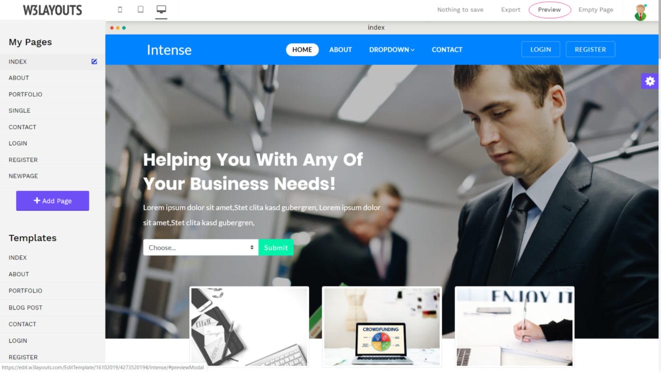
2). Is there a way to see my page outside the editor?
Yes! If you want to see what your page looks like without our Online Editors user interface over it, you can click the “Preview” button on the top right corner. It is placed right next to the “Export” button we mentioned earlier.
Please note that the preview will always show your latest changes, even if these have not been saved yet. Links do not work in the preview; you can only preview the page you are currently working on.
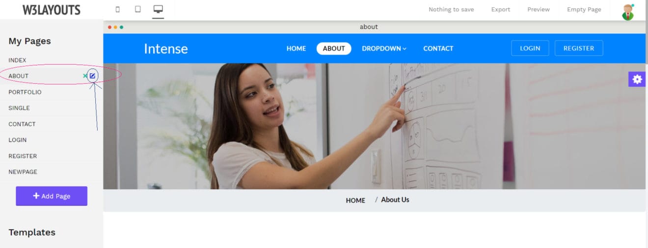
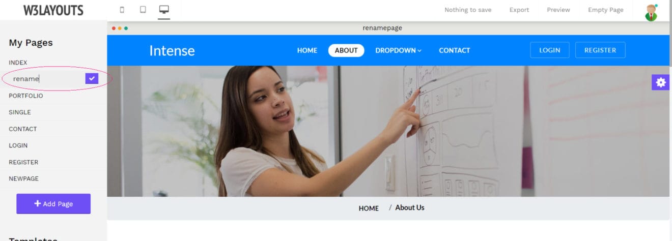
3). How to rename a page?
Whether you accidentally set the wrong page name or just want to try a new one, you can change it by clicking on the name of the page in the sidebar panel. Once you open the page you want to rename, a tiny blue edit icon will show next to it.
You can change the name of your page by clicking on that icon. Be sure to press the blue “tick” button to save it.
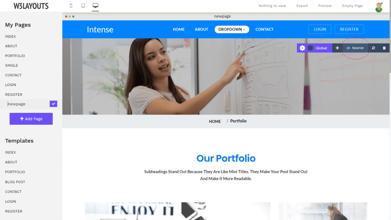
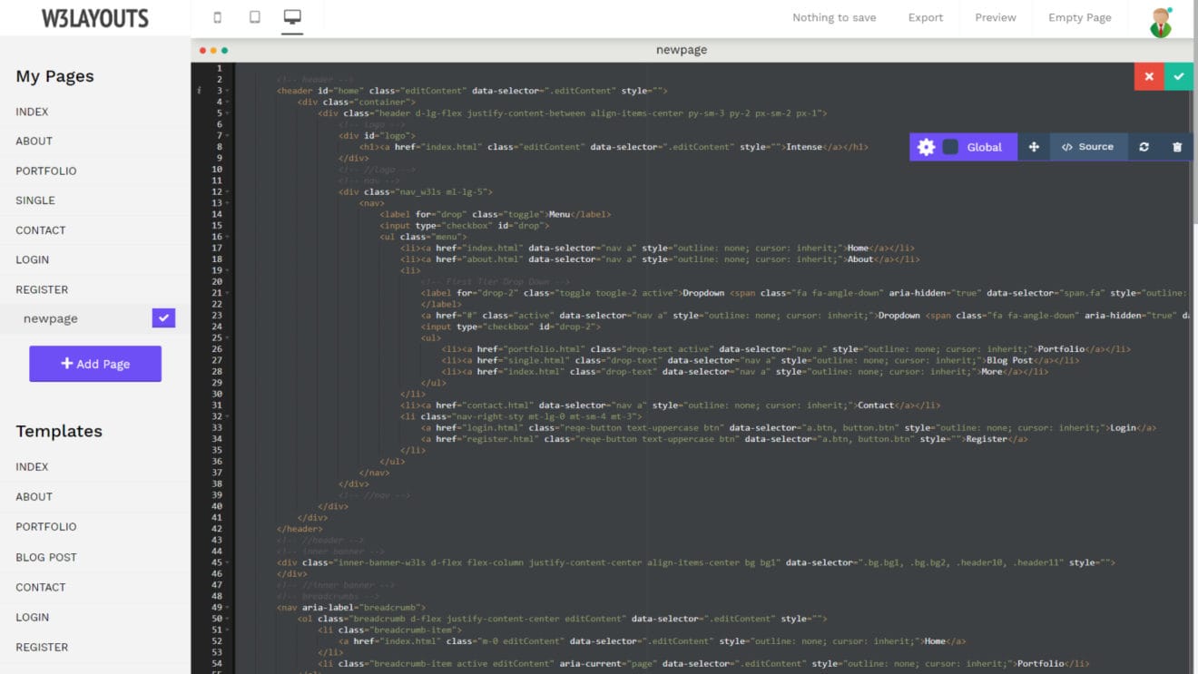
4). Can I view the source code of my page?
We know some of our users are more advanced than the others. Some of you know your way around HTML, CSS and even JavaScript. To give you more freedom and control over your template, we have added the option to directly modify the code within our online editor.
To bring up the source code, you should click on the small gear icon on the right side. You will see a menu slide up. Click the “</> Source” button to bring up the source code panel. The panel contains all the HTML code for your page. You can edit anything directly through here.
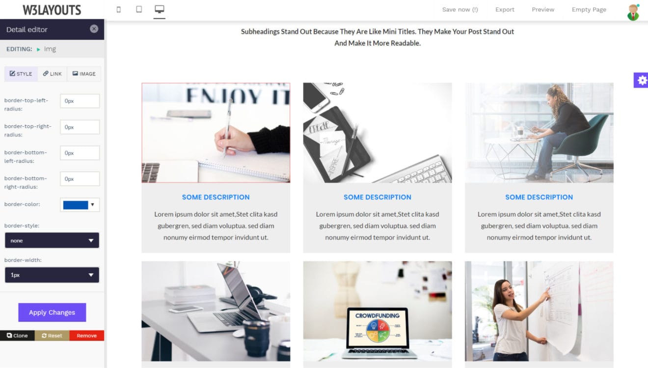
5). How to add a border around an image?
To add a border around an image, click on the image you want to edit. The image editing options will show up in the left panel. Once there, you can change any of the following values:
Border Radius – You can add a border with rounded corners to your image using these properties. You can add it for all four positions including top-left, top-right, bottom-left, and bottom-right.
Border Color – As the name suggests, any color you choose here will be used as the color of the border around your images.
Border Style – The border style value comes with three options. You can have either a dotted, dashed or a solid border.
Border Width – The higher the number you choose here, the thicker your border will be.
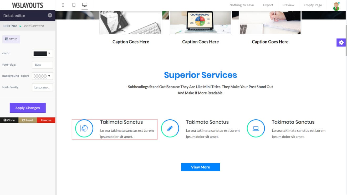
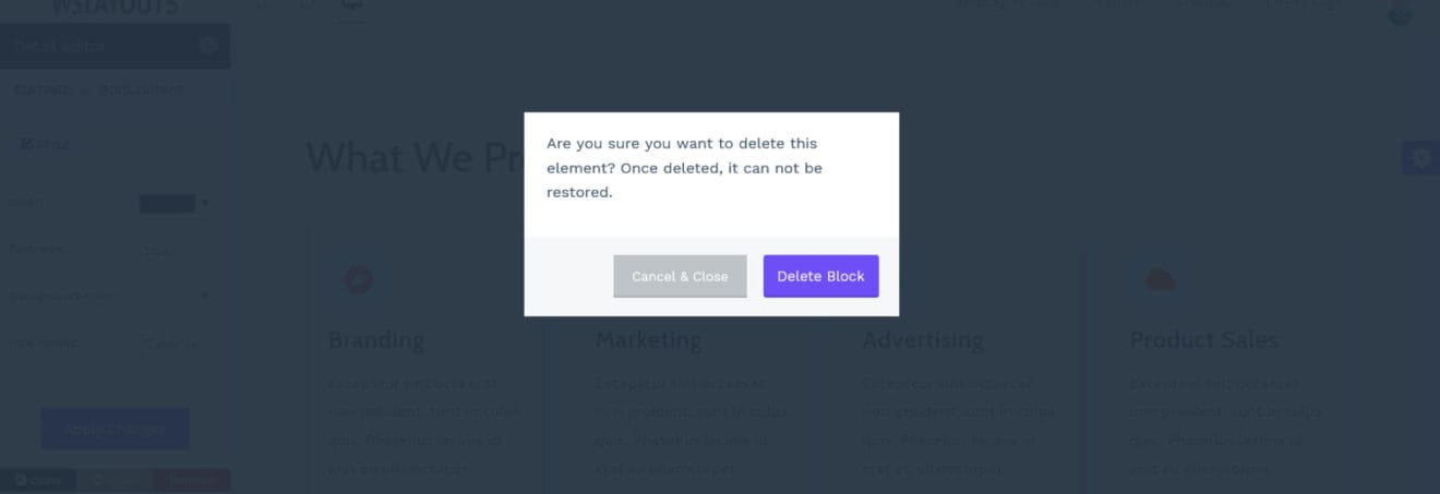
6). How to delete an element?
To delete an element, you need to select it by clicking the left mouse button. You will see a red border around the selected element. To delete it, you need to click the red “remove” button at the bottom of the sidebar panel.
There’s a built-in confirmation dialogue to prevent any accidental deletions. Simply click the “Delete Block” button when prompted to do so.
7). I have designed my website using the W3Layouts Editor. How can I publish it on my actual website?
Congratulations! We are delighted to see you’ve found the perfect design for your website. You need a web hosting account from any of the major providers to host your website.
Simply export your website using the export button (as explained earlier). You will get a zip file containing all the files including HTML, CSS and images as well.
You need to log into your hosting provider’s panel to upload these files. Your website will go live as soon as you publish these.
Sounds too complicated? Don’t have a hosting account? We have something exciting for you. We are working on a tool that will allow you to host your websites made with the W3Layouts Website Builder in a few clicks only. No complex setups.
The best part? We will offer our hosting tool completely free! Do follow us our social channel for the exciting updates.
According to statistics, More than 1.8 billion websites on the internet today, out of which about 200 million are updated regularly. This number just keeps on growing, thus making the online space more competitive every day. Standing out in this web crowd is way more difficult today than it was ever before.
Your website represents your business (be it online or offline) and needs to stand out from the rest of the competition in terms of design, look and feel. If your website feels slow and difficult to navigate with a design that is straight out of a 90’s website, then customers will have a hard time interacting with your site. So, Create website for free using w3layouts free website templates and WordPress Themes.
Building a website is not an easy task, there are a lot of moving parts such as UI design, User experience, Frontend(HTML, CSS, and JS) and Backend(PHP, MySQL). Even a simple website takes a lot of time and energy. Build a website for free will be easy task when you use our templates and themes.
Our designers and developers at W3layouts have created 4000+ free responsive website templates and Responsive WordPress themes which support web and mobile browsers which can be Catering to every niche. Our web page templates are built with HTML5 & CSS on Bootstrap and use modern design techniques to provide a seamless user experience for end-users.
Our templates assist web developers and web designers finish their day to day operations faster.
Whether you are building a new website or looking to revamp your existing website design, HTML templates are a great option. Especially if you’re a startup or a freelance web developer, hiring a designer becomes quite costly and is not really a viable option. Web templates are modern responsive, easy-to-customize, free to download which can make your site look stunning within a few minutes.
Editing W3layouts website templates is a piece of cake. You can use the “Edit” option before downloading the template(s) or simply alter the code after downloading to suit your needs.
Our free Website Template and WordPress Themes Features
Some salient features of all W3layouts templates which make a website free:
100% Responsive Design
Clean and Professional Design
Bootstrap Framework
Font Awesome Icons
Very Easy to Customize
Attractive Images
Google Fonts
Valid HTML5 and CSS3 and much more.
ecommerce website
Most of our HTML & CSS templates come with the website builder
These are just a handful of popular categories covering a wide range of niches. All our web themes are easily customizable and fully responsive.
Our templates are suitable for web developers looking to build a landing page for your personal portfolio or a client’s business portfolio. Web designers looking for inspiration on stunning landing page templates can also benefit.
Download these free HTML website templates and give your projects the much-desired look & feel. We have a wide array of web themes covering almost every business that you can think of. From corporate websites to eCommerce to restaurant sites to blogs (food, fashion, travel, etc.), we have you covered.
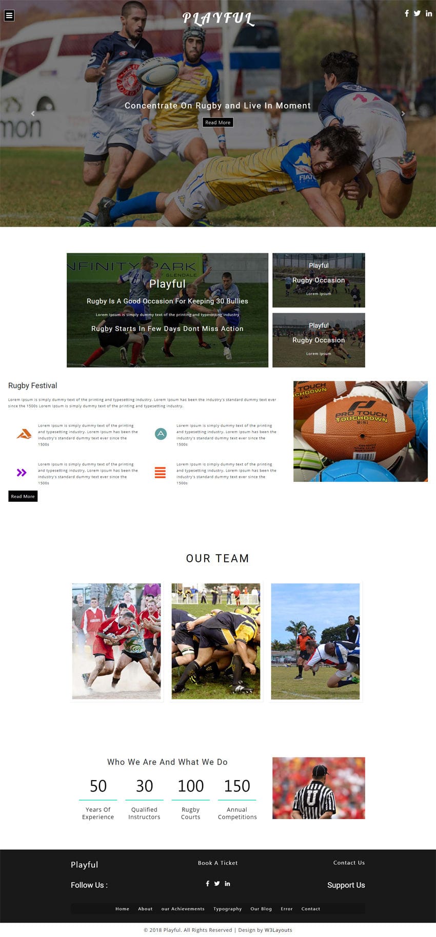
Playful is a beautifully designed multipage template for your sports website with dynamic, clean and modern design. This theme is specially designed for Rugby sport, but could also be used for any other sports club or sports event which has an extremely versatile design and is highly customizable. It has very attractive home page and highly useful inner pages to provide important features needed by sports clubs. Choose this Playful website template to spice up your sports website and add a unique character to it. You can also make websites for other sports like Badminton, Bowling, Boxing, Cycling, Figure skating, Golf, Skiing, and Snowboarding by using this Playful template. This smartly designed template has awesome features like banner bootstrap carousel slider, overlay navigation, eye catching hover effects, countdown timer, booking form, social media icons, gallery page, blog page, single page, contact page, very clean, sleek, minimalistic and elegance style of design in every detail. Grab this template and start your sport theme Rugby website and get noticed on the web with a professional website right now. This magnificently designed Playful template is 100% responsive cross browser template entirely built in Bootstrap framework, HTML5, CSS3 and JQuery. Make it yours now by using it, downloading it and please share it.
TEMPLATE INFORMATION:
Template Name : – Playful Sports Category Bootstrap Responsive Web Template
License : – Life Time Free License Under Creative Commons Attribution 3.0 Unported. Unlimited Use, you can help & support us (W3Layouts, a Non-Profit) by donations or you should keep link to our website.
Compatible Browsers: – Google Chrome, Firefox, Safari, IE 10, Opera etc.
Capture login form is a modern, elegant and creative login page for your corporate websites, admin panels, landing pages or any other type of websites which can be used as per your convenience. This Capture login form with sleek and modern design layout is perfect choice for your all types of websites. This fabulously designed login form has an attractive image background on which the main content is elegantly crafted in two grids of which the form content is designed on the left grid with transparent background and on the right grid the mobile image shows the view of details like online, search, friends, www, games, work etc. with clean and minimalistic style of design in every detail. This elegantly designed login form is 100% responsive cross browser form, compatible on all devices, displayed on all screen sizes. It is entirely built in HTML5 and CSS3. Make it yours now by using it, downloading it and please share it.
TEMPLATE INFORMATION:
Template Name : Capture Login Form Responsive Widget Template License : Life Time Free License Under Creative Commons Attribution 3.0 Unported. Unlimited Use, you can help & support us (W3Layouts, a Non-Profit) by donations or you should keep link to our website.
Compatible Browsers : Google Chrome, Firefox, Safari, IE 10, Opera etc. Source Files included : HTML files (.html), Style Sheets (.css), Images (.jpg), Fonts (.ttf). High Resolution : Yes.
Features:
Fully Responsive
Modern and Elegant Design
HTML5 & CSS3
Google Fonts used
And more…
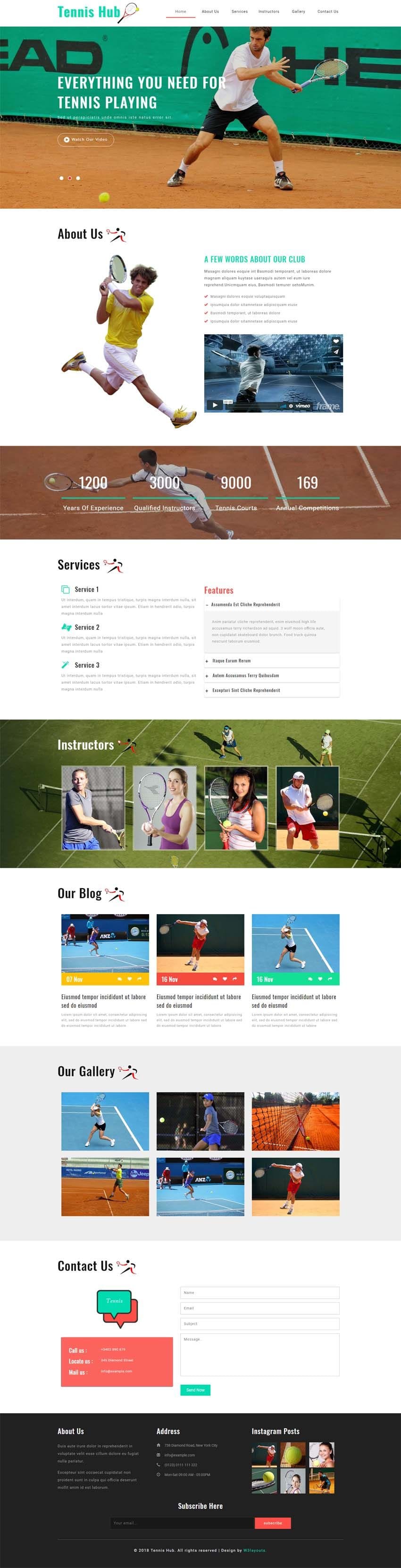
Tennis Hub is a beautiful template for a sports website with dynamic, clean and modern design. It’s a great choice for tennis clubs, coaches who provide tennis lessons and training, as well as tennis tournaments and competitions. Choose this Tennis Hub website template to spice up your sports website and add a unique character to it. This modern and professional Tennis Hub is a perfect option for your tennis clubs as well as other sports, personal trainers, sports centers, tennis / sport review magazine, and any other sports related websites which has an extremely versatile design and is highly customizable. You can also make websites for other sports like Badminton, Bowling, Boxing, Cycling, Figure skating, Golf, Skiing, and Snowboarding by using this Tennis Hub template. This smartly designed template comes with pretty awesome features like banner text slider, video popup, sports services, team of instructors or coaches, gallery image chocolat effect, news blog section, contact information, newsletter subscription form in the footer section and clean, sleek, minimalistic and elegance style of design in every detail. This elegantly designed Tennis Hub template is 100% responsive cross browser template, compatible on all devices, displayed on all screen sizes. It is entirely built in Bootstrap framework, HTML5, CSS3 and JQuery. Make it yours now by using it, downloading it and please share it.
TEMPLATE INFORMATION:
Template Name : – Tennis Hub Sports Category Flat Bootstrap Responsive Web Template License : – Life Time Free License Under Creative Commons Attribution 3.0 Unported. Unlimited Use, you can help & support us (W3Layouts, a Non-Profit) by donations or you should keep link to our website. Compatible Browsers: – Google Chrome, Firefox, Safari, IE 10, Opera etc. Source Files included: – HTML files (.html), Style Sheets (.css), Images (.jpg/.png/.gif),
JQuery plugins (.js), Fonts (.ttf). High Resolution: – Yes.
100% Responsive
Icons based on Font Awesome
HTML5 & CSS3
Google Fonts used
Simple & Easy to Use/Customize
Bootstrap Framework
Used Smooth Scroll
And more…
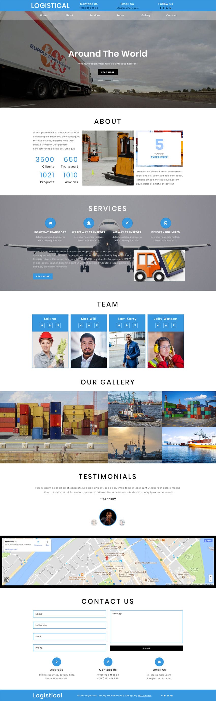
Logistical is a stylish, elegant and versatile logistics website template for transportation category websites. You can easily create a professional website and start promoting your services by using this logistical template.
Although the name suggests that it is a fit for logistics companies, this web theme can be used for other industries like:
Cargo delivery agencies
Truck agencies
Warehouse management
Shipping companies
Freight services
Delivery agencies and much more.
We designed our Logistical theme to be simple to use, intuitive and powerful, and most importantly results orientated. This Logistical template will help you get your site up and running in minutes, provide an excellent user and admin experience, and help convert visitors into customers! W3layout templates are easy to customize & integrate and can be downloaded for free.
This is a unique and creatively designed template that has awesome features like:
Banner text slider
Number counter
Awesome hover effects
Gallery lightbox effect
Testimonial slider plugin
Interactive locations google map
Contact form and much more
This template is a 100% responsive cross browser template, compatible on all devices and displayed on all screen sizes. It is entirely built in the Bootstrap framework, HTML5, CSS3, and JQuery. Download this logistics website template for free and build your business website today.
TEMPLATE INFORMATION:
Template Name: Logistical Transportation Category Bootstrap Responsive Web Template
License: Life Time Free License Under Creative Commons Attribution 3.0 Unported. Unlimited Use, you can help & support us (W3Layouts, a Non-Profit) by donations or you should keep a link to our website.
Compatible Browsers: – Google Chrome, Firefox, Safari, IE 10, Opera, etc.


